Create a multi-level category chart in Excel
A multi-level category chart can display both the main category and subcategory labels at the same time. When you have values for items that belong to different categories and want to distinguish the values between categories visually, this chart can do you a favor.
This tutorial demonstrates methods to create two kinds of multi-level category charts in Excel in details.

Create a multi-level category bar chart in Excel
Create a multi-level category column chart in Excel
Easily create a multi-level category chart with an amazing tool
Download the sample file
Video: Create band chart in Excel
Create a multi-level category chart in Excel
Please do as follows to create a multi-level category chart in Excel.
1. Firstly, arrange your data which you will create a multi-level category chart based on as follows.

2. Select the data range, click Insert > Insert Column or Bar Chart > Clustered Bar.

3. Drag the chart border to enlarge the chart area. See the below demo.

4. Right click the bar and select Format Data Series from the right-clicking menu to open the Format Data Series pane.
Tips: You can also double click any of the bars to open the Format Data Series pane.

5. In the Format Data Series pane, change the Gap Width to 50%.

Now the chart is displayed as follows.

6. Insert two blank rows before each main subcategory (except the first one) in the data range. Then you can see categories and data bars in the chart are separated with blank spaces as well.

7. Double click the first cell of the first row of each pair of blank rows you have inserted in step 6, type in a blank space by pressing the Space key once in the keyboard. Then you can see black outlines are added to the blank areas in the vertical axis fields.

8. Click the vertical axis, go to the Format Axis pane, and then check the Categories in reverse order box.

9. Select the chart title and then press the Delete key to remove it from the chart. Do the same to remove the horizontal axis and the gridlines.
10. Now you need to specify different colors for each main category.


After specifying fill colors to distinguish the categories, you can see the chart is displayed as the below screenshot shown.

11. Now change the outline colors of the vertical axis and bars to black.

Now the chart is displayed as follows.

13. Now you need to add data labels to the data bars. Please select the chart, click the Chart Elements button, and then check the Data Labels box.
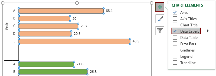
Now the multi-level category chart is complete as the below screenshot shown.
Create a multi-level category column chart in Excel
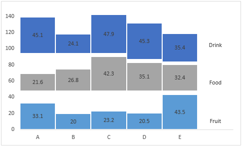
In this section, I will show a new type of multi-level category column chart for you. As the below screenshot shown, this kind of multi-level category column chart can be more efficient to display both the main category and the subcategory labels at the same time. And you can compare the same subcategory in each main category vertically.
You can follows the below guidance to create this kind of multi-level category column chart in Excel.
1. As the above chart shown, there are three-level category columns, and each level of columns is separated by spacing, so the first step is to calculate the spacing between each level of columns based on the original data as the below screenshot shown.


2. Select the whole helper range (A9:G14), click Insert > Insert Column or Bar Chart > Stacked Column.

3. Then a stacked chart is inserted into current worksheet. Keep the chart selecting, click Switch Row/Column under the Design tab (Chart Tools).

Then the chart is displayed as follows.

4. Double click any series in the chart to open the Format Data Series pane. In the pane, change the Gap Width to 0%.

5. Select the spacing1 data series in the chart, go to the Format Data Series pane to configure as follows.
Then these data bars are hidden.

6. Select the spacing2 data series, press the F4 key to hide it in the chart.
7. Then hide the spacing3 data series as the same operation as above.
8. Remove the chart title and gridlines.
Then the chart is displayed as the below screenshot shown.

9. Select the top data series and go to the Format Data Series pane to configure as follows.

10. Repeat the step 9 to add the same border styles to the other two rows. Then you will get the following chart.

Now you need to add the main category values to the right side of the plot area as the below screenshot shown.

11. For adding these values, firstly, we need to get the certain positions of these values in the chart with some helper data.
- 1) As we can see, there are five columns represent the subcategories in the chart. In order to locate the main category values to the right side of the plot area, we need to place the main category values in the sixth column of the chart. So the first column data of the new helper range is 6. And as there are three main categories, here we need three 6.
- 2) The number 0 represents the position of the first main category.


12. Right click the chart and click Select Data from the right-clicking menu.

13. In the Select Data Source dialog box, click the Add button.
14. In the Edit Series dialog box, select the position data you have calculated for the main categories in the Series value box, and then click the OK button.

15. Then, it turns back to the Select Data Source dialog box, you can see a new series “Series7” is added in the Legend Entries box, click OK to save the changes.

16. Right click the chart and select Change Series Chart Type in the right-clicking menu.

17. In the Change Chart Type dialog box, specify the Chart Type as “Scatter” for the new series you added in step 15, and then click OK.

Now the chart is displayed as the below screenshot shown.

18. Right click the chart and click Select Data in the context menu.
19. In the Select Data Source dialog box, select the series you have added in step 15, and then click the Edit button.

20. In the Edit Series dialog box, select the number 6 cells in the Series X values box and then click OK.

21. Click OK to save the changes went it returns to the Select Data source dialog box.
22. Now the new series is shown as scatter dots and displayed on the right side of the plot area. Select the dots, click the Chart Elements button, and then check the Data Labels box.

23. Right click the data labels and select Format Data Labels from the right-clicking menu.

24. In the Format Data Labels pane, please do as follows.


25. Select the dots in the chart, and then go to the Format Data Series pane to configure as follows.

26. Remove the legend from the chart by selecting and pressing the Delete key in the keyboard.
27. You can format the maximum of the vertical axis to make the chart compact by double clicking the vertical axis, then entering a new value into the Maximum box in the Format Axis pane.

28. Add data labels to the series by selecting the series, clicking the Chart Elements button and then checking the Data Labels box. See screenshot:

Now a multi-level category column chart is complete.
Easily create a multi-level category chart in Excel
The Multi Layer Column Chart utility of Kutools for Excel provides three multi-level category chart types. With this feature, you can easily create one of the multi-level category chart in Excel with several clicks only as the below demo shown.
Download and try it now! 30-day free trail

Download the sample file
