
How to group (two-level) axis labels in a chart in Excel?

For example you have a purchase table as below screen shot shown, and you need to create a column chart with two-lever X axis labels of date labels and fruit labels, and at the same time date labels are grouped by fruits, how to solve it? This article provides a couple of ways to help you group (two-level) axis labels in a chart in Excel.


Group (two-level) axis labels with adjusting layout of source data in Excel

This first method will guide you to change the layout of source data before creating the column chart in Excel. And you can do as follows:

1. Move the fruit column before Date column with cutting the fruit column and then pasting before the date column.

2. Select the fruit column except the column heading. In our case, please select the Range A2:A17, and then click the Sort A to Z button on the Data tab.
doc group axis labels 2

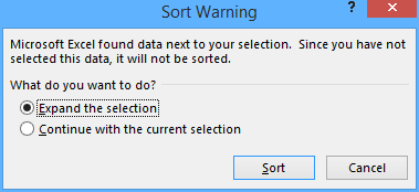
3. In the throwing out Sort Warning dialog box, keep the Expand the selection option checked, and click the Sort button.

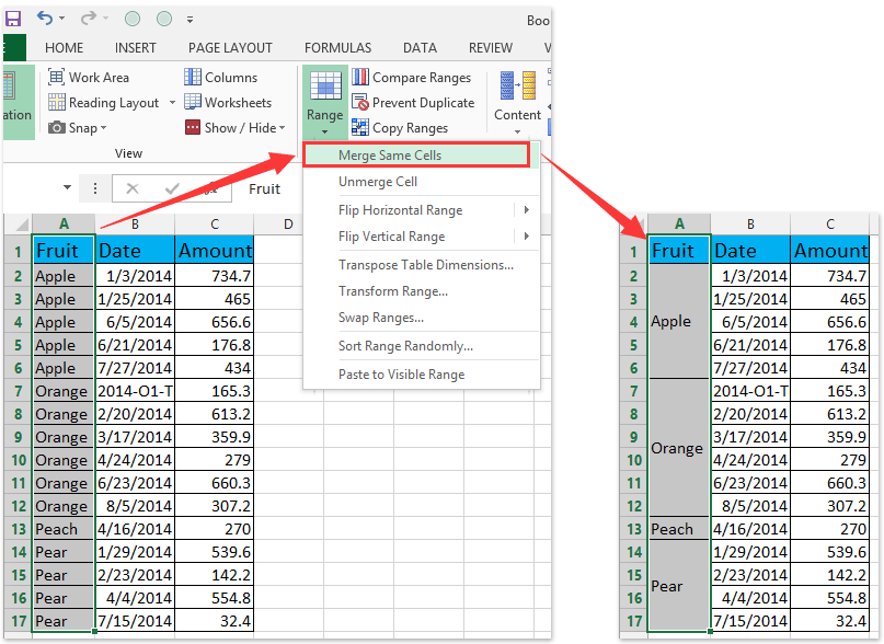
4. In the fruit column, select the first series of same cells, says A2:A6, and click Home > Merge & Center. And then click the OK button in the popping Microsoft Excel dialog box. See below screenshots:
doc group axis labels 01doc group axis labels 02
And then the first series of adjacent cells filled by Apple are merged. See below screenshot:
doc group axis labels 03

5. Repeat Step 4 and merge other adjacent cells filled with same values.

Tip: One click to merge all adjacent cells filled with same value in Excel
If you have Kutools for Excel installed, you can apply its Merge Same Cells utility to merge all adjacent cells which contain same value with only one click.


ad merge same cells 2

6. Select the source data, and then click the Insert Column Chart (or Column) > Column on the Insert tab.

Now the new created column chart has a two-level X axis, and in the X axis date labels are grouped by fruits. See below screen shot:


Group (two-level) axis labels with Pivot Chart in Excel

The Pivot Chart tool is so powerful that it can help you to create a chart with one kind of labels grouped by another kind of labels in a two-lever axis easily in Excel. You can do as follows:

1. Create a Pivot Chart with selecting the source data, and:
(1) In Excel 2007 and 2010, clicking the PivotTable > PivotChart in the Tables group on the Insert Tab;
(2) In Excel 2013, clicking the Pivot Chart > Pivot Chart in the Charts group on the Insert tab.

2. In the opening dialog box, check the Existing worksheet option, and then select a cell in current worksheet, and click the OK button.

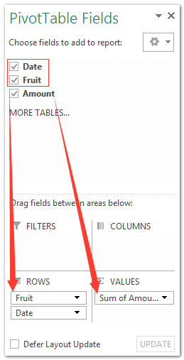
3. Now in the opening PivotTable Fields pane, drag the Date field and Fruit field to the Rows section, and drag Amount to the Values section.

Notes:
(1) The Fruit filed must be above the Date filed in the Rows section.
(2) Apart from dragging, you can also right click a filed, and then select Add to Row Labels or Add to Values in the right-clicking menu.

Then the date labels are grouped by fruits automatically in the new created pivot chart as below screen shot shown:


Demo: Group (two-level) axis labels in normal chart or PivotChart


Kutools for Excel: Over 300 handy tools at your fingertips! Start your 30-day free trial with no feature limitations today. Download Now!

Best Office Productivity Tools

🤖 Kutools AI Aide: Revolutionize data analysis based on: Intelligent Execution   |  Generate Code  |  Create Custom Formulas  |  Analyze Data and Generate Charts  |  Invoke Kutools Functions
Popular Features: Find, Highlight or Identify Duplicates   |  Delete Blank Rows   |  Combine Columns or Cells without Losing Data   |   Round without Formula ...
Super Lookup: Multiple Criteria VLookup    Multiple Value VLookup  |   VLookup Across Multiple Sheets   |   Fuzzy Lookup ....
Advanced Drop-down List: Quickly Create Drop Down List   |  Dependent Drop Down List   |  Multi-select Drop Down List ....
Column Manager: Add a Specific Number of Columns  |  Move Columns  |  Toggle Visibility Status of Hidden Columns  |  Compare Ranges & Columns ...
Featured Features: Grid Focus   |  Design View   |   Big Formula Bar    Workbook & Sheet Manager   |  Resource Library (Auto Text)   |  Date Picker   |  Combine Worksheets   |  Encrypt/Decrypt Cells    Send Emails by List   |  Super Filter   |   Special Filter (filter bold/italic/strikethrough...) ...
Top 15 Toolsets12 Text Tools (Add Text, Remove Characters, ...)   |   50+ Chart Types (Gantt Chart, ...)   |   40+ Practical Formulas (Calculate age based on birthday, ...)   |   19 Insertion Tools (Insert QR Code, Insert Picture from Path, ...)   |   12 Conversion Tools (Numbers to Words, Currency Conversion, ...)   |   7 Merge & Split Tools (Advanced Combine Rows, Split Cells, ...)   |   ... and more

Supercharge Your Excel Skills with Kutools for Excel, and Experience Efficiency Like Never Before. Kutools for Excel Offers Over 300 Advanced Features to Boost Productivity and Save Time.  Click Here to Get The Feature You Need The Most...

Description


Office Tab Brings Tabbed interface to Office, and Make Your Work Much Easier

  • Enable tabbed editing and reading in Word, Excel, PowerPoint, Publisher, Access, Visio and Project.
  • Open and create multiple documents in new tabs of the same window, rather than in new windows.
  • Increases your productivity by 50%, and reduces hundreds of mouse clicks for you every day!
Comments (7)
No ratings yet. Be the first to rate!
This comment was minimized by the moderator on the site
Thank you! In order to save space, is it possible to only label the first and last date in the series? I've tried changing the "interval unit" setting under label, but it doesn't seem to have any effect on a multi-level chart. I also tried setting the middle date labels to spaces or blanks, but that completely confused excel.,
This comment was minimized by the moderator on the site
Hi Kathy,
There is another trick that can save space in the X axis in chart.
Select the date cells in the source data, right click, and select Format Cells from context menu. And then customize the date format with the number formatting code m/d
This comment was minimized by the moderator on the site
Thanks @kellyette, I'll give that a try.
This comment was minimized by the moderator on the site
Hello, I am trying to make a graph but I am not able to display data as I need it. I have 5 columns of data. first 3 columns are identifiers (date, location, product), 4th and 5th columns are to compare the sales numbers in a graph. However when I select the columns I only get location as vertical text on horizontal axis and date and product data is showing as horizontal text and gets all scrambled. I tried changing the text direction but it did not work. How can I have date, location, product information next to each other for each date, displaying vertically under each comparison data? Thanks in advance for your help. AJ
This comment was minimized by the moderator on the site
Hi aj,
Which version of Excel are you using? And which chart type are you creating? In Excel 2013, select 5 columns, and then click Insert > Insert Column Chart > Clustered Column, the first 3 columns will be added as x axis automatically.
This comment was minimized by the moderator on the site
I have this same problem. You can only rotate the upper level of labels. The 2nd level will always be Horizontal (or Vertical on the Y-axis). I can't figure a way to change it either.
This comment was minimized by the moderator on the site
merging cells makes the table un-usable. Might as well use powerpoint instead of a table.
There are no comments posted here yet
Please leave your comments in English
Posting as Guest
×
Rate this post:
0   Characters
Suggested Locations