How to create simple Pareto chart in Excel?
A Pareto chart is composed of a column chart and a line graph, it is used to analyze the quality problems and determine the major factor in the production of quality problems. If you want to create a Pareto chart in your worksheet to display the most common reasons for failure, customer complaints or product defects, I can introduce the steps for you.
- Create a pareto chart in Excel 2016, 2019, or 365
- Create a Pareto chart in Excel 2013 or earlier versions
Create a pareto chart in Excel 2016, 2019, or 365
If you are using Excel 2016, 2019, or 365, you can easily create a pareto chart as follows:
1. Prepare the source data in Excel, and select the source data.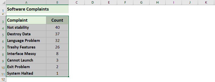
2. Click Insert > Insert Statistic Chart > Pareto.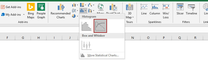
Then the pareto chart is created. See screenshot: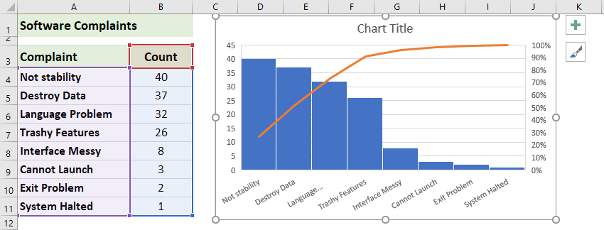
One click to add a cumulative sum line and labels for a cluster column chart
The cluster column chart is quite common and useful in statistic works. Now, Kutools for Excel releases a chart tool – Add Cumulative Sum to Chart to quickly add a cumulative total line and all cumulative total labels for a cluster column chart by only one click!
Kutools for Excel - Supercharge Excel with over 300 essential tools, making your work faster and easier, and take advantage of AI features for smarter data processing and productivity. Get It Now
Create a Pareto chart in Excel 2013 or earlier versions
To create a Pareto chart in Excel 2013 or earlier versions, please do as this:
1. Type and list the number of each complaints or defects of your production in a worksheet like the following screenshot:
2. Sort this data in descending order by selecting the cell B4 in this case and clicking Data > Sort Largest to Smallest icon.
And now your values in column B are in descending order as below screenshot shown:
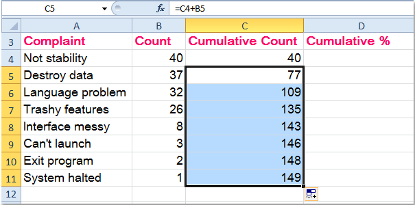
3. Then calculate the Cumulative Count by entering this formula =B4 into the cell C4 in this case, and press Enter key.
4. In cell C5, type this formula =C4+B5, press Enter key, and select cell C5 then drag the fill handle to the range that you want to contain this formula, and all the Cumulative Count values in column C have been calculated. See screenshots:
5. Next, you need to calculate the Cumulative Percentage, in cell D4 for example, input this formula =C4/$C$11, (the cell C4 indicates the number of the first complaints, and the cell C11 contains the total number of the complaints) and then drag the formula down to fill the range you want to use.

Tip: You can format the cell to percentage formatting by selecting the range and right clicking to select Format cells > Percentage.
6. And now your data is complete and ready to create a Pareto chart, hold down the Ctrl key select data in column A, column B and column D, and then click Insert > Column > Clustered Column, see screenshot:
7. And you will get a chart as follows:
8. Then select one red bar (Cumulative Percentage) and right click, then choose Change Series Chart Type from the context menu, see screenshot:
9. In the Change Chart Type dialog, select Line with Makers, and click OK. And you will get the chart like the following screenshots shown:


10. And then select the red line, right click and choose Format Data Series, in the Format Data Series dialog box, select Series Options and check Secondary Axis in the right section. See screenshots:

11. Then close the dialog, and the secondary axis has been added to the chart, go on selecting the percentage axis and right clicking to choose Format Axis.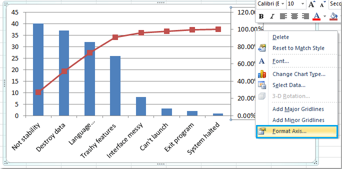
12. In the Format Axis dialog, check Fixed radio button beside Maximum, and set the number to 1.0 in to the text box. See screenshot:
13. And then close the dialog, the Pareto chart has been finished completely as following screenshot: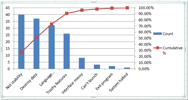
Demo: Create a simple Pareto chart in Excel
Related articles:
Best Office Productivity Tools
Supercharge Your Excel Skills with Kutools for Excel, and Experience Efficiency Like Never Before. Kutools for Excel Offers Over 300 Advanced Features to Boost Productivity and Save Time. Click Here to Get The Feature You Need The Most...
Office Tab Brings Tabbed interface to Office, and Make Your Work Much Easier
- Enable tabbed editing and reading in Word, Excel, PowerPoint, Publisher, Access, Visio and Project.
- Open and create multiple documents in new tabs of the same window, rather than in new windows.
- Increases your productivity by 50%, and reduces hundreds of mouse clicks for you every day!
All Kutools add-ins. One installer
Kutools for Office suite bundles add-ins for Excel, Word, Outlook & PowerPoint plus Office Tab Pro, which is ideal for teams working across Office apps.
- All-in-one suite — Excel, Word, Outlook & PowerPoint add-ins + Office Tab Pro
- One installer, one license — set up in minutes (MSI-ready)
- Works better together — streamlined productivity across Office apps
- 30-day full-featured trial — no registration, no credit card
- Best value — save vs buying individual add-in