How to create waterfall chart in Excel?
The waterfall chart is usually made for clearly viewing and understanding how a start value is affected by a series of intermediate positive or negative values and get the finally value, which is very useful. It can be used for the cash flow, the inventory audit and so on. Here are the steps to create a waterfall chart in Excel.
Create and make a waterfall chart in Excel
Clicks to create a horizontal waterfall chart with a handy tool
Comparison of Methods for Creating a Waterfall Chart in Excel
A waterfall chart shows how a starting value is affected by a series of positive and negative changes before reaching a final value. It is commonly used for cash flow, inventory changes, profit analysis, and other sequential financial data. The following table compares the two methods introduced in this article.
| Feature | Excel Built-in Method | Kutools Horizontal Waterfall Chart |
|---|---|---|
| Create a waterfall chart | ✔ | ✔ |
| Dedicated waterfall chart tool | ✘ Uses a manually constructed stacked column chart | ✔ |
| Requires helper data | ✔ Several helper columns are required | ✘ Uses the prepared source data directly |
| Requires formulas | ✔ Multiple formulas are required | ✘ |
| Requires calculating positive and negative values separately | ✔ Uses formulas such as MIN and MAX | ✘ |
| Requires calculating a Base series | ✔ | ✘ |
| Requires inserting a standard chart first | ✔ Stacked Column Chart | ✘ |
| Requires hiding the Base series | ✔ Set Shape Fill to No Fill | ✘ |
| Requires manual color formatting | ✔ | ✘ During initial creation |
| Requires adjusting Gap Width | ✔ | ✘ |
| Create a horizontal waterfall chart directly | ✘ Article demonstrates a vertical stacked-column approach | ✔ |
| Automatically detect selected data | ✘ Manual range setup required | ✔ Axis Labels and Data Range are auto-filled |
| Requires VBA / coding | ✘ | ✘ |
| Manual data preparation | High | Low |
| Manual chart-formatting effort | Moderate to High | Low |
| Main setup process | Prepare helper columns and formulas for the Base, decrease, increase, start, and end values; insert a Stacked Column Chart; hide the Base series; format the Start and End series; and adjust the Gap Width to complete the waterfall chart. | Select the source data, choose Kutools > Charts > Difference Comparison > Horizontal Waterfall Chart, confirm the Axis Labels and Data Range, and click OK. |
| Best for | Users who prefer a built-in Excel approach and are comfortable preparing helper formulas and manually formatting charts | Quickly creating horizontal waterfall charts without constructing helper series or manually formatting a stacked column chart |
| Ease of use | Moderate to Advanced | Very easy |
 Create and make a waterfall chart in Excel

For instance, here we make a waterfall chart about the cash flow during a year.
1. To create a waterfall chart, firstly, you need to arrange and type your data as below screenshot: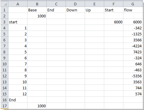
Tip: Base 1000 is a calculated amount for a series, you can change it as you need.
2. In the following cells, type these formula:
A2: =" "
F3: =G3, press Enter;
B4: =SUM(B3,E3:F3,-D4), press Enter, then drag the fill handle to fill the range B4:B15 (you can change the range as you need).
D4: =-MIN(G4,0), press Enter, then drag the fill handle to fill the range D4:D15 (you can change the range as you need).
E4: =MAX(G4,0), press Enter, then drag the fill handle to fill the range B4:B15 (you can change the range as you need).
C16: =SUM(B15,E15:F15,-D16).
Then you can see the data has been set as below:
3. Select the range A1: F17 (except the Flow column in my case), and click Insert > Column Chart > Stacked Column. See screenshot:


4. Click the Base column (the dark blue bricks) in the chart, and click Format > Shape Fill > No Fill. See screenshot:


5. Select the Start column in the chart, and click Format > Shape Fill, and select the same color as the color of the End column in the chart. See screenshot:

6. Select a column and click Format > Format Selection to open the Format Data Series dialog. See screenshot:
7. In the Format Data Series dialog, adjust the Gap Width axle to meet your need and click Close to close the dialog. See screenshot:
Attention: If you are using Microsoft Excel 2013 or later versions, a Format Data Series pane will appear on the right side after clicking Format > Format Selection. You can adjust the gap width in this pane. See screenshot:
Then you can see the waterfall chart has been made as below:
Clicks to create a horizontal waterfall chart with a handy tool
If you want to quickly and easily to create a waterfall chart without formulas, you can try Kutools for Excel’s Horizontal Waterfall Chart feature, which creates a horizontal waterfall chart in just a few clicks.
In Kutools for Excel’s Charts group, it provides dozens of smart and beautiful chart templates for you, all of them only need clicks to create in seconds.
Make your data as below screenshot shown:
1. Select the data, click Kutools > Charts > Difference Comparison > Horizontal Waterfall Chart.
2. In the Horizontal Waterfall Chart dialog, check Chart option in the Chart Type section, and in the Select Data section, the data ranges have been auto filled in the Axis Labels and Data range textboxes. Checking all settings are right, click OK.
Then the horizontal waterfall chart will be created.

Conclusion
Excel's built-in method can create a waterfall chart without an add-in, but the workflow requires considerable preparation. Users first need to build several helper series with formulas to calculate the base positions, increases, decreases, and final value. After inserting a stacked column chart, the Base series must be hidden and additional formatting, such as series colors and Gap Width, must be adjusted manually.
Kutools for Excel's Horizontal Waterfall Chart provides a much simpler approach. After selecting the source data, the Axis Labels and Data Range are automatically detected in the chart dialog. Users only need to confirm the settings and click OK to generate the chart. This removes the need to create helper formulas, construct a stacked column chart, hide a Base series, or perform multiple manual formatting steps, making it especially useful for quickly visualizing cash flow, profit changes, inventory movements, and other positive-and-negative contributions.
Related Articles:
Best Office Productivity Tools
Supercharge Your Excel Skills with Kutools for Excel, and Experience Efficiency Like Never Before. Kutools for Excel Offers Over 300 Advanced Features to Boost Productivity and Save Time. Click Here to Get The Feature You Need The Most...
Office Tab Brings Tabbed interface to Office, and Make Your Work Much Easier
- Enable tabbed editing and reading in Word, Excel, PowerPoint, Publisher, Access, Visio and Project.
- Open and create multiple documents in new tabs of the same window, rather than in new windows.
- Increases your productivity by 50%, and reduces hundreds of mouse clicks for you every day!
All Kutools add-ins. One installer
Kutools for Office suite bundles add-ins for Excel, Word, Outlook & PowerPoint plus Office Tab Pro, which is ideal for teams working across Office apps.





- All-in-one suite — Excel, Word, Outlook & PowerPoint add-ins + Office Tab Pro
- One installer, one license — set up in minutes (MSI-ready)
- Works better together — streamlined productivity across Office apps
- 30-day full-featured trial — no registration, no credit card
- Best value — save vs buying individual add-in