How to make a cumulative sum chart in Excel?
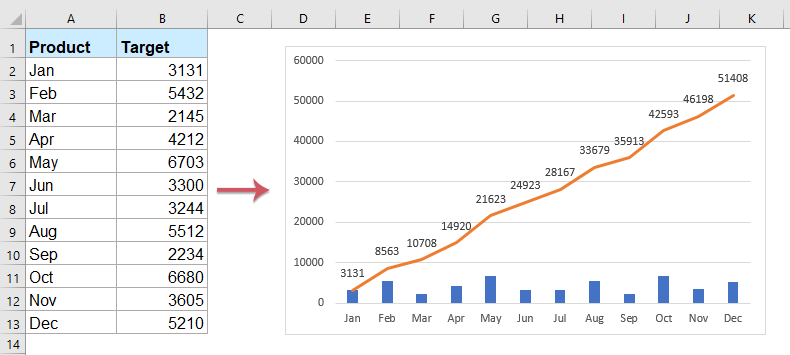
If you have a list of monthly sales volumes for a year and want to create a cumulative sum chart to show the cumulative sales each month as shown in the screenshot below, how would you do it? Here, I will introduce some ways to make a cumulative sum chart in Excel.
Create an accumulative sum chart in Excel
Add accumulative sum for chart in Excel with a handy feature
Create an accumulative sum chart in Excel
1. Select a blank cell adjacent to the Target column, in this case, select Cell C2, and type this formula =SUM(B$2:B2), and then drag the fill handle down to the cells you want to apply this formula. See screenshot:

2. Then, select the Target and Total column ranges, and then click Insert > Column > Clustered Column, see screenshot:

3. In the inserted chart, click one total column and right click to select Change Series Chart Type… from the context menu. See screenshot:

4. In the Change Chart Type dialog, click Combo from the left pane, and then select Clustered Column-Line chart type in the right pane, see screenshot:

Note: If you are using Excel 2010 and earlier version, please select Line in the left pane, and then choose one line chart type from the right pane, see screenshot:

5. Click OK, and then right click the line in the chart, and select Add Data Labels > Add Data Labels from the context menu. See screenshot:

6. Then you can see the cumulative sum chart has been finished:

Add accumulative sum for chart in Excel with a handy feature
If you have Kutools for Excel, with its Add Cumulative Sum to Chart feature, you can insert the cumulative total sum for the chart with only several clicks.
After installing Kutools for Excel, please do as this:
1. First, please insert the chart based on your data, see screenshot:

2. Then, click to select the chart, and then click Kutools > Charts > Chart Tools > Add Cumulative Sum to Chart, see screenshot:

3. And then, click Yes in the popped out prompt box, and click OK in the following box, see screenshots:
 |  |
4.Now, the cumulative sum value have been added to the chart, see screenshot:

Kutools for Excel - Supercharge Excel with over 300 essential tools. Enjoy permanently free AI features! Get It Now
More related chart articles:
- Create A Bar Chart Overlaying Another Bar Chart In Excel
- When we create a clustered bar or column chart with two data series, the two data series bars will be shown side by side. But, sometimes, we need to use the overlay or overlapped bar chart to compare the two data series more clearly. In this article, I will talk about how to create an overlapped bar chart in Excel.
- Color Chart Based On Cell Color In Excel
- Normally, when you create a chart, the color of the column bar is the default. If you need to format filled color on each bar based on the cell colors as following screenshot shown, how could you solve it in Excel?
- Highlight Max And Min Data Points In A Chart
- If you have a column chart which you want to highlight the highest or smallest data points with different colors to outstand them as following screenshot shown. How could you identify the highest and smallest values and then highlight the data points in the chart quickly?
- Create A Step Chart In Excel
- A step chart is used to show the changes happened at irregular intervals, it is an extended version of a line chart. But, there is no direct way to create it in Excel. This article, I will talk about how to create a step chart step by step in Excel worksheet.
- Create Progress Bar Chart In Excel
- In Excel, progress bar chart can help you to monitor progress towards a target as following screenshot shown. But, how could you create a progress bar chart in Excel worksheet?
Best Office Productivity Tools
Supercharge Your Excel Skills with Kutools for Excel, and Experience Efficiency Like Never Before. Kutools for Excel Offers Over 300 Advanced Features to Boost Productivity and Save Time. Click Here to Get The Feature You Need The Most...
Office Tab Brings Tabbed interface to Office, and Make Your Work Much Easier
- Enable tabbed editing and reading in Word, Excel, PowerPoint, Publisher, Access, Visio and Project.
- Open and create multiple documents in new tabs of the same window, rather than in new windows.
- Increases your productivity by 50%, and reduces hundreds of mouse clicks for you every day!
All Kutools add-ins. One installer
Kutools for Office suite bundles add-ins for Excel, Word, Outlook & PowerPoint plus Office Tab Pro, which is ideal for teams working across Office apps.
- All-in-one suite — Excel, Word, Outlook & PowerPoint add-ins + Office Tab Pro
- One installer, one license — set up in minutes (MSI-ready)
- Works better together — streamlined productivity across Office apps
- 30-day full-featured trial — no registration, no credit card
- Best value — save vs buying individual add-in