How to vary colors by point for chart in Excel?
When you create a single-series column, bar, or line chart in Excel, you'll often notice that all the data points within the series are displayed using the same color by default. This uniform color scheme can sometimes make charts less visually engaging or make it harder to distinguish between individual data values at a glance. Naturally, many users want to customize their charts so that each data point is represented by a unique color, making the chart not only more attractive and professional but also more readable—especially when highlighting trends, outliers, or specific categories.
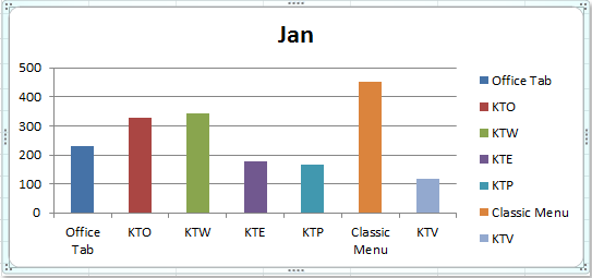
However, if you try to change the color of an individual data point through the standard formatting options, you'll find that Excel applies the color change to the entire data series, not just the selected data point. This limitation can be frustrating when you wish to create visual effects like the ones shown below:
 |
 |
 |
In this article, we will explore several practical solutions to achieve this kind of multi-color effect for each data point in your chart, including both built-in Excel features and more advanced methods using VBA code. With these techniques, you can create charts that not only communicate your data more effectively but also stand out in presentations or reports.
Vary colors by point for column / bar / line chart
VBA: Assign custom colors to chart data points
Vary colors by point for column / bar / line chart
If you want to manually apply different colors to each data point in a column, bar, or line chart, Excel’s “Vary colors by point” feature provides a quick and effective solution for single-series charts. This feature is especially useful when you have a small number of data points and prefer a quick visual distinction between each value. However, it does not allow unlimited color customization, as it works within the constraints of Excel’s default color palette and themes.
To color code each data point with different colors, use the following steps:
1. First, click on one of the data columns (or points) within the chart to select the entire data series. Then, right-click to open the context menu and select Format Data Series. If you have problems selecting a single series, make sure you click once (not double click) a data point.

2. In the Format Data Series dialog box, click Fill in the left pane. Next, check the Vary colors by point checkbox in the right section. This immediately assigns different default theme colors to each data point in the series.

Tip: If you are using Excel2013 or a later version, the interface may look slightly different. Here, in the Format Data Series pane, choose the Fill & Line icon (paint bucket). Under the FILL section, you'll find the same Vary colors by point option. Check it to apply the setting. See screenshot:

3. After you click Close to exit the dialog, your chart will now display each data point in a different color. Notice that the assigned colors are based on the current workbook theme.
4. If you don’t like the default color selection, you can easily change the color style by customizing the theme. Go to the Page Layout tab, click Themes, and select a color theme you prefer. All the chart colors will update automatically based on the selected theme. This provides a quick way to experiment with color schemes that suit your presentation or branding requirements.

5. After changing the theme, your chart will display the data bars or columns with the new color palette you selected.
Usage tips:
• The “Vary colors by point” option can be used not only for column charts but also for bar charts and line charts in Excel.
• While “Vary colors by point” is easy and quick for basic charts, it does not offer full control over the exact color of each point. If you require specific branding colors or wish to assign a particular color to each value, you may prefer to use manual formatting for each data point or consider the more advanced methods below.
• This feature only works for single-series charts. For more complex multi-series charts or scenarios where granular color control is necessary, see the following expanded solutions.
Troubleshooting:
• If the “Vary colors by point” option is greyed out, check whether you have more than one series in the chart. This option is only available for single-series charts.
• In some older Excel versions, the naming or icon may differ slightly; hover over similar options to locate it.
• If your chart doesn't update instantly, try re-clicking the chart or refreshing the worksheet.
Summary suggestion: This method is most recommended when you need fast, simple color variation for each point in a small data set and do not require customized color schemes for individual points.
VBA: Assign custom colors to chart data points
There are scenarios where Excel’s built-in “Vary colors by point” feature or chart themes are not precise enough—such as when you want to apply a specific color to each data point for advanced visualization (e.g., matching brand colors, highlighting outliers, or using standardized color codes). Here, you can use VBA to programmatically set the color of each data point. This method is particularly useful if you have a large dataset or need to repeatedly apply custom colors.
Applicable scenario: Use when you need exact color assignment (including RGB or hex codes) for each point, or want to auto-apply colors without formatting each point manually. The drawback is that macro security permissions must be enabled and editing macro code requires some familiarity with VBA.
1. Click Developer Tools > Visual Basic. In the new Microsoft Visual Basic for Applications window, click Insert > Module, and enter the following code into the Module:
Sub SetChartPointColors()
    ' Assigns custom colors to each data point in the first series of the first chart on the active sheet
    Dim cht As ChartObject
    Dim i As Integer
    Dim colorArray As Variant

    ' Define custom color codes (RGB values or color constants)
    colorArray = Array(RGB(255, 0, 0), RGB(0, 176, 80), RGB(0, 112, 192), RGB(255, 192, 0), RGB(112, 48, 160))

    On Error Resume Next
    Set cht = ActiveSheet.ChartObjects(1)

    If cht Is Nothing Then
        xTitleId = "KutoolsforExcel"
        MsgBox "No chart found on the active sheet.", vbExclamation, xTitleId
        Exit Sub
    End If

    For i = 1 To cht.Chart.SeriesCollection(1).Points.Count
        cht.Chart.SeriesCollection(1).Points(i).Format.Fill.ForeColor.RGB = colorArray((i - 1) Mod UBound(colorArray) + 1)
    Next i

    MsgBox "Custom colors have been assigned to data points.", vbInformation, xTitleId
End Sub
Parameter explanation and customization tips:
• colorArray holds color values you want to assign to data points. You can edit these RGB tuples to match your exact color needs.
• ActiveSheet.ChartObjects(1) targets the first chart object on your active worksheet. If you have multiple charts, you may need to adjust this reference.
2. To run the code, click the ![]() button in VBA or press F5. The macro will apply your custom palette to each point in the chart’s first series. If there are more points than colors in the array, the macro cycles through your colors.
button in VBA or press F5. The macro will apply your custom palette to each point in the chart’s first series. If there are more points than colors in the array, the macro cycles through your colors.
Precautions and troubleshooting:
• Make sure macro permissions are enabled in your Excel settings, as macros are disabled by default.
• If you receive a "No chart found" message, activate the worksheet containing your target chart.
• RGB colors can be adjusted as needed, use Excel’s color picker or online tools to find your preferred RGB codes.
• You can further enhance the VBA to prompt you for color selection or to work with specific charts/series.
Summary suggestion: The VBA method is best when you need to automate or precisely control data point coloring, especially for charts updated frequently or with many values.
Best Office Productivity Tools
Supercharge Your Excel Skills with Kutools for Excel, and Experience Efficiency Like Never Before. Kutools for Excel Offers Over 300 Advanced Features to Boost Productivity and Save Time. Click Here to Get The Feature You Need The Most...
Office Tab Brings Tabbed interface to Office, and Make Your Work Much Easier
- Enable tabbed editing and reading in Word, Excel, PowerPoint, Publisher, Access, Visio and Project.
- Open and create multiple documents in new tabs of the same window, rather than in new windows.
- Increases your productivity by 50%, and reduces hundreds of mouse clicks for you every day!
All Kutools add-ins. One installer
Kutools for Office suite bundles add-ins for Excel, Word, Outlook & PowerPoint plus Office Tab Pro, which is ideal for teams working across Office apps.
- All-in-one suite — Excel, Word, Outlook & PowerPoint add-ins + Office Tab Pro
- One installer, one license — set up in minutes (MSI-ready)
- Works better together — streamlined productivity across Office apps
- 30-day full-featured trial — no registration, no credit card
- Best value — save vs buying individual add-in