Change chart color based on value in Excel
Sometimes, when you insert a chart, you may want to show different value ranges as different colors in the chart. For example, when the value range is 0-60, show series color as blue, if 71-80 then show grey, if 81-90 show color as yellow and so on as below screenshot shown. Now this tutorial will introduce the ways for you to change chart color based on value in Excel.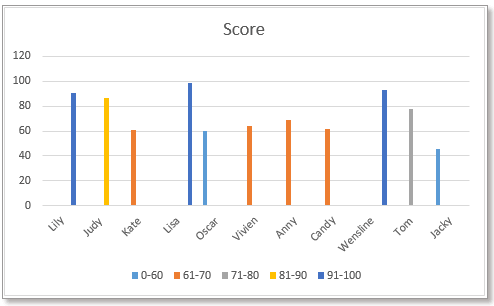
Change column/bar chart color based on value
Method 1:Change bar char color based on value by using formulas and built-in chart feature
Method 2:Change bar char color based on value by using a handy tool
Change line chart color based on value
Firstly, you need to create the data as below screenshot shown, list each value range, and then next to the data, insert the value range as column headers.
1. In cell C5, type this formula
Then drag fill handle down to fill cells, then continue dragging the handle right.
2. Then select the Column Name, hold Ctrl key, select the formula cells including value range headers.
3. click "Insert" > "Insert Column or Bar Chart", select "Clustered Column" or "Cluster Bar" as you need.
Then the chart has been inserted, and the chart colors are different based on the value.
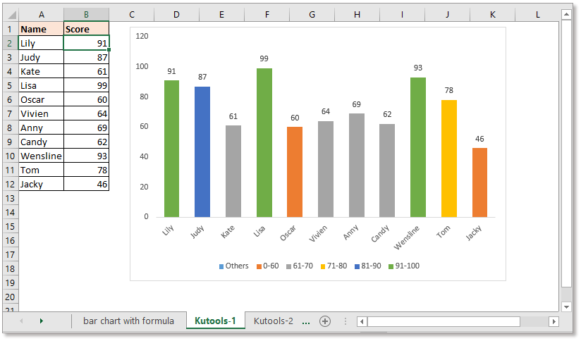
Sometimes, using the formula to create a chart may cause some errors while the formulas are wrong or deleted. Now the "Change chart color by value" tool of Kutools for Excel can help you.
After free installing Kutools for Excel, please do as below:
1. Click "Kutools" > "Charts" > "Change chart color by value". See screenshot:
2. In the popping dialog, do as these:
1) Select the chart type you want, then select the axis labels and series values separately except column headers.
2) Then click "Add" button  to add a value range as you need.
3) Repeat above step to add all value ranges to the "Groups" list. Then click Ok.
Tip:
1. You can double click the column or bar to display the "Format Data Point" pane to change the color.
2. If there has been inserted a column or bar chart before, you can apply this tool - "Color Chart by Value" to change the color of chart based on value.
Select the bar chart or column chart, then click "Kutools" > "Charts" > "Color Chart by Value". Then in the popped-out dialog, set the value range and the relative color as you need. Click to free download now!
If you want to insert a line chart with different colors based on values, you need another formula.
Firstly, you need to create the data as below screenshot shown, list each value range, and then next to the data, insert the value range as column headers.
Note: the series value must be sorted from A to Z.
1. In cell C5, type this formula
Then drag fill handle down to fill cells, then continue dragging the handle right.
3. Select the data range including the value range headers and the formula cells, see screenshot:
4. click "Insert" > "Insert Line or Area Chart", select "Line" type.
Now the line chart has been created with different color lines by values.
Create an interactive chart with series-selection checkbox in Excel
In Excel, we usually insert a chart for better displaying data, sometimes, the chart with more than one series selections. In this case, you may want to show the series by checking the checkboxes.
Conditional formatting stacked bar chart in Excel
This tutorial, it introduces how to create conditional formatting stacked bar chart as below screenshot shown step by step in Excel.
Creating an actual vs budget chart in Excel step by step
This tutorial, it introduces how to create conditional formatting stacked bar chart as below screenshot shown step by step in Excel.
The Best Office Productivity Tools
Kutools for Excel Solves Most of Your Problems, and Increases Your Productivity by 80%
- Super Formula Bar (easily edit multiple lines of text and formula); Reading Layout (easily read and edit large numbers of cells); Paste to Filtered Range...
- Merge Cells/Rows/Columns and Keeping Data; Split Cells Content; Combine Duplicate Rows and Sum/Average... Prevent Duplicate Cells; Compare Ranges...
- Select Duplicate or Unique Rows; Select Blank Rows (all cells are empty); Super Find and Fuzzy Find in Many Workbooks; Random Select...
- Exact Copy Multiple Cells without changing formula reference; Auto Create References to Multiple Sheets; Insert Bullets, Check Boxes and more...
- Favorite and Quickly Insert Formulas, Ranges, Charts and Pictures; Encrypt Cells with password; Create Mailing List and send emails...
- Extract Text, Add Text, Remove by Position, Remove Space; Create and Print Paging Subtotals; Convert Between Cells Content and Comments...
- Super Filter (save and apply filter schemes to other sheets); Advanced Sort by month/week/day, frequency and more; Special Filter by bold, italic...
- Combine Workbooks and WorkSheets; Merge Tables based on key columns; Split Data into Multiple Sheets; Batch Convert xls, xlsx and PDF...
- Pivot Table Grouping by week number, day of week and more... Show Unlocked, Locked Cells by different colors; Highlight Cells That Have Formula/Name...
")
- Enable tabbed editing and reading in Word, Excel, PowerPoint, Publisher, Access, Visio and Project.
- Open and create multiple documents in new tabs of the same window, rather than in new windows.
- Increases your productivity by 50%, and reduces hundreds of mouse clicks for you every day!
")