How to create speedometer or gauge chart in Excel?
Have you ever tried creating a speedometer chart in Excel? This tutorial provides two methods to help you create a speedometer chart effectively.

Create speedometer chart with the help of Doughnut chart
Quickly create speedometer chart with an amazing tool (3 steps)
More tutorial for charts…
Create speedometer chart with the help of Doughnut chart
Follow these step-by-step instructions to create a speedometer chart in Excel.
1. Before creating a speedometer chart, you need to prepare some data at first.
- Create the first value range and parts you want to display in the speedometer chart. Here I will separate the speedometer into three parts, so I type 30, 60, 90 separately into A2, A3 and A4, then in the cell A5, type the total number of numbers that typed in the above three cells.
- Create the second value range. Go to the blank range next to the Value column, and type 10 and 5 separately into D2 and D3, and then copy the below formula into cell D4. See screenshot:
=360-(D2+D3)

3. Select data in the Value column, click Insert > Insert Pie or Doughnut Chart > Doughnut. See screenshot:

4. Right click the doughnut chart and select Format Data Series from the context menu.

5. In the opening Format Data Series pane, type 271 into the Angle of first slice textbox and close the pane.

5. Right click on the biggest point, and click Format Data Point in the context menu.

6. In the Format Data Point pane, go to the Fill & Line tab, check the No fill box in the Fill section, and then close the pane. You can see the biggest point is disappeared from the chart.

7. Right click on the doughnut to select Select Data from context menu.

8. Then in the popping Select Data Source dialog, click the Add button.

9. In the Edit Series dialog, specify the new series name, select the series values and click OK. See screenshot.

10. Click OK when it returns to the Select Data Source dialog box.
11. Right click the second doughnut (the outside one), click Change Series Chart Type.

12. Under the All Charts tab, click to open the Combo section, select Pie from the Pointer series, check the Secondary Axis box, and click OK. See screenshot:

13. Then select and right click the pie chart, select Format Data Series from the context menu.

14. In the opening Format Data Series pane, type 270 into the Angle of first slice textbox under the Series Options tab, and then close the pane.

15. Select only the biggest point of pie, right click to select Format Data Point.

16. In the Format Data Point pane, check the No fill option and close the pane.

17. Then repeat the step 14 and 15 to remove the fill color of the remaining bigger one in pie. Remove the chart border, chart title and legend as you need. Then you can see the chart shown as below:

18. Click at the pointer, and right click to select Add Data Label.

19. Click the appeared label, and click it again to edit it. Type = into the formula bar, and then select the cell D2 you have typed 10 in step 1, and then press the Enter key.

Now the speedometer chart is created. Whenever you update the value in cell D2, the pointer in the speedometer chart will adjust automatically. See below demo:

Quickly create speedometer chart with an amazing tool
As you see, it is too time-consuming to create a speedometer chart with the above method. We recommend a handy tool: the Quickly Create Speedometer Chart utility of Kutools for Excel. With this utility, you can quickly create a speedometer chart in Excel as the below demo shown.

We also provide a step by step guide to show you how to create a speedometer chart with this feature. Please do as follows.
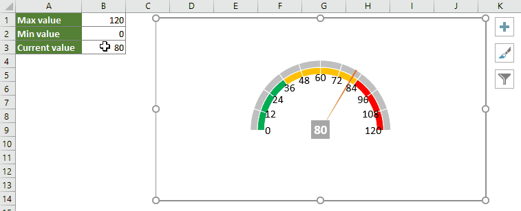
1. Prepare three values, the max, min and current value in your worksheet as below screenshot shown.

2. Click Kutools > Charts > Progress > Speedometer to enable the utility. See screenshot:

3. In the Quickly create speedometer chart dialog box, select the max, min and current values separately in the Max value, Min value and Current value textboxes, choose one chart type, check the Generate dynamic chart box and click the OK button to create the chart.

From now on, when you change the current value, the pointer will automatically change in the speedometer chart. See below demo:
Kutools for Excel - Supercharge Excel with over 300 essential tools. Enjoy permanently free AI features! Get It Now
Relative Articles:
Quickly create a bubble chart in Excel
In Excel, a Bubble chart is a variation of a Scatter chart and its data is pointed as bubble. And if your each series has three data, creating a Bubble chart will be a good choice to show the data series vividly. This tutorial provides methods to help you create a bubble chart in Excel.
Create dynamic interactive charts in Excel
This article introduces two types of interactive charts: Interactive charts using Drop down menu and Interactive charts using Option buttons.
Create a bell curve chart template in Excel
Bell curve chart, named as normal probability distributions in Statistics, is usually made to show the probable events, and the top of the bell curve indicates the most probable event. This article guides you to create a bell curve chart with your own data, and save the workbook as a template in Excel.
Create funnel chart in Excel
Have you ever wanted to create a funnel chart to show the data ascending or descending in Excel? In Excel, there is no a direct way to create a funnel chart, but this tutorial will show you a circuitous method to create a funnel chart in Excel.
Best Office Productivity Tools
Supercharge Your Excel Skills with Kutools for Excel, and Experience Efficiency Like Never Before. Kutools for Excel Offers Over 300 Advanced Features to Boost Productivity and Save Time. Click Here to Get The Feature You Need The Most...
Office Tab Brings Tabbed interface to Office, and Make Your Work Much Easier
- Enable tabbed editing and reading in Word, Excel, PowerPoint, Publisher, Access, Visio and Project.
- Open and create multiple documents in new tabs of the same window, rather than in new windows.
- Increases your productivity by 50%, and reduces hundreds of mouse clicks for you every day!