How to create a bell curve chart template in Excel?
Bell curve chart, named as normal probability distributions in Statistics, is usually made to show the probable events, and the top of the bell curve indicates the most probable event. In this article, I will guide you to create a bell curve chart with your own data, and save the workbook as a template in Excel.
- Create a bell curve chart and save as chart template in Excel
- Quickly create a bell curve with an amazing tool
Create a bell curve chart and save as a chart template in Excel
To create a bell chart with your own data, and then save it as an Excel template, you can do as following:
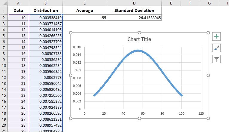
1. Create a blank workbook, and enter the column header In Range A1:D1 as following screen shot shows:

2. Enter your data into the Data column, and sort the data by clicking by clicking Data > Sort.
In our case, we enter from 10 to 100 into Rang A2:A92 in the Data Column.

3. Calculate the data as follows:
(1) In Cell C2, please type in below formula to calculate the average:
(2) In Cell D2, please enter below formula to calculate the standard deviation:
(3) In Cell B2, please type in one of below formulas, and drag the AutoFill Handle to the Range A3:A92.
A. In Excel 2010 or later versions: =NORM.DIST(A2,$C$2,$D$2,FALSE) | B. In Excel 2007: =NORMDIST(A2,$C$2,$D$2,FALSE)) |
Note: The A2:A92 is the range we enter our data, and please change the A2:A92 to the range with your data.

4. Select the Range A2:B92 (Data column and Distribution column) ,and click the Insert > Scatter ( or Scatter and Doughnut chart in Excel 2013) > Scatter with Smooth Lines and Markers.

Then a bell curve chart is created showing as following screen shot.
You can format the bell curve by removing legends, axis, and gridlines in the bell curve chart.
And now you can save the created bell curve chart as a normal chart template in Excel with following steps:
5. Save the bell curve chart as a chart template:
A. In Excel 2013 or later versions, right click the bell curve chart, and select the Save as Template from the right-clicking menu;
B. In Excel 2007 and 2010, click the bell curve chart to activate the Chart Tools, and then click the Design > Save As Template.
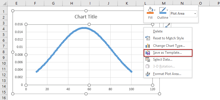
6. In the popping up Save Chart Template dialog box, enter a name for your template in the File name box, and click the Save button.

Quickly create a bell curve with an amazing tool
In this method, I will introduce the Normal Distribution / Bell Curve feature of Kutools for Excel. This feature will help you easily create a bell curve chart with only two clicks. In addition, this feature also supports to create a frequency histogram chart, and a combo chart of bell curve and frequency histogram as well.
1. Select the data range you will create a bell curve based on, and click Kutools > Charts > Data Distruibution > Normal Distribution / Bell Curve.
2. In the opening dialog, check the Normal distribution chart option in the Select section, and click the OK Button. See screenshot:

Tips:
(1) It’s optional to type in the Chart title in the Chart title box;
(2) If you need to create a frequency histogram chart, please check the Frequency histogram chart option only in the Select section; for a combo chart of bell curve and frequency histogram, please check both options in the Select section.
If you only check the Normal Distribution chart option:

If you check both Normal Distribution chart and Frequency histogram chart options:

Related Articles

Move chart X axis below negative values/zero/bottom in Excel
When negative data existing in source data, the chart X axis stays in the middle of chart. For good looking, some users may want to move the X axis below negative labels, below zero, or to the bottom in the chart in Excel.

Add a horizontal average line to chart in Excel
In Excel, you may often create a chart to analyze the trend of the data. But sometimes, you need to add a simple horizontal line across the chart that represents the average line of the plotted data, so that you can see the average value of the data clearly and easily.

Break chart axis in Excel
When there are extraordinary big or small series/points in source data, the small series/points will not be precise enough in the chart. In these cases, some users may want to break the axis, and make both small series and big series precise simultaneously.
Best Office Productivity Tools
Supercharge Your Excel Skills with Kutools for Excel, and Experience Efficiency Like Never Before. Kutools for Excel Offers Over 300 Advanced Features to Boost Productivity and Save Time. Click Here to Get The Feature You Need The Most...
Office Tab Brings Tabbed interface to Office, and Make Your Work Much Easier
- Enable tabbed editing and reading in Word, Excel, PowerPoint, Publisher, Access, Visio and Project.
- Open and create multiple documents in new tabs of the same window, rather than in new windows.
- Increases your productivity by 50%, and reduces hundreds of mouse clicks for you every day!