How to add secondary axis to a pivot chart in Excel?
To address this issue, you can add a secondary axis to a pivot chart in Excel. By doing this, each series can be plotted on its appropriate scale, helping create a more informative and visually balanced chart. This guide will walk you through the steps of adding a secondary axis to a pivot chart, and also cover practical usage tips, potential pitfalls, and alternative solutions.
Add a secondary axis to the pivot chart
Add a secondary axis to the pivot chart
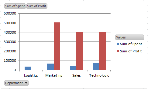
Suppose you have a pivot chart that displays both sales revenue and profit for several products or periods, where the Sum of Profit series values are much smaller than the other series. In this case, adding a secondary axis for the profit data allows both series to be appropriately visualized and compared within the same chart.
This approach is especially useful when:
- Your chart contains multiple data series with vastly different value ranges.
- You need to compare metrics like quantities and percentages side-by-side.
- You want to easily visualize trends for both large and small data series without losing clarity.
Note: While a secondary axis improves clarity for charts with differing scales, it is important to clearly label both axes to avoid misinterpretation of the data.
Follow these steps to add a secondary axis to a specific series in your pivot chart:
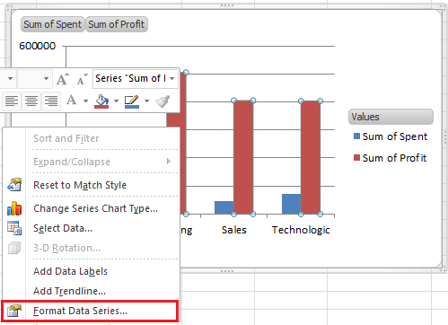
1. In your pivot chart, right-click on the data series you wish to plot on a secondary axis (for example, Sum of Profit), and select Format Data Series from the context menu. This will open the Format Data Series options dialog or pane, which differs slightly between Excel versions. See screenshot:
2. In the Format Data Series dialog box (or pane), locate the Series Options section. Here, check the Secondary Axis option. This action assigns the series to a new vertical axis, which will be displayed on the right side of your chart. See screenshot:
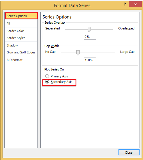
If you are using Excel 2013 or a later version, this step is found in the Format Data Series pane on the right side of the screen. Make sure to select the Secondary Axis option under Series Options.
Tip: If the Secondary Axis option appears grayed out, ensure you have selected a compatible chart type. Not all series types allow assignment to a secondary axis.
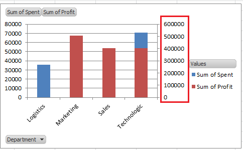
3. After applying the change, close the Format Data Series dialog or pane. You will see that the secondary axis has been added to the pivot chart, and the selected series is now plotted based on the new scale on the right side. This adjustment helps both series stand out without compressing the data with smaller values. Preview the updated chart below:
4. Optionally, to further enhance chart clarity, you can change the chart type for the secondary series. For example, right-click the Sum of Profit series again and choose Change Series Chart Type from the context menu. This allows you to select a chart type that best differentiates the two series, such as using a column chart for the primary axis and a line chart for the secondary axis.
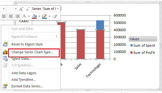
5. In the Change Chart Type dialog, select Line (or another preferred option) for the secondary series, then click OK to confirm and apply the changes. This creates a combination chart that effectively distinguishes each series. See screenshot:

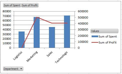
The result should look similar to the screenshot below—a combined chart with one series as columns and the other as a line, plotted against separate axes:
For users of Excel 2013 and later, the steps to set up this combination chart are slightly different: In the Change Chart Type dialog box, go to the Combo section. Here you will see each data series listed. Under the "Choose the chart type and axis for your data series" section, assign your desired chart type (for example, Line for the secondary axis series), and ensure the Secondary Axis box is checked for that series. This interface provides a clear overview to configure each series according to your needs.

Practical Tips and Common Issues:
- Ensure your chart has enough space to display both axes and their labels without overlap. Adjusting chart size or rearranging the chart area can improve readability.
- Always double-check which series is assigned to which axis. Misassignment can cause confusion or distortion in data interpretation.
- After creating a combination chart, make sure to clearly label the axes and, if necessary, add a chart legend to help others understand the chart structure.
- Some chart types, such as stacked columns, do not support secondary axes for individual series. If you cannot activate the option, consider switching chart types or restructuring your data.
Troubleshooting Suggestions:
- If you do not see the secondary axis appear, double-check you are working with a compatible chart type—simple column, bar, or line charts work best.
- In case the chart does not update as expected after checking the secondary axis option, try refreshing the chart or restarting Excel.
- If data appears misaligned after changing chart types, check the series order and ensure each data point is mapped correctly in the chart setup.
Alternative Solutions:
- Use formulas to normalize series data — When secondary axes are not available or suitable, you can create helper columns in your source data to scale the values of one or more series for visual comparison, and then add the recalculated series to your pivot chart.
- Create two overlaying charts — For greater customization, advanced users can overlay two separate charts (e.g., by positioning a transparent background chart with a matching axis over the original pivot chart) for precise control of secondary axis styling.
Export graphics (Pictures/Charts/Shapes/All Types) from workbook to a folder as Gif/Tif/PNG/JPEG |
| If there are multiple type of graphics in a workbook, and you just want to export all charts across worksheet to a folder as gif of other type of picture, you can use Kutools for Excel's Export Graphics utilty, which only need 3 steps to handle this job . Click for full-featured 30 days free trial! |
 |
| Kutools for Excel: with more than 300 handy Excel add-ins, free to try with no limitation in 30 days. |
Relative Articles:
Best Office Productivity Tools
Supercharge Your Excel Skills with Kutools for Excel, and Experience Efficiency Like Never Before. Kutools for Excel Offers Over 300 Advanced Features to Boost Productivity and Save Time. Click Here to Get The Feature You Need The Most...
Office Tab Brings Tabbed interface to Office, and Make Your Work Much Easier
- Enable tabbed editing and reading in Word, Excel, PowerPoint, Publisher, Access, Visio and Project.
- Open and create multiple documents in new tabs of the same window, rather than in new windows.
- Increases your productivity by 50%, and reduces hundreds of mouse clicks for you every day!
All Kutools add-ins. One installer
Kutools for Office suite bundles add-ins for Excel, Word, Outlook & PowerPoint plus Office Tab Pro, which is ideal for teams working across Office apps.
- All-in-one suite — Excel, Word, Outlook & PowerPoint add-ins + Office Tab Pro
- One installer, one license — set up in minutes (MSI-ready)
- Works better together — streamlined productivity across Office apps
- 30-day full-featured trial — no registration, no credit card
- Best value — save vs buying individual add-in