How to add best fit line/curve and formula in Excel?
For example, you have been researching in the relationship between product units and total cost, and after many experiments you get some data. Therefore, the problem at present is to get the best fit curve for the data, and figure out its equation. Actually, we can add the best fit line/curve and formula in Excel easily.
- Add best fit line/curve and formula in Excel 2013 or later versions
- Add best fit line/curve and formula in Excel 2007 and 2010
- Add best fit line/curve and formula for multiple sets of data
Add best fit line/curve and formula in Excel 2013 or later versions
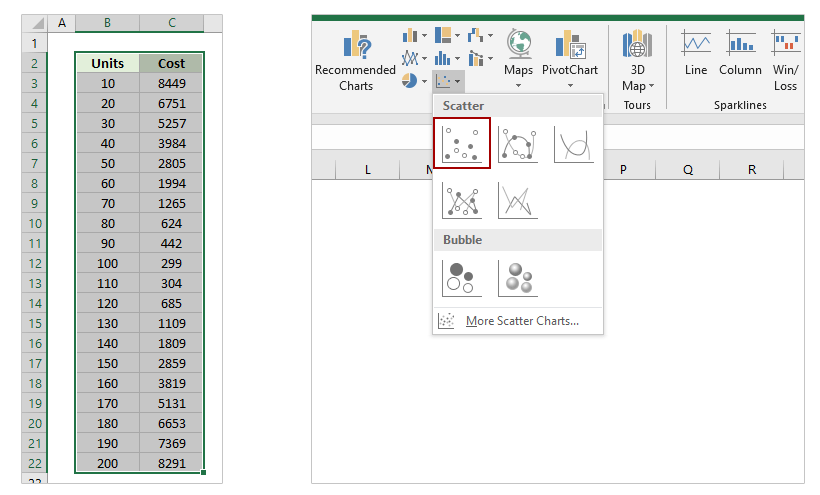
Supposing you have recorded the experiments data as left screenshot shown, and to add best fit line or curve and figure out its equation (formula) for a series of experiment data in Excel 2013, you can do as follows:
1. Select the experiment data in Excel. In our case, please select the Range A1:B19, and click the Insert Scatter (X, Y) or Bubble Chart > Scatter on the Insert tab. See screen shot:
2. Select the scatter chart, and then click the Add Chart Element > Trendline > More Trendline Options on the Design tab.
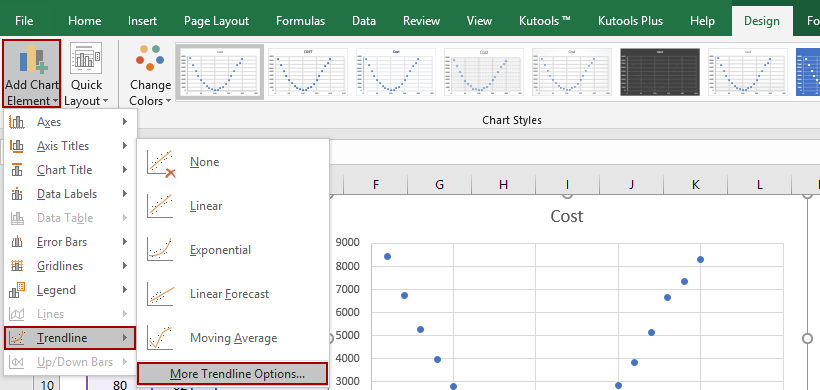
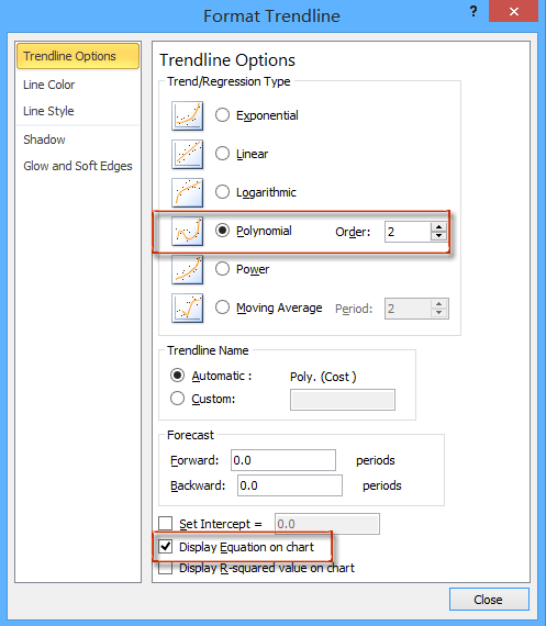
3. In the opening Format Trendline pane, check the Polynomial option, and adjust the order number in the Trendline Options section, and then check the Display Equation on Chart option. See below screen shot:
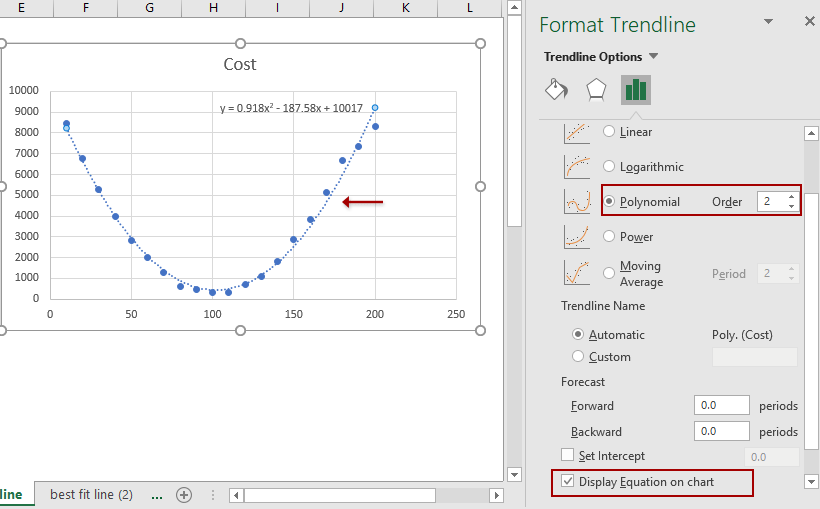
Then you will get the best fit line or curve as well as its equation in the scatter chart as above screen shot shown.
Easily combine multiple worksheets/workbooks/CSV files into one worksheet/workbook
It may be tedious to combine dozens of sheets from different workbooks into one sheet. But with Kutools for Excel’s Combine (worksheets and workbooks) utility, you can get it done with just several clicks!
Add best fit line/curve and formula in Excel 2007 and 2010
There are a few differences to add best fit line or curve and equation between Excel 2007/2010 and 2013.
1. Select the original experiment data in Excel, and then click the Scatter > Scatter on the Insert tab.

2. Select the new added scatter chart, and then click the Trendline > More Trendline Options on the Layout tab. See above screen shot:

3. In the coming Format Trendline dialog box, check the Polynomial option, specify an order number based on your experiment data, and check the Display Equation on chart option. See screenshot:
4. Click the Close button to close this dialog box.
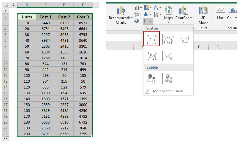
Add best fit line/curve and formula for multiple sets of data
In most cases, you may get multiple sets of experiment data. You can show these sets of data in a scatter chart simultaneously, and then use an amazing chart tool – Add Trend Lines to Multiple Series provided by Kutools for Excel – to add the best fit line/curve and formula in Excel.
Kutools for Excel - Packed with over 300 essential tools for Excel. Enjoy a full-featured 30-day FREE trial with no credit card required! Download now!
1. Select the sets of experiment data, and click Insert > Scatter > Scatter to create a scatter chart.
2. Now the scatter chart is created. Keep the scatter chart, and click Kutools > Charts > Chart Tools > Add Trend Lines to Multiple Series. See screenshot:

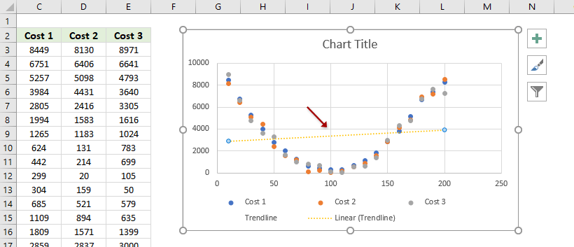
Now the trendline is added to the scatter chart. If the trendline does not match with the scatter plots, you can go ahead to adjust the trendline.
3. In the scatter chart, double click the trendline to enable the Format Trendline pane.
4. In the Format Trendline pane, tick the trendline types one by one to check which kind of trendlines is the best fit. In my case, the Polynomial trendline fits best. And tick the Display Equation on chart as well.

Demo: Add best fit line/curve and formula in Excel 2013 or later versions
Related articles:
Best Office Productivity Tools
Supercharge Your Excel Skills with Kutools for Excel, and Experience Efficiency Like Never Before. Kutools for Excel Offers Over 300 Advanced Features to Boost Productivity and Save Time. Click Here to Get The Feature You Need The Most...
")
Office Tab Brings Tabbed interface to Office, and Make Your Work Much Easier
- Enable tabbed editing and reading in Word, Excel, PowerPoint, Publisher, Access, Visio and Project.
- Open and create multiple documents in new tabs of the same window, rather than in new windows.
- Increases your productivity by 50%, and reduces hundreds of mouse clicks for you every day!
")