How to format chart axis to percentage in Excel?
When working with charts in Excel, the axis labels are typically displayed in a general numeric format, which may not always align with the way your data should be interpreted—especially if your data represents ratios, probabilities, survey responses, or other values that make more sense shown as percentages. Converting axis labels to a percentage format not only makes the chart more intuitive but can also prevent misinterpretation, making your reports and presentations clearer for your audience.
This guide details several practical methods to format chart axis labels as percentages within Excel, including built-in dialog settings, preparing data with formulas, and streamlining the process using VBA macros for automation.
Format chart axis to percentage in Excel | Format data as percentage| Excel Formula - Prepare source data as percentages | VBA Code - Automatically format chart axis labels to percentage
Format chart axis to percentage in Excel
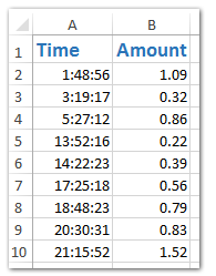
Suppose you have a dataset similar to the screenshot below, where numeric values represent proportions or fractions that should be interpreted as percentages. After creating a chart in Excel, you can adjust a specific axis to display its numeric labels as percentages for greater clarity:
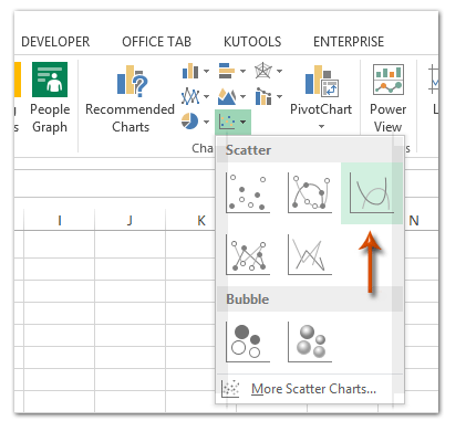
1. Select your source data in the worksheet. Then, go to the Insert tab, locate the Insert Scatter (X, Y) and Bubble Chart or just Scatter option, and select Scatter with Smooth lines (or the chart type that suits your analysis best):
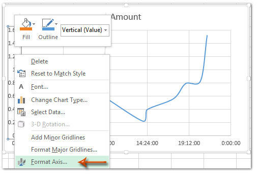
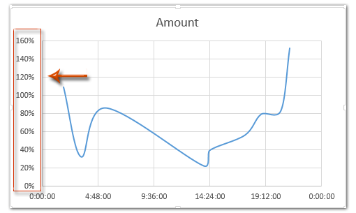
2. In the chart that appears, right-click the axis (either horizontal or vertical) that you wish to format as percentage. Choose Format Axis from the context menu to open the formatting options:
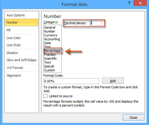
3. Depending on your Excel version, set the axis label format to percentage by following these steps:
- Excel 2013 and later: In the Format Axis pane, expand the Number group on the Axis Options tab. Click the Category drop-down list, select Percentage, and specify the number of Decimal Places (for example, type 0 for whole numbers).

- Excel 2007 and 2010: In the Format Axis dialog box, click Number from the left pane, choose Percentage in the Category list, and adjust the Decimal places field as needed (enter 0 for no decimals).
4. Close the Format Axis pane or dialog. The selected axis will now display all its labels as percentages in the chart, as shown below:
Applicable scenarios: This method is ideal when your axis values are already numeric fractions (e.g.,0.25,0.75) that need to be shown as 25%,75%, etc. It is quick, requires no formula manipulation, and accurately preserves the original data.
Tips & troubleshooting: If your axis does not reflect the change to percentage:
- Ensure that the underlying source values are decimals (not already formatted or entered as percentages, e.g.,25%).
- Changing cell formatting in the worksheet does not automatically alter chart axis display; you must adjust the axis via the Format Axis dialog or pane.
Format data as percentage
1. Copy the Source Data
Select your original data and press Ctrl + C to copy it.
2. Paste to a New Location
Right-click on an empty area and choose Paste Values or press Ctrl + V.
3. Format the date as Percentages
Select the copied numbers → Right-click → Format Cells → choose Percentage → click OK.
(You can also click the % button on the Home tab.)
4. Create the Chart Using the Copied Data
Now insert your chart (e.g. column, line, bar) based on the copied range.
The vertical axis will display percentage values, but your original data remains unchanged.
Tip:
You can hide the copied data range afterward by placing it in a separate sheet or hiding the rows/columns.
Excel Formula - Prepare source data as percentages before creating the chart
Another practical approach is to format your source data as percentages before creating your chart. This is useful when your original data is not already in the correct decimal form, or if you want your worksheet values and your chart to match visually as percentages.
Advantages: Pre-formatting data helps ensure that both your chart and data table are consistent, and it can prevent confusion in reports and presentations. You can also easily customize the number formatting for further analysis.
Potential drawback: This method modifies your displayed data, so if you rely on the original numeric (decimal) values for calculations elsewhere, you may want to work in a separate column.
1. Suppose your original values are in column B (e.g., B2:B10) as decimals such as0.23,0.48, etc. Enter the following formula in an adjacent column (for example, C2):
=TEXT(B2,"0%")This will display the value as a percentage string (e.g., "23%").
3. Fill the formula down through the rest of the column to apply it to the whole data range (drag the fill handle or copy-paste as needed).
4. Now, select this formula-based percentage column as the source data to create your chart. The chart's axis labels will automatically reflect the percentage values as you have formatted them. By pre-formatting your data, you reduce the risk of display mismatches and can include other useful calculations alongside your chart.
Error reminder: Using the TEXT function returns a text value, so this approach is best if you only need the appearance of percentages for labeling, and not further numeric processing.
VBA Code - Automatically format chart axis labels to percentage via macro
For users who frequently need to reformat multiple charts, or who want to automate the process (including batch processing charts on a worksheet), using VBA can greatly speed up formatting chart axis labels as percentages. This is particularly helpful for dashboards or recurring reports where consistent formatting is essential.
Advantages: Automates repetitive tasks, ensures consistent formatting across many charts, and reduces manual errors.
Potential drawbacks: Requires access to the VBA editor and enabling macros. It may not be suitable for Excel Online or restricted environments.
Operation steps:
1. Go to Developer tab > Visual Basic. In the Microsoft Visual Basic for Applications window, click Insert > Module, and paste the following code into the module window:
Sub FormatChartAxisToPercent()
    Dim cht As ChartObject
    Dim ax As Axis
    On Error Resume Next
    xTitleId = "KutoolsforExcel"

    If ActiveSheet.ChartObjects.Count = 0 Then
        MsgBox "No charts found on current sheet!", vbExclamation, xTitleId
        Exit Sub
    End If

    For Each cht In ActiveSheet.ChartObjects
        For Each ax In cht.Chart.Axes
            ax.TickLabels.NumberFormat = "0%"
        Next ax
    Next cht
End Sub2. After entering this code, close the VBA editor. On your worksheet, run the macro by pressing F5 key or clicking Run. All chart axes on the active worksheet will be instantly formatted so their labels appear as percentages.
Troubleshooting tips: The macro will only affect charts present on the current worksheet. If you have no charts, it will alert you. If you have charts where axis source data is not in decimal format, tick labels may not display as expected.
Practical tip: You can modify the macro to target only specific chart types or axes (e.g., only the Y-axis) by adding additional checks within the loop.
Note:
Demo: Format chart axis and labels to percentage in Excel
Easily create a stacked column chart with percentage data labels and subtotal labels in Excel
It's easy to create a stacked column chart in Excel. However, it will be a little tedious to add percentage data labels for all data points and the subtotal labels for every set of series values. Here, with Kutools for Excel's Stacked Column Chart with Percentage feature, you can easily get it done in 10 seconds.
Kutools for Excel - Supercharge Excel with over 300 essential tools, making your work faster and easier, and take advantage of AI features for smarter data processing and productivity. Get It Now
Best Office Productivity Tools
Supercharge Your Excel Skills with Kutools for Excel, and Experience Efficiency Like Never Before. Kutools for Excel Offers Over 300 Advanced Features to Boost Productivity and Save Time. Click Here to Get The Feature You Need The Most...
Office Tab Brings Tabbed interface to Office, and Make Your Work Much Easier
- Enable tabbed editing and reading in Word, Excel, PowerPoint, Publisher, Access, Visio and Project.
- Open and create multiple documents in new tabs of the same window, rather than in new windows.
- Increases your productivity by 50%, and reduces hundreds of mouse clicks for you every day!
All Kutools add-ins. One installer
Kutools for Office suite bundles add-ins for Excel, Word, Outlook & PowerPoint plus Office Tab Pro, which is ideal for teams working across Office apps.
- All-in-one suite — Excel, Word, Outlook & PowerPoint add-ins + Office Tab Pro
- One installer, one license — set up in minutes (MSI-ready)
- Works better together — streamlined productivity across Office apps
- 30-day full-featured trial — no registration, no credit card
- Best value — save vs buying individual add-in