How to break chart axis in Excel?
When there are extraordinary big or small series/points in source data, the small series/points will not be precise enough in the chart. In these cases, some users may want to break the axis, and make both small series and big series precise simultaneously. This article will show you two ways to break chart axis in Excel.

Break a chart axis with a secondary axis in chart
Supposing there are two data series in the source data as below screen shot shown, we can easily add a chart and break the chart axis with adding a secondary axis in the chart. And you can do as follows:
1. Select the source data, and add a line chart with clicking the Insert Line or Area Chart (or Line)> Line on the Insert tab.
2. In the chart, right click the below series, and then select the Format Data Series from the right-clicking menu.
3. In the opening Format Data Series pane/dialog box, check the Secondary Axis option, and then close the pane or dialog box.
4. In the chart, right click the secondary vertical axis (the right one) and select Format Axis from the right-clicking menu. 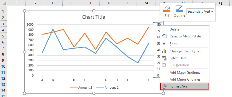
5. In the Format Axis pane, type 160 into the Maximum box in the Bounds section, and in the Number group enter [<=80]0;;; into the Format code box and click the Add button, and then close the pane.
Tip: In Excel 2010 or earlier versions, it will open Format Axis dialog box. Please click Axis Option in left bar, check Fixed option behind Maximum and then type 200 into following box; click Number in left bar, type [<=80]0;;; into the Format code box and click the Add button, at last close the dialog box.
6. Right click the primary vertical axis (the left one) in the chart and select the Format Axis to open the Format Axis pane, then enter [>=500]0;;; into the Format Code box and click the Add button, and close the pane.
Tip: If you are using Excel 2007 or 2010, right click the primary vertical axis in the chart and select the Format Axis to open the Format Axis dialog box, click Number in left bar, type [>=500]0;;; into the Format Code box and click the Add button, and close the dialog box.)
Then you will see there are two Y axes in the selected chart which looks like the Y axis is broken. See below screen shot:
Save created break Y axis chart as AutoText entry for easy reusing with only one click
In addition to saving the created break Y axis chart as a chart template for reusing in future, Kutools for Excel's AutoText utility supports Excel users to save created chart as an AutoText entry and reuse the AutoText of chart at any time in any workbook with only one click.
Kutools for Excel - Supercharge Excel with over 300 essential tools, making your work faster and easier, and take advantage of AI features for smarter data processing and productivity. Get It Now
Demo: Break the Y axis with a secondary axis in chart
Break axis by adding a dummy axis in chart
Supposing there is an extraordinary big data in the source data as below screenshot shown, we can add a dummy axis with a break to make your chart axis precise enough. Please select either of the below methods to follow the corresponding instructions.
- Using built-in Excel functionalities (16 steps)
- Using Kutools for Excel's Truncate the Y-axis Chart (3 steps)
Break axis by adding a dummy axis in chart using built-in Excel functionalities (16 steps)
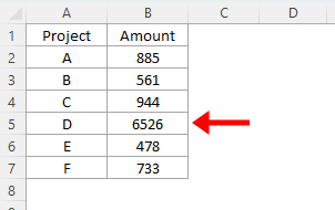
1. To break the Y axis, we have to determine the min value, break value, restart value, and max value in the new broken axis. In our example we get four values in the Range A11:B14.
2. We need to refigure out the source data as below screenshot shown:
(1) In Cell C2 enter =IF(B2>$B$13,$B$13,B2), and drag the Fill Handle to the Range C2:C7;
(2) In Cell D2 enter =IF(B2>$B$13,100,NA()), and drag the Fill Handle to the Range D2:D7;
(3) In Cell E2 enter =IF(B2>$B$13,B2-$B$12-1,NA()), and drag the Fill Handle to the Range E2:E7.
3. Create a chart with new source data. Select Range A1:A7, then select Range C1:E7 with holding the Ctrl key, and insert a chart with clicking the Insert Column or Bar Chart (or Column)> Stacked Column.
4. In the new chart, right click the Break series (the red one) and select Format Data Series from the right-clicking menu.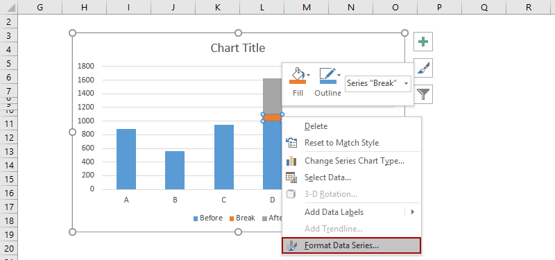
5. In the opening Format Data Series pane, click the Color button on the Fill & Line tab, and then select the same color as background color (White in our example).
Tip: I you are using Excel 2007 or 2010, it will open the Format Data Series dialog box. Click Fill in left bar, and then check No fill option, at last close the dialog box.)
And change the After series' color to the same color as Before series with same way. In our example, we select Blue.
6. Now we need to figure out a source data for the dummy axis. We list the data in the Range I1:K13 as below screen shot shown:
(1) In the Labels column, List all labels based on the min value, break value, restart value, and max value we listed in Step 1.
(2) In the Xpos column, type 0 to all cells except the broken cell. In broken cell type 0.25. See left screen shot.
(3) In the Ypos column, type numbers based on the labels of Y axis in the stacked chart.
7. Right click the chart and select Select Data from right-clicking menu.
8. In the popping up Select Data Source dialog box, click the Add button. Now in the opening Edit Series dialog box, select Cell I1 (For Broken Y Axis) as series name, and select Range K3:K13 (Ypos Column) as series values, and click OK > OK to close two dialog boxes.

9. Now get back to the chart, right click the new added series, and select Change Series Chart Type from right-clicking menu.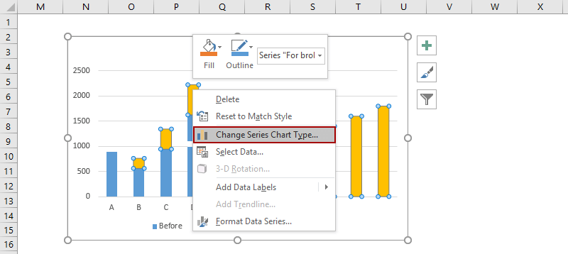
10. In the opening Change Chart Type dialog box, go to the Choose the chart type and axis for your data series section, click the For Broken Y axis box, and select the Scatter with Straight Line from the drop down list, and click the OK button.
Note: If you are using Excel 2007 and 2010, in the Change Chart Type dialog box, click X Y (Scatter) in left bar, and then click to select the Scatter with Straight Line from the drop down list, and click the OK button.
11. Right click the new series once again, and select the Select Data from right-clicking menu.
12. In the Select Data Source dialog box, click to select the For broken Y axis in the Legend Entries (Series) section, and click the Edit button. Then in the opening Edit Series dialog box, select Range J3:J13 (Xpos column) as Series X values, and click OK > OK to close two dialog boxes.
13. Right click the new scatter with straight line and select Format Data Series in right-clicking menu. 
14. In the opening Format Data Series pane in Excel 2013, click the color button on the Fill & Line tab, and then select the same color as the Before columns. In our example, select Blue. (Note: If you are using Excel 2007 or 2010, in the Format Data Series dialog box, click Line color in left bar, check Solid line option, click the Color button and select the same color as before columns, and close the dialog box.)
15. Keep selecting the scatter with straight line, and then click the Add Chart Element > Data Labels > Left on the Design tab.
Tip: Click Data Labels > Left on Layout tab in Excel 2007 and 2010.
16. Change all labels based on the Labels column. For example, select the label at the top in the chart, and then type = in the format bar, then select the Cell I13, and press the Enter key.
16. Delete some chart elements. For example, select original vertical Y axis, and then press the Delete key.
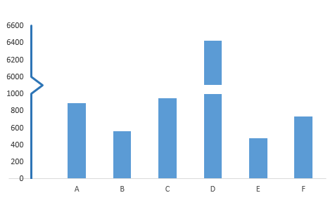
At last, you will see your chart with a broken Y axis is created.
Demo: Break the Y axis by adding a dummy axis in char
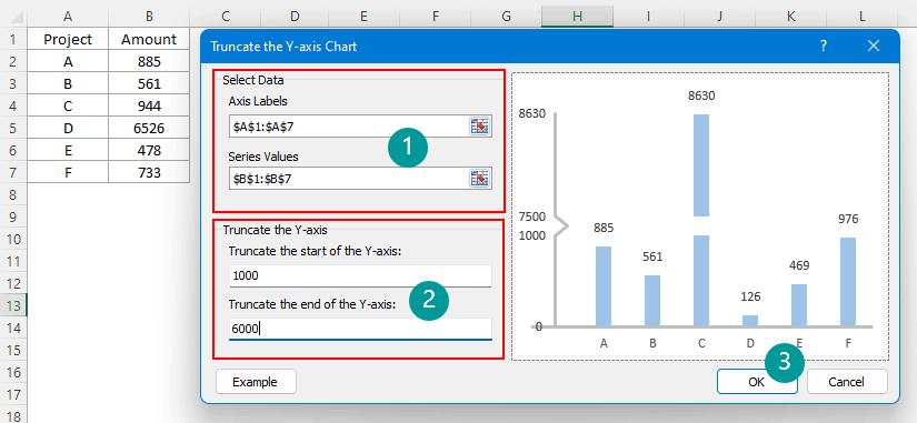
Break axis by adding a dummy axis in chart using Kutools for Excel's Truncate the Y-axis Chart (3 steps)
The above method is complicated and time-consuming. Hence, Kutools for Excel introduces an easy-to-use feature called Truncate the Y-axis Chart, which allows you to create a column chart with broken Y-axis quickly and easily.
1. Click Kutools > Charts > Difference Comparison > Truncate the Y-axis Chart to open the setting dialog.
- Select the data range of the axis labels and series values separately in the Select Data box.
- Specify and enter the start and end data points based on which you want to truncate the Y-axis.
- Click OK.
3. A prompt box pops out reminding you that a hidden sheet will be created to store the intermediate data, please click Yes button.
A column chart is now created with truncated y-axis as shown below.
- In order to use the Truncate the Y-axis Chart feature, you should have Kutools for Excel installed on your computer. Please click here to download and install. The professional Excel add-in offers a 30-day free trial with no limitations.
- Instead of selecting the data range by yourself in the Truncate the Y-axis Chart dialog, before clicking on the Truncate the Y-axis Chart feature, you can select the whole table first, so that the corresponding range boxes will be filled automatically.
Related Articles

Create a bell curve chart template in Excel
Two solutions to create a bell curve chart (named as normal probability distributions in Statistics) in Excel, and save the bell curve chart as a chart template easily.

Move chart X axis below negative values/zero/bottom in Excel
When negative data existing in source data, the chart X axis stays in the middle of chart. For good looking, some users may want to move the X axis below negative labels, below zero, or to the bottom in the chart in Excel.

Add a horizontal average line to chart in Excel
In Excel, you may often create a chart to analyze the trend of the data. But sometimes, you need to add a simple horizontal line across the chart that represents the average line of the plotted data, so that you can see the average value of the data clearly and easily.

More chart tutorials...
50+ chart tutorial guides you create all kinds of charts step by step in Excel: bar chart from yes no cells, bell curve chart, control chart, floating column chart, win loss sparkline chart, funnel chart, cumulative average chart, bubble chart, etc.
Best Office Productivity Tools
Supercharge Your Excel Skills with Kutools for Excel, and Experience Efficiency Like Never Before. Kutools for Excel Offers Over 300 Advanced Features to Boost Productivity and Save Time. Click Here to Get The Feature You Need The Most...
Office Tab Brings Tabbed interface to Office, and Make Your Work Much Easier
- Enable tabbed editing and reading in Word, Excel, PowerPoint, Publisher, Access, Visio and Project.
- Open and create multiple documents in new tabs of the same window, rather than in new windows.
- Increases your productivity by 50%, and reduces hundreds of mouse clicks for you every day!
All Kutools add-ins. One installer
Kutools for Office suite bundles add-ins for Excel, Word, Outlook & PowerPoint plus Office Tab Pro, which is ideal for teams working across Office apps.
- All-in-one suite — Excel, Word, Outlook & PowerPoint add-ins + Office Tab Pro
- One installer, one license — set up in minutes (MSI-ready)
- Works better together — streamlined productivity across Office apps
- 30-day full-featured trial — no registration, no credit card
- Best value — save vs buying individual add-in