How to create a bar chart overlaying another bar chart in Excel?
Creating a bar chart overlaying another bar chart in Excel is an excellent way to compare two sets of data within the same chart. This type of visualization can highlight trends, differences, or relationships between the two datasets clearly and effectively. While Excel does not offer a built-in overlay bar chart feature, you can easily achieve this effect by combining two data series into a single chart.
In this article, we'll guide you through two methods to create an overlay bar chart in Excel, allowing you to compare multiple datasets in one view.
Create a bar chart overlaying another bar chart in Excel
Create a bar chart overlaying another bar chart by Kutools for Excel
Create a bar chart overlaying another bar chart in Excel
Please do the following steps to achieve this task.
1. Select the data range that you want to create an overlapped chart, and then click "Insert" > "Insert Column or Bar Chart" > "Clustered Chart", as shown in the screenshot:

2. After creating the clustered chart, right-click one series bar, and then choose "Change Series Chart Type" from the context menu, see screenshot:

3. In the "Change Chart Type" dialog box, select "Combo" in the left pane under the "All Charts" tab, and then click "Custom Combination chart" in the right section, and check one checkbox in the "Secondary Axis" list, see screenshot:

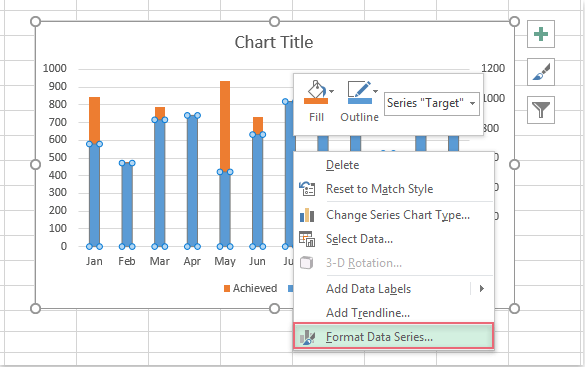
4. Then click "OK" to close the dialog box, go on selecting the data series bar, and right click, choose "Format Data Series" from the context menu, see screenshot:
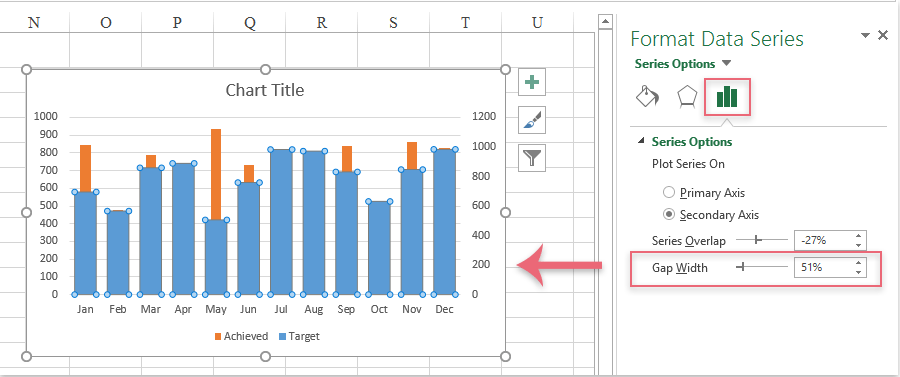
5. In the popping up "Format Data Series" pane, click "Series Options" button, adjust the "Gap Width" to make the bar wider or narrower as your need, see screenshot:
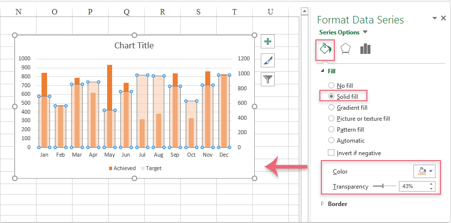
6. Then click "Fill & Line" button, click "Fill" to expand it, in the "Fill" section, select "Solid fill" option, and then select the same color with another data series, at the same time, increase the transparency, you will get the following overlapping bar chart:
Create a bar chart overlaying another bar chart by Kutools for Excel
With Kutools for Excel, creating a bar chart that overlays another bar chart is easier than ever. Instead of manually adjusting multiple data series and axis settings, Kutools simplifies the process with its intuitive interface and powerful charting tools. With just a few clicks, you can combine two datasets into a single chart, adjusting the appearance, colors, and layout to suit your needs.
After installing Kutools for Excel, please do with the following steps:
- Click "Kutools" > "Charts" > "Progress" > "Target and Actual Chart", see screenshot:

- In the "Target and Actual Chart" dialog box:
- (1.) Select "Show target value with a column" option under the "Chart Type" section;
- (2.) Then, specify the "Axis Labels", "Target Value" and "Actual Value" separately from each textboxes;
- (3.) At last, click OK button.

- Now, a bar chart overlaying another bar chart is created at once, see screenshot:


In conclusion, creating a bar chart overlaying another bar chart in Excel can be done manually using built-in Excel features or effortlessly with Kutools for Excel, both approaches allow you to create clear, impactful chart. By selecting the method that best suits your needs. If you're interested in exploring more Excel tips and tricks, our website offers thousands of tutorials.
Best Office Productivity Tools
Supercharge Your Excel Skills with Kutools for Excel, and Experience Efficiency Like Never Before. Kutools for Excel Offers Over 300 Advanced Features to Boost Productivity and Save Time. Click Here to Get The Feature You Need The Most...
Office Tab Brings Tabbed interface to Office, and Make Your Work Much Easier
- Enable tabbed editing and reading in Word, Excel, PowerPoint, Publisher, Access, Visio and Project.
- Open and create multiple documents in new tabs of the same window, rather than in new windows.
- Increases your productivity by 50%, and reduces hundreds of mouse clicks for you every day!
All Kutools add-ins. One installer
Kutools for Office suite bundles add-ins for Excel, Word, Outlook & PowerPoint plus Office Tab Pro, which is ideal for teams working across Office apps.
- All-in-one suite — Excel, Word, Outlook & PowerPoint add-ins + Office Tab Pro
- One installer, one license — set up in minutes (MSI-ready)
- Works better together — streamlined productivity across Office apps
- 30-day full-featured trial — no registration, no credit card
- Best value — save vs buying individual add-in