How to split a stacked bar chart in Excel?
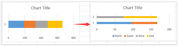
Working with stacked bar charts in Excel is a practical way to visualize component data, such as regional sales totals. However, there are times when you may need to highlight specific comparisons by splitting a single stacked bar chart into multiple groups. For example, if your stacked bar chart displays sales amounts for four regions, but you want to clearly separate them into two grouped categories—as illustrated in the screenshot below—it may not be obvious how to achieve this directly in Excel. This guide will demonstrate clear and detailed steps for creating a split stacked bar chart, helping you present your data more effectively and enhance comparative analysis.
Split a stacked bar chart in Excel
Scenarios where this split chart method helps:
- Comparing pre- and post-intervention results across different groups
- Visualizing target versus actual results side by side
- Highlighting how two distinct product categories performed within multiple subregions
Split a stacked bar chart in Excel
It is not currently possible to split a single stacked bar directly into separate groups using a built-in feature in Excel. However, you can achieve this effect by restructuring your dataset, which allows for clearer comparison between different groups within your chart. This approach is especially useful when you want to visually separate performance data, highlight trends in different categories, or make presentations more engaging for your audience. Here are detailed steps for splitting a stacked bar chart in Excel.
1. First, adjust your source data so it represents the intended split groups.
For example, your data lists sales amounts for four regions in columns, and you want to split those regions into two groups (such as Group1: Region North & South, Group2: Region West & East), move the corresponding data into separate columns to visually clarify the groups. Your revised data setup should have a gap or distinct grouping so that Excel interprets two separate data series. The screenshot below shows such a modification:
2. Once your source data is organized, select the entire range you wish to plot—including headers.
Then, go to the Excel ribbon and click Insert > Insert Column or Bar Chart (or Insert Bar Chart depending on your Excel version), and select Clustered Bar. See screenshot:
3. With the clustered bar chart now created, right-click any chart bar and choose Change Series Chart Type from the context menu.

4. In the Change Chart Type dialog box, find and click Bar on the left panel. Then, choose the Stacked Bar chart type for each data series you want to combine in the stacks. Ensure both grouped series are set to Stacked Bar. Click OK to apply changes. 
At this point, your chart should now show two distinct stacked bars, each representing a group of the original data—just as intended. The final effect is shown here:
Additional suggestions and error reminders:
- If the stacks display incorrectly, double-check that your data contains no accidental merged cells, hidden columns, or misplaced values.
- Blank cells help in visually separating the two groups; alternatively, zeros can be used, but may display as slim bars.
- You can further customize bar colors by right-clicking individual data series within the chart and choosing Format Data Series.
Limitations and applicability: This approach works in Excel 2013 and newer. In Excel 2010 or older versions, the Change Series Chart Type feature may not be available, making it difficult to achieve similar results without complex workarounds.
Related articles:
Best Office Productivity Tools
Supercharge Your Excel Skills with Kutools for Excel, and Experience Efficiency Like Never Before. Kutools for Excel Offers Over 300 Advanced Features to Boost Productivity and Save Time. Click Here to Get The Feature You Need The Most...
Office Tab Brings Tabbed interface to Office, and Make Your Work Much Easier
- Enable tabbed editing and reading in Word, Excel, PowerPoint, Publisher, Access, Visio and Project.
- Open and create multiple documents in new tabs of the same window, rather than in new windows.
- Increases your productivity by 50%, and reduces hundreds of mouse clicks for you every day!
All Kutools add-ins. One installer
Kutools for Office suite bundles add-ins for Excel, Word, Outlook & PowerPoint plus Office Tab Pro, which is ideal for teams working across Office apps.
- All-in-one suite — Excel, Word, Outlook & PowerPoint add-ins + Office Tab Pro
- One installer, one license — set up in minutes (MSI-ready)
- Works better together — streamlined productivity across Office apps
- 30-day full-featured trial — no registration, no credit card
- Best value — save vs buying individual add-in