Two methods to create a column chart with percentage change in Excel
Visualizing data changes over time can significantly enhance the interpretation and presentation of trends and patterns, offering clear insights into data progression. This article explores two effective methods for constructing column charts that display percentage changes.
- Create a chart with percentage change with helper columns - Complicated
- Create a chart with percentage chart with Kutools for Excel - Simple
- Download sample file
Create a chart with percentage change with helper columns
Supposing your original data contains the Year and Amount data as below screenshot shown:
To create a chart showing percentage changes based on this data, first apply the following formulas to generate the necessary helper columns.
- In the column C, use "Year Label" as header, then in cell C2, type below formula then drag fill handle down to fill cells till blank cell appears.
=REPT(A2,1)"A2" is the cell containing the year number.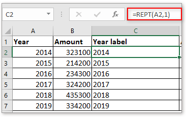
- In column D, use "Amount 1" as header, then use below formula to cell D2, drag fill handle to fill cells till blank cell appears.
=B2"B2" is the cell containing the first amount value.
- In column E which is used to display invisible column in the chart, "Invisible" is the header, use below formula to E2 then drag auto fill handle over the cells till zero appears, and finally remove the zero value.
=B3"B3" is the cell that contains the second amount value.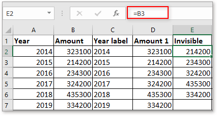
- In column E, header is "Variance", this column calculates the difference between last year and next year. In E2, use below formula and drag fill handle down till the penultimate cell of the data column.
=B3-B2"B3" is the amount of the second year, B2 is the amount of the first year.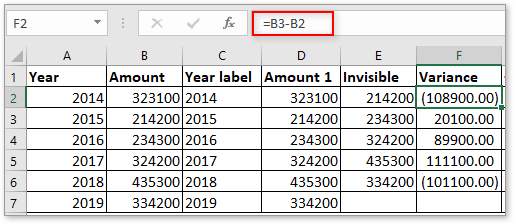
- In column G, type "Positive" or the "plus symbol" as header, then in cell G2, use below formula then drag auto fill handle over cells till the last one of the data range.
=IF(F2>0,-F2,"")"F2" is the cell containing the variance of two years.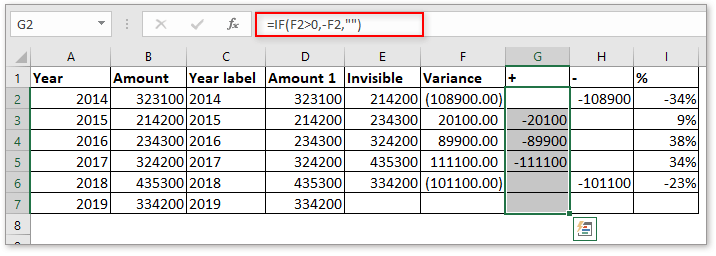
- In column H, use "Negative" or "minus symbol" as the header, then in H2, type below formula and drag fill handle over cells till the penultimate cell of the data range.
=IF(F2<0,F2,"")"F2" is the cell that contains the variance of two years.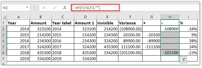
- In column I, which will display the percentage value of the variance between two years. Type below formula in I2, then drag fill handle over cells till the penultimate cell of the data range and format the cells as percentage format.
=F2/B2"F2" is the cell that contains variance of the first year and the second year, "B2" is the amount of first year.


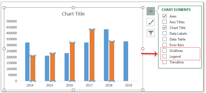
- Select the column C, D, and E ("Year label", "Amount 1" and "Invisible") data range, click "Insert" > "Insert Column or Bar Chart" > "Clustered Column".

- Click the plus symbol beside the chart to display the "CHART ELEMENT" menu, then uncheck "Gridlines" and "Legend", this step is optional, just for better viewing data.
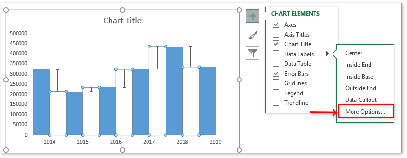
- Click at the column which displays the invisible data, then click the plus symbol to display the "CHART ELEMENT" menu, click arrow beside the "Error Bars", and click "More Options" in the sub menu.

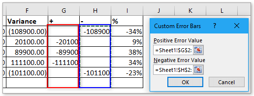
- In the "Format Error Bars" pane, check "Both" and "Cap" option, the check "Custom" option at the bottom, and click "Specify Value".
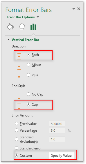
- In the "Custom Error Bars" dialog, select G2:G7 as the range in "Positive Error Value" section, and H2:H7 as the range in "Negative Error Value" section. Click "OK".
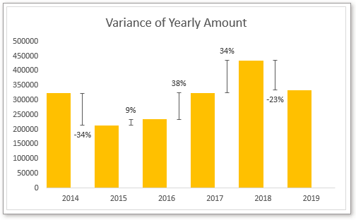
 Now the chart is shown as below
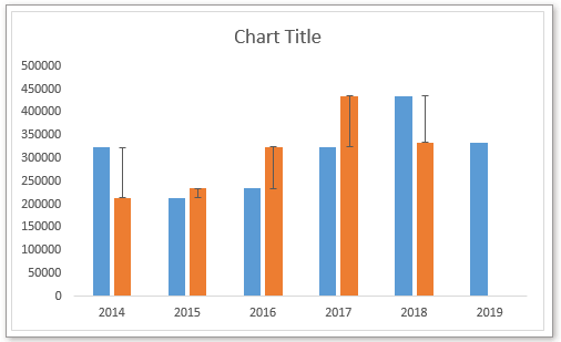
- Now right click at the column which expresses the value of Amount 1, then select "Format Data Series" from the context menu.
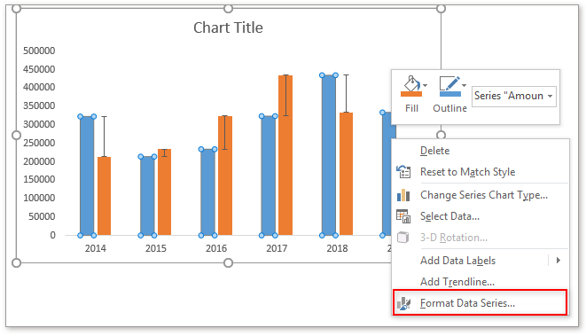
- In the "Format Data Series" pane, change values in both "Series Overlap" and "Gap Width" sections to zero. Then the chart will display as below:

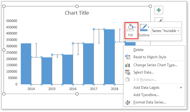
- Now you need to change the fill color of the Invisible column to no fill. Right click at the columns that indicate "Invisible" values, then choose "No fill" from the drop-down list of the "Fill" in the context menu. If you are in Excel versions before 2013, just click "Format Data Series" from context menu, and under the "Fill & Line" tab of the "Format Data Series" pane, choose "No fill" in "Fill" section.
- Click at the "Invisible" column, then click plus symbol to display the "CHART ELEMENT" menu, click the arrow beside "Data Labels" to display the sub menu, and click "More Options".
- In the "Format Data Labels" pane, check "Value From Cells" checkbox in the "Label Options" section, then select the percentage cells (column I) to the "Data Label Range" dialog. Click "OK".
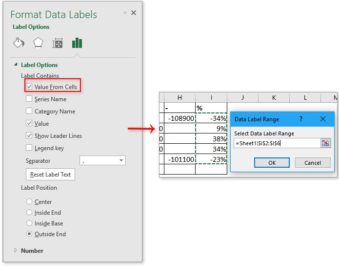
- Then uncheck "Value" and "Show Leader Lines" check boxes, in the "Label Position" section, select the position option as you need.


Then you can format the chart title or chart fill color as you need.
Now, the ultimate chart is shown as below:

Create a chart with percentage chart with Kutools for Excel
If you usually use this type of chart, the above method will be troublesome and time-wasted. Here, I recommend you a powerful Charts group in "Kutools for Excel", it can quickly create multiple complex charts with clicks including the chart with percentage change.
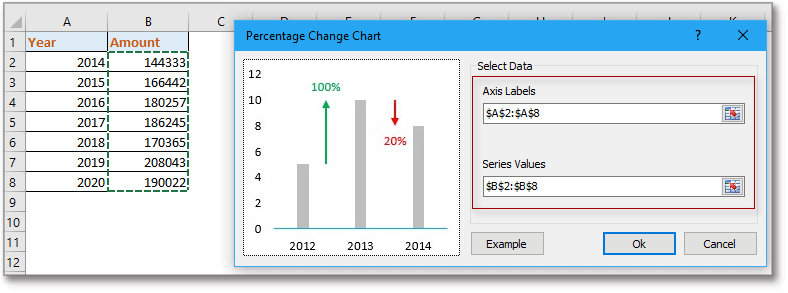
After installing Kutools for Excel, select "Kutools" > "Charts" > "Difference Comparison" > "Column Chart with Percentage Change" to open the "Percentage Change Chart" dialog box. Then do as follows:
- In the "Axis Labels" section ,select the data to display on the x-axis of your chart. Here I select the range A2:A8.
- In the "Series Values" section, select the date that will be used for the values in the chart, which are displayed as columns.
- Click "OK".

Then a chart with percentage change is created.

To know more about this chart tool, please visit this page: Quickly create a column chart with percentage change in Excel
Creating column charts with percentage changes in Excel can really bring your data to life, highlighting key trends and shifts that might otherwise go unnoticed. Whether you choose to set up a helper column with formulas for a hands-on approach, or use Kutools for Excel for a quicker, more automated process, both methods will help you present your data more effectively.
Kutools for Excel - Supercharge Excel with over 300 essential tools, making your work faster and easier, and take advantage of AI features for smarter data processing and productivity. Get It Now
Download sample file
Other Operations (Articles) Related To Chart
Create an interactive chart with series-selection checkbox in Excel
In Excel, we usually insert a chart for better displaying data, sometimes, the chart with more than one series selections. In this case, you may want to show the series by checking the checkboxes.
Conditional formatting stacked bar chart in Excel
This tutorial, it introduces how to create conditional formatting stacked bar chart as below screenshot shown step by step in Excel.
Creating an actual vs budget chart in Excel step by step
This tutorial, it introduces how to create conditional formatting stacked bar chart as below screenshot shown step by step in Excel.
The Best Office Productivity Tools
Kutools for Excel Solves Most of Your Problems, and Increases Your Productivity by 80%
- Super Formula Bar (easily edit multiple lines of text and formula); Reading Layout (easily read and edit large numbers of cells); Paste to Filtered Range...
- Merge Cells/Rows/Columns and Keeping Data; Split Cells Content; Combine Duplicate Rows and Sum/Average... Prevent Duplicate Cells; Compare Ranges...
- Select Duplicate or Unique Rows; Select Blank Rows (all cells are empty); Super Find and Fuzzy Find in Many Workbooks; Random Select...
- Exact Copy Multiple Cells without changing formula reference; Auto Create References to Multiple Sheets; Insert Bullets, Check Boxes and more...
- Favorite and Quickly Insert Formulas, Ranges, Charts and Pictures; Encrypt Cells with password; Create Mailing List and send emails...
- Extract Text, Add Text, Remove by Position, Remove Space; Create and Print Paging Subtotals; Convert Between Cells Content and Comments...
- Super Filter (save and apply filter schemes to other sheets); Advanced Sort by month/week/day, frequency and more; Special Filter by bold, italic...
- Combine Workbooks and WorkSheets; Merge Tables based on key columns; Split Data into Multiple Sheets; Batch Convert xls, xlsx and PDF...
- Pivot Table Grouping by week number, day of week and more... Show Unlocked, Locked Cells by different colors; Highlight Cells That Have Formula/Name...
")
- Enable tabbed editing and reading in Word, Excel, PowerPoint, Publisher, Access, Visio and Project.
- Open and create multiple documents in new tabs of the same window, rather than in new windows.
- Increases your productivity by 50%, and reduces hundreds of mouse clicks for you every day!
")