Quickly create a positive negative bar chart in Excel
If you need to compare multiple units against the same criteria and display both positive and negative developments clearly, a positive-negative bar chart is an excellent choice. This type of chart visually highlights gains and losses, making it easy to analyze trends, as shown in the example below.
 | Create positive negative bar chart step by step (15 steps) Create positive negative bar chart with a handy tool (3 steps) |
Supposing the original data displayed as below:
Firstly, add some helper columns:
1. Calculate the difference between two columns (Column C and Column B)
In cell D2, type this formula
Drag fill handle down to calculate the differences.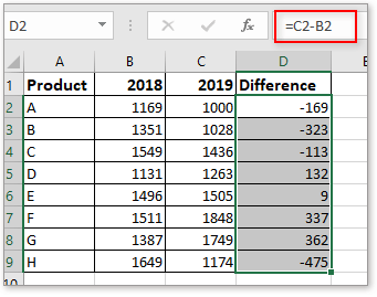
2. Calculate the increase or decrease percentage
In cell E2, type this formula
Drag fill handle down to fill cells with this formula
Then keep cells selected, click Home tab, and go to the Number group, choose Percent Style button to format the cells shown as percentage.
3. Calculate the positive value and negative value
In cell F2, type this formula
E2 is the percentage cell, drag fill handle down to fill the cells with this formula.
In Cell G2, type this formula
E2 is the percentage cell, drag fill handle down to fill the cells with this formula.
Now, select F2: G9, click Home > Percent Style to format these cells as percentages.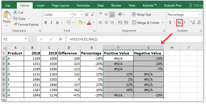
Now create the positive negative bar chart based on the data.
1. Select a blank cell, and click Insert > Insert Column or Bar Chart > Clustered Bar.
2. Right click at the blank chart, in the context menu, choose Select Data.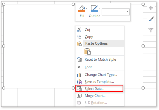
3. In the Select Data Source dialog, click Add button to open the Edit Series dialog. In the Series name textbox, choose the Percentage header, then in the Series values textbox, choose E2:E9 that contains increasing and decreasing percentages, click OK.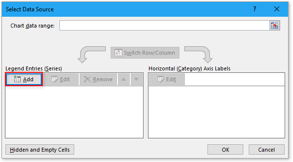

4. Back to the Select Data Source dialog, click Add to go to the Edit Series dialog again, select F1 as the series name, and F2:F9 as the series values. F2:F9 are the positive values, Click OK.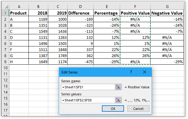
5. Again, Click Add in the Select Data Source dialog to go to the Edit Series dialog, select G1 as series name, G2:G9 as series values. Click OK.
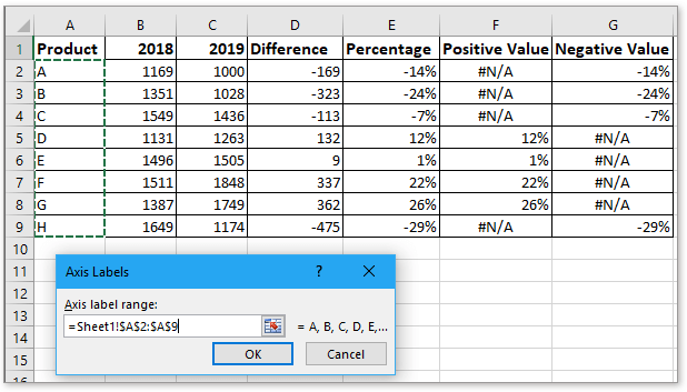
6. Back to the Select Data Series dialog, click Edit button in the Horizontal (Category) Axis Labels section, and choose A2:A9 as the axis label names in the Axis Labels dialog, click OK > OK to finish the select data.
Now the chart is displayed as below: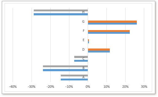
Then select the blue series, which express the increasing and decreasing percentage values, click Delete to remove them.
Then adjust the chart.
1. Right click at the axis labels, then choose Format Axis from context menu, and in the popped Format Axis pane, check Categories in reverse order checkbox in Axis Options section, and scroll down to the Labels section, choose Low from the drop-down list beside Label Position.
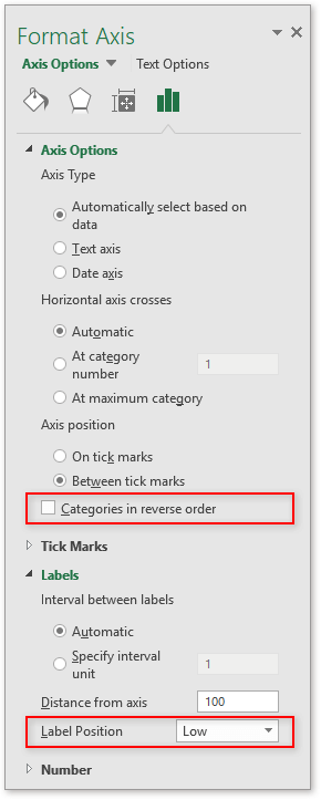
2. Remove gridlines and X (horizontal) axis.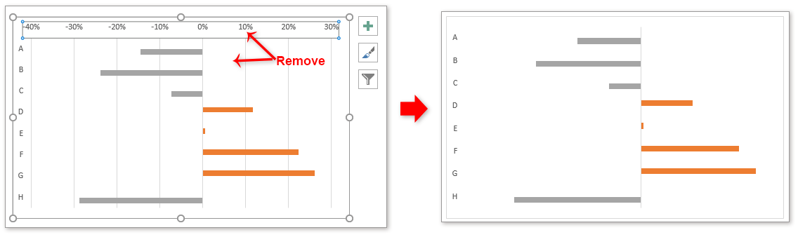
3. Right click at one series to select Format Data Point from the context menu, and in the Format Data Point pane, adjust Series Overlap to 0%, Gap Width to 25%.
4. Right click at left series, and click Add Data Label > Add Data Labels. 

5. Remove the #N/A labels one by one.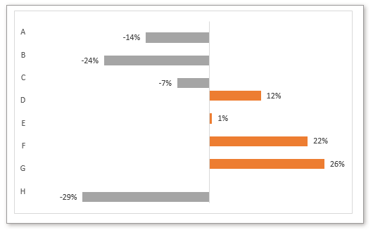
6. Select the chart to show the Design tab, and under Design tab, click Add Chart Element > Gridlines > Primary Major Horizontal.
You can change the series color and add chart title as you need.
This normal way can create the positive negative bar chart, but it is troublesome and takes much time. For users who want to quickly and easily handle this job, you can try below method.
With the Positive Negative Bar Chart tool of Kutools for Excel, which only needs 3 steps to deal with this job in Excel.
1. Click Kutools > Charts > Positive Negative Bar Chart.
2. In the popping dialog, choose one chart type you need, the choose the axis labels, two series values separately. Then click Ok.
3. Then a dialog pops out to remind you it will create a new sheet to store some data, if you want to continue create the chart, click Yes.
Now a positive negative chart has been created, at the same time, a hidden sheet created to place the calculated data.
Type 1
Type 2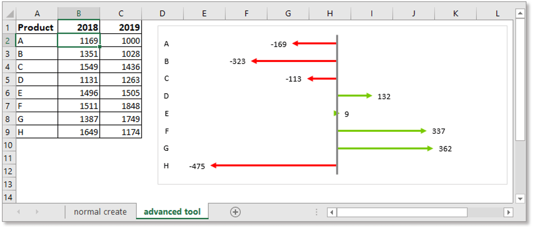
You can format the generated chart in Design and Format tab as you need.
Kutools for Excel - Supercharge Excel with over 300 essential tools, making your work faster and easier, and take advantage of AI features for smarter data processing and productivity. Get It Now
How to create thermometer goal chart in Excel?
Have you ever imaged to create a thermometer goal chart in Excel? This tutorial will show you the detailed steps of creating a thermometer goal chart in Excel.
Change chart color based on value in Excel
Sometimes, when you insert a chart, you may want to show different value ranges as different colors in the chart. For example, when series value (Y value in our case) in the value range 10-30, show the series color as red; when in value range 30-50, show color as green; and when in value range 50-70, show color as purple. Now this tutorial will introduce the way for you to change chart color based on value in Excel.
Conditional formatting stacked bar chart in Excel
This tutorial, it introduces how to create conditional formatting stacked bar chart as below screenshot shown step by step in Excel.
Create an interactive chart with series-selection checkbox in Excel
In Excel, we usually insert a chart for better displaying data, sometimes, the chart with more than one series selections. In this case, you may want to show the series by checking the checkboxes. Supposing there are two series in the chart, check checkbox1 to display series 1, check checkbox2 to display series 2, and both checked, display two series
Best Office Productivity Tools
Supercharge Your Excel Skills with Kutools for Excel, and Experience Efficiency Like Never Before. Kutools for Excel Offers Over 300 Advanced Features to Boost Productivity and Save Time. Click Here to Get The Feature You Need The Most...
Office Tab Brings Tabbed interface to Office, and Make Your Work Much Easier
- Enable tabbed editing and reading in Word, Excel, PowerPoint, Publisher, Access, Visio and Project.
- Open and create multiple documents in new tabs of the same window, rather than in new windows.
- Increases your productivity by 50%, and reduces hundreds of mouse clicks for you every day!
All Kutools add-ins. One installer
Kutools for Office suite bundles add-ins for Excel, Word, Outlook & PowerPoint plus Office Tab Pro, which is ideal for teams working across Office apps.
- All-in-one suite — Excel, Word, Outlook & PowerPoint add-ins + Office Tab Pro
- One installer, one license — set up in minutes (MSI-ready)
- Works better together — streamlined productivity across Office apps
- 30-day full-featured trial — no registration, no credit card
- Best value — save vs buying individual add-in