Excel: How to add max or min line to a chart
Adding max or min lines to an Excel chart can make it easier to identify the highest or lowest values at a glance. This tutorial provides step-by-step guidance on how to add these lines manually using helper columns or automatically with Kutools for Excel, making your charts more insightful and visually clear.
Add max and min line to chart by using helper columns
Add max and min line to chart by Kutools for Excel's Chart Tool
To add a max or min line to a chart, firstly, you need to find the maximum value and the minimum value of the original data.
1. Select a blank cell next to the data, type the following formula, and then press "Enter" to get the maximum.
=MAX($B$2:$B$21)Tip: Since we need to find the maximum value in the same range, absolute reference ensures the range remains unchanged when you drag the autofill handle down or right.
2. Then select this formula cell, drag the autofill handle down to the end of the data.
3. Then right-click on the chart to show the context menu, and click "Select Data".
4. In the "Select Data Source" dialog, click "Add" button.
5. In the "Edit Series" dialog, select the cell to shown the series name, then select the cells that contain MAX function you have done in step 1 and 2. Click "OK" > "OK".
Now the max values have been added into the chart.
6. Right-click at the added maximum values in the chart, and select "Change Series Chart Type" from the context menu.
7. In the "Change Chart Type" window, go to "Choose the chart type and axis for your data series" section, and click the drop-down list to change the chart type to "Line" for the "Max" series. Click "OK".
Now the max line has been added to the chart.
Use the following formula and repeat the above steps to add the min line to the chart.
=MIN($B$2:$B$21)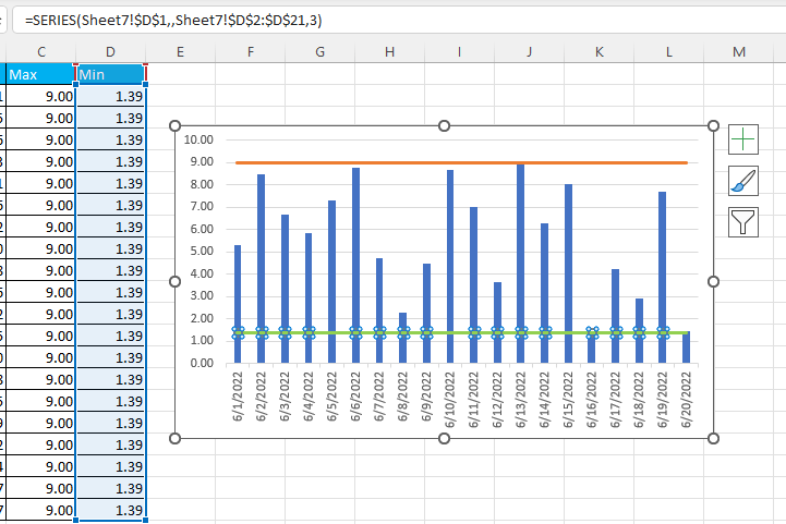
If you have "Kutools for Excel" installed, there is a feature "Add Line to Chart" in the "Chart Tools", which can quickly add a line to the selected chart.
1. Select the chart you want to add max or min line, then click "Kutools" > "Chart" > "Chart Tools" > "Add Line to Chart".
2. In the "Add line to chart" dialog, check "Other values" option, and type the maximum or minimum value in the textbox. Click "Ok".
Now the maximum line or minimum line has been inserted to the chart. 
Repeat the above steps to add another line.
To learn more about how to use the "Add Line to Chart" feature in Kutools for Excel, please visit our detailed tutorial.
Kutools for Excel - Supercharge Excel with over 300 essential tools, making your work faster and easier, and take advantage of AI features for smarter data processing and productivity. Get It Now
How to alternate row color based on group in Excel?
In Excel, to color every other row may be easier for most of us, but, have you ever tried to color the rows alternately based on a column value changes – Column A as following screenshot shown, in this article, I will talk about how to alternate row color based on group in Excel.
How to apply color gradient across multiple cells?
In Excel, we can easily fill background color to a cell or multiple cells, but, sometimes, we need the color be filled gradient as following screenshot shown, how could get the color gradient in a cell or across multiple cells in Excel?
How to apply color banded rows or columns in Excel?
This article will show you three methods of applying color banded rows or columns in Excel. Please do as follows.
How to apply shading to odd or even (alternative) rows/columns in Excel?
While designing a worksheet, many people tend to apply shading to odd or even (alternative) rows or columns in order to make the worksheet more visual. This article will show you two methods to apply shading to odd or even rows/columns in Excel.
Best Office Productivity Tools
Supercharge Your Excel Skills with Kutools for Excel, and Experience Efficiency Like Never Before. Kutools for Excel Offers Over 300 Advanced Features to Boost Productivity and Save Time. Click Here to Get The Feature You Need The Most...
Office Tab Brings Tabbed interface to Office, and Make Your Work Much Easier
- Enable tabbed editing and reading in Word, Excel, PowerPoint, Publisher, Access, Visio and Project.
- Open and create multiple documents in new tabs of the same window, rather than in new windows.
- Increases your productivity by 50%, and reduces hundreds of mouse clicks for you every day!
All Kutools add-ins. One installer
Kutools for Office suite bundles add-ins for Excel, Word, Outlook & PowerPoint plus Office Tab Pro, which is ideal for teams working across Office apps.
- All-in-one suite — Excel, Word, Outlook & PowerPoint add-ins + Office Tab Pro
- One installer, one license — set up in minutes (MSI-ready)
- Works better together — streamlined productivity across Office apps
- 30-day full-featured trial — no registration, no credit card
- Best value — save vs buying individual add-in