Mastering Excel sparklines: Insert, group, customize and more
Excel offers a wide range of data visualization tools, including Sparklines and traditional charts. Unlike space-consuming traditional charts, Excel's Sparklines offer a concise, in-cell visual summary of data, displaying trends and patterns directly. These differences make Sparklines an ideal choice for compact data representation, allowing for immediate visual comparisons between rows and columns without the spatial requirements of full-sized charts. In this comprehensive guide, we will delve into Excel Sparklines, exploring how to insert, group, customize, and effectively use them to enhance your data instantly and visually.

- Insert sparklines to cells
- Group and ungroup sparklines
- Customize sparklines
- Change the dataset for existing sparklines
- Delete sparklines
- FAQs for sparklines
Insert Sparklines into Cells
Suppose you have a quarterly sales table for different stores, as shown in the following figure. If you want to visualize the trend of the sales for each store in a single cell, adding a sparkline is your best option. This section explains how to insert sparklines in cells in Excel.

- To start, select a cell where you want the Sparkline to appear. In this case, I select cell F2.
- Then, go to the Insert tab, select the type of Sparkline you wish to insert (Line, Column, or Win/Los). Here I select the Line Sparkline.

- In the Create Sparklines dialog box, select the data range that you want to reflect the data trend, and then click the OK button.
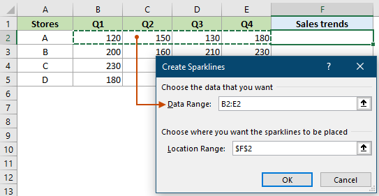
- A sparkline has now been added to the selected cell E2. You will need to select this cell and drag its Fill Handle down to add the rest of the sparklines to reflect the sales trends of the other stores.


- To insert Sparklines to multiple cells at the same time, follow the steps above to open the Create Sparklines dialog box. Then you need to select the range containing the datasets you cant to create sparklines based on, select a range of cells where you want the Sparklines to appear and click OK.
- You can also use the Quick Analysis tool to add sparklines to multiple cells at the same time. As shown in the following figure, after selecting the range containing the datasets, click the Quick Analysis button, go to the Sparklines tab, and then select the type of sparklines as needed. Sparklines for each dataset are then generated and displayed in the cell next to the selected range.


Unlock Excel Magic with Kutools AI
- Smart Execution: Perform cell operations, analyze data, and create charts—all driven by simple commands.
- Custom Formulas: Generate tailored formulas to streamline your workflows.
- VBA Coding: Write and implement VBA code effortlessly.
- Formula Interpretation: Understand complex formulas with ease.
- Text Translation: Break language barriers within your spreadsheets.
Group and ungroup sparklines
Grouping Sparklines allows you to apply the same formatting (like line color, marker style, etc.) across all Sparklines in the group. When Sparklines are grouped, any changes you make to one Sparklines are automatically applied to all Sparklines in the group. This ensures a uniform appearance, which is crucial for making fair comparisons and maintaining a professional look in your reports. This section will show you how to group and ungroup Sparklines in Excel.
Group sparklines
Select two or more sparklines you want to group together, go to the Sparkline tab, select Group.

Then the selected sparklines are grouped together. When you select any sparkline in the group, all sparklines in that group will be selected at once.

Ungroup sparklines
To ungroup sparklines, select any sparkline in the group, go to the Sparkline tab and click the Ungroup button.
- If multiple Sparklines are inserted in a batch at the same time, they are automatically grouped together.
- All sparklines in a group must be of the same type. If you group different types of sparklines together, they will automatically convert to a uniform type.
Customize sparklines
After creating sparkline, you can change their type, style, and format at any time. This section will show you how to customize sparklines in Excel.
Change sparkline types
There are three types of sparklines in Excel: Line, Column, and Win/Loss. Different types of sparklines can be more effective in visualizing certain kinds of data, and customization allows you to choose the most suitable type.
To quickly change the existing sparkline type to the desired new type, do as follows:
Select one or more sparklines, or an entire group, go to the Sparkline tab, choose the desired type you need from the Type group. See screenshot:

Result: The selected line sparklines are changed to column sparklines:


Highlight specific data points and show markers
Through customization, you can highlight significant data points, like peaks (highs) or valleys (lows), making it easier for viewers to focus on the most important aspects of the data. For line sparklines, you can show markers for each data point to make it more intuitive.
Select the sparklines, go to the Sparkline tab, and then select the options you need in the Show group.

- Hight Point – Highlight the highest points of data in the selected sparkline group.
- Low Point – Highlight the lowest points of data in the selected sparkline group.
- Negative Points – Highlight the negative values on the selected sparkline group with a different color or marker.
- First Points – Highlight the first point of data in the selected sparkline group.
- Last Point – Highlight the last point of data in the selected sparkline group.
- Markers – Add markers to each data point in the selected line sparkline group.
- After highlighting specific data points, select the Marker Color drop-down list, and specify different colors for the data point.
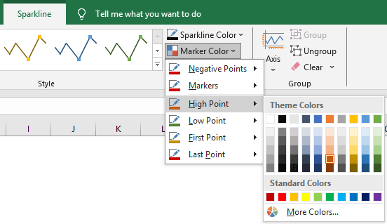
- The Markers option is only available for line sparklines.

Change sparkline color, style, ...
This section will demonstrate how to change the appearance of sparklines, such as adjusting their color and style to match the overall design of your spreadsheet or presentation ensures visual consistency.
Change the sparkline color
Select the sparklines, then go to the Sparkline tab, click the Sparkline Color drop-down list, and specify a new color for it.

Change the sparkline style
Select the sparklines, under the Sparkline tab, choose a desired style in the Style gallery.

Customize sparkline axis
After creating Sparklines, you might encounter some unexpected phenomena. For instance, minor variations in the original data may appear exaggerated in the chart; columns may display the same height despite different maximum values in the data; and distinguishing between positive and negative values in Sparklines might be challenging. This section will guide you on how to customize the Sparkline axis to resolve these issues.
Variation between data points appears exaggerated
As shown in the screenshot below, the entire dataset is between 80 and 85 (the variation is only 5 points), but the variation in the sparkline looks huge. That’s because Excel automatically sets the axis that starts from the lowest value 80. In this case, customizing the axis can help represent the data more accurately in sparklines.

- Select the sparklines or the entire sparkline group, go to the Sparkline tab.
- Select Axis > Custom Value.

- In the opening Sparkline Vertical Axis Setting dialog box, enter the value 0, or another minimum value for the vertical axis and click OK.
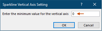


Result
After setting the minimum value for the vertical axis as 0, the sparkline represents the data more accurately as shown in the screenshot below.

Inconsistent Representation of Maximum Values
As shown in the figure below, the maximum values in each dataset are different, but all the red bars representing the maximum values in sparklines have the same height. This does not make it easy for us to find out the differences in the maximum values between the datasets from the charts. To solve this problem, the following approach can be taken.

- Select the sparklines or the entire sparkline group, go to the Sparkline tab.
- Click Axis to expand the drop-down list, and then select Same for All Sparklines respectively from both the Vertical Axis Minimum Value Options and the Vertical Axis Maximum Value Options.
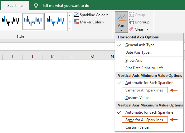

Result
You can now see that all the red bars representing the maximum values in sparklines are in different heights.

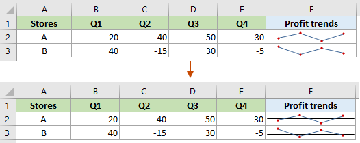
Difficulty in Distinguishing Positive and Negative Values
As illustrated in the screenshot below, the original data includes both negative and positive values, yet distinguishing them in the Sparklines is not straightforward. Displaying the horizontal axis in Sparklines can be an effective way to help differentiate between positive and negative values.

- Select the sparklines or the entire sparkline group, go to the Sparkline tab.
- Click Axis to expand the drop-down list, and then select Show Axis in the Horizontal Axis Options section.


Result
Then a horizontal axis appears in the sparklines, which helps to visually separate positive values from negative ones. Values above the line are positive, while those below are negative.
Resize sparklines
Sparklines in Excel are contained within a cell. To resize a sparkline, you need to resize the cell that it's in. This can be done by changing the row height or column width where the sparkline is located. See the following demo.
Change the dataset for existing sparklines
To modify the data range of existing Sparklines, please do as follows.
- Select the sparklines or the entire sparkline group.
- Go to the Sparkline tab, click Edit Data button.
- To change the location and data source for the selected sparkline group, select the Edit Group Location & Data… option;
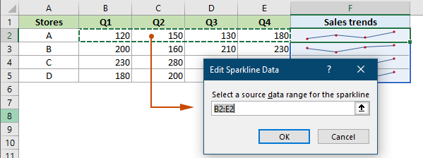
- To change only the data source for the selected sparkline, select the Edit Single Sparkline’s Data… option.

- Then select the new data source for your sparklines and click OK to save the changes.
- If you selected Edit Group Location & Data… in the previous step, an Edit Sparklines dialog box will pop up. You can change the data source as well as the location of the sparklines.
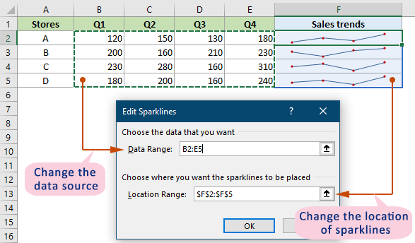
- If you selected Edit Single Sparkline’s data… in the previous step, an Edit Sparkline Data dialog box will pop up. You can only change the data source for the selected single sparkline.
- If you selected Edit Group Location & Data… in the previous step, an Edit Sparklines dialog box will pop up. You can change the data source as well as the location of the sparklines.


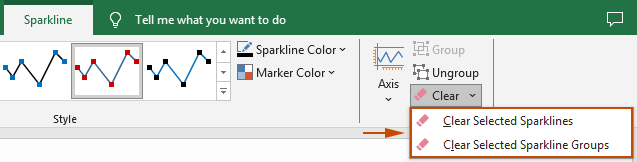
Delete sparklines
To delete sparklines, select sparklines or sparkline groups, go to the Sparkline tab, click Clear, and then select the option you need:
- Clear Selected Sparklines: click this option will clear all selected sparklines.
- Clear Selected Sparklines Group: click this option will clear all sparklines groups.

FAQs for sparklines
1. Are Sparkline charts dynamic?
Yes, Sparkline charts in Excel are dynamic. When you modify the data that a Sparkline is referencing, the Sparkline will adjust to display the new data.
2. What types of data are suitable for Sparklines?
Sparklines are only suitable for numbers, text and error values are ignored.
3. How are blank cells handled in Sparklines?
Blank cells are by default shown as a gap in Sparklines. How to display these blank cells can be decided as needed.
4. Can cells with inserted Sparklines be edited?
Excel allows you to edit cells with inserted Sparklines in any way, such as adding text or conditional formatting. This operation will not disrupt the existing Sparklines.
Sparkline is an excellent tool for bringing data to life in Excel. By mastering these simple yet effective techniques, you can add a new dimension to your data presentation and analysis. For those eager to delve deeper into Excel's capabilities, our website boasts a wealth of tutorials. Discover more Excel tips and tricks here.
Best Office Productivity Tools
Supercharge Your Excel Skills with Kutools for Excel, and Experience Efficiency Like Never Before. Kutools for Excel Offers Over 300 Advanced Features to Boost Productivity and Save Time. Click Here to Get The Feature You Need The Most...
Office Tab Brings Tabbed interface to Office, and Make Your Work Much Easier
- Enable tabbed editing and reading in Word, Excel, PowerPoint, Publisher, Access, Visio and Project.
- Open and create multiple documents in new tabs of the same window, rather than in new windows.
- Increases your productivity by 50%, and reduces hundreds of mouse clicks for you every day!
All Kutools add-ins. One installer
Kutools for Office suite bundles add-ins for Excel, Word, Outlook & PowerPoint plus Office Tab Pro, which is ideal for teams working across Office apps.
- All-in-one suite — Excel, Word, Outlook & PowerPoint add-ins + Office Tab Pro
- One installer, one license — set up in minutes (MSI-ready)
- Works better together — streamlined productivity across Office apps
- 30-day full-featured trial — no registration, no credit card
- Best value — save vs buying individual add-in
Table of contents
- Insert sparklines to cells
- Group and ungroup sparklines
- Customize sparklines
- Change sparkline types
- Highlight specific data points
- Change sparkline color, style, ...
- Customize sparkline axis
- Resize sparklines
- Change the dataset for existing sparklines
- Delete sparklines
- More FAQs for sparklines
- Related Articles
- The Best Office Productivity Tools
- Comments