Analyze Data in Excel: data analysis made easy with AI
Welcome to the world of simplified data analysis in Excel! Whether you're a seasoned data analyst or someone just getting started, Excel's Analyze Data feature (formerly called Ideas) is a game-changer. With its AI-driven capabilities, this tool transforms complex data into comprehensible insights with ease. Gone are the days of daunting formulas and time-consuming data crunching.
This tutorial is designed to guide you through the powerful Analyze Data feature, making data visualization and analysis not only accessible but also enjoyable. Get ready to unlock the full potential of your data with just a few clicks, and discover insights you never knew were at your fingertips. Let's dive in and explore how Excel's Analyze Data can revolutionize the way you work with data!
Note that the Analyze Data feature in Excel utilizes artificial intelligence services to scrutinize your data, which may raise concerns about data security. To address any such concerns and provide clarity on how your data is managed, review the Microsoft privacy statement for comprehensive information.
Video: Analyze Data in Excel
What is Analyze Data
Excel's Analyze Data, an AI-driven tool, revolutionizes data analysis by enabling you to interact with your data using simple, natural language queries. This feature eliminates the need for intricate formula writing, allowing you to easily uncover and comprehend intricate patterns and trends within your datasets. It processes your data and delivers insights in the form of visual summaries, identifying key trends and patterns, thus simplifying the complexity of data analysis.
Analyze Data simplifies the complexity of data analysis and offers significant advantages, such as increased efficiency in data processing, user-friendly interaction, and the ability to quickly generate actionable insights. These benefits make Analyze Data an invaluable tool for both novice and experienced Excel users alike, streamlining the data analysis process in a powerful and intuitive way.
The feature currently supports four analysis types:
- 🥇 Rank: This analysis identifies and emphasizes items that significantly stand out from others, highlighting the most prominent data points.
- 📈 Trend: It detects and accentuates consistent patterns over a series of time-related data, revealing progression or changes.
- 👤 Outlier: This type is adept at pinpointing unusual data points in time series, spotlighting anomalies.
- 👨👩👧👧 Majority: This analysis is key for identifying scenarios where a majority of the total value is driven by a singular factor, illustrating concentrated impacts.
Where to find Analyze Data
To utilize Analyze Data, ensure you're using the latest version of Office as a Microsoft 365 subscriber. It's available in Excel for Microsoft 365 on both Windows and Mac platforms, as well as in Excel for the web. The "Analyze Data" feature is accessible to Microsoft 365 subscribers across multiple languages, including English, French, Spanish, German, Simplified Chinese, and Japanese.
To locate the Analyze Data command:
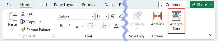
- Go to the "Home" tab in Excel.
- Look towards the far right of the ribbon, where you will find the "Analyze Data" command.

Use Analyze Data to create charts / get answers
After opening the worksheet containing the dataset you wish to analyze with the "Analyze Data" feature:
- Select a cell within your data range.
- Under the "Home" tab, click the "Analyze Data" button.
The "Analyze Data" pane will emerge on the right side of your Excel workspace. This pane serves as a powerful gateway to deep data insights, allowing you to ask tailored questions, explore various insights, and uncover hidden trends within your data, all through this intuitive and user-friendly interface.
Easy guide to asking questions in Excel's Analyze Data
When engaging with the Analyze Data feature, leverage the power of natural language processing to interact with your data. This advanced capability allows you to pose queries in plain language, similar to how you would ask a colleague. With its advanced AI algorithms, Excel interprets your queries, delving into your dataset to unearth and visually represent meaningful insights.
Tips for asking a question:
- "Simple Queries for Direct Answers": For immediate insights, ask straightforward questions like "What are the sales by regions" to understand the sales distribution across different regions.
- "Query for Top Performers": You can ask Analyze Data for specific rankings, such as "What are the top 5 sales". This allows you to quickly identify and analyze your highest-performing data points, such as sales, regions, or products.
- "Include Time Frames": For more targeted insights, include specific time frames in your queries, such as asking for "Sales in the first quarter of 2023" to focus on that particular period.
- "Use Specific Metrics": Clarify the metrics you're interested in. For instance, "What is the average sales per employee" or "What was the total expenditure in July". These questions provide specific numerical insights.
- "Specify Result Type": Indicate the type of result you want, for instance, “The percentage of Apparel sales as a pie chart, line chart, or table” to get the answer in your preferred format.
- "Sorting Preferences": You can specify how you want your data sorted in the answer. For example, request "Sort Customer Satisfaction (%) per month in ascending order" to see a progressive view of customer satisfaction.
- "Comparative Questions": If you want to compare different sets of data, phrase your question accordingly, like "How do 2023 sales compare to 2022".
- "Combine Factors for Comprehensive Analysis": To delve deeper, combine different factors in a single query. For example, "What is the average customer satisfaction for Electronics in the North region" combines product category, region, and customer satisfaction metrics.
- "Keywords for General Insights": If you're uncertain about what to ask, use a keyword with “insights”, such as “quantity insights”, to get a broad overview of that particular aspect in your data.
Steps to ask questions and get answers:
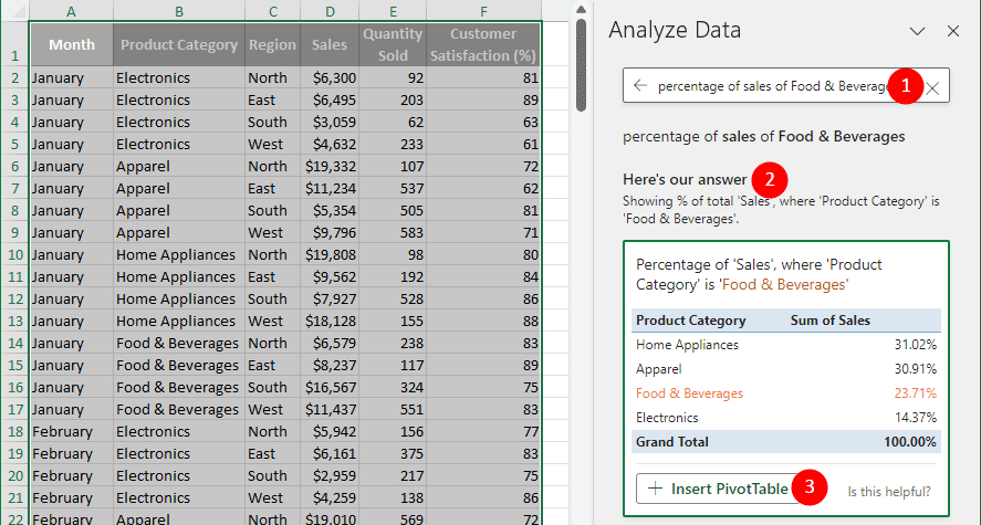
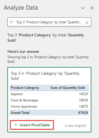
- Type your question into the "query" box.
- Hit "Enter" to retrieve answers, which "Analyze Data" displays as visual representations like charts or tables in the Here’s our answer section.
- Select an answer that closely aligns with your question, and click the "+ Insert PivotTable" button to add the corresponding pivottable into your workbook.
Tip: The button might vary and appear as "+ Insert Chart" or "+ Insert PivotChart" based on the answer type.

Result
- When you insert a PivotTable or PivotChart using the "Analyze Data" feature, Excel creates a new worksheet to accommodate it as shown below.
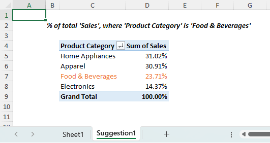
- If you insert a regular chart, it will be inserted directly into your original worksheet, without creating a new sheet.


Do not have a question in mind (Explore possibilities in your data)
If you're approaching your data without a specific query in mind, or are interested in exploring your data and want to know what is possible, you can either try personalized suggested questions or discover personalized visual summaries, trends, and patterns:
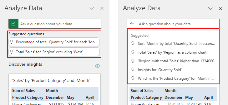
Try personalized suggested questions
Excel automatically generates questions relevant to your data, displayed below the query box. More suggestions will appear as you interact with the input box, providing a range of queries tailored to your dataset's characteristics.
- Select the question that interests you from either the list displayed below the query box or the additional suggestions that appear as you interact with the input box.
- With answers presented as visual representations, such as charts or tables, in the "Here's our answer" section, select an answer you like, and click the "+ Insert PivotTable" button to add the corresponding table into your workbook.
Tip: The button might vary and appear as "+ Insert Chart" or "+ Insert PivotChart" based on the answer type.


Discover personalized visual summaries, trends, and patterns
In the "Discover insights" section, discover automatically generated visual insights with Excel's Analyze Data. This feature also smartly creates automated visual summaries for your data. It simplifies the process of exploring your data from multiple perspectives, offering an accessible way to uncover hidden insights. Just select an insight you like, and click the "+ Insert" button to add the corresponding table or chart into your workbook. Tip: Click the gear icon  in the upper-right corner of the Discover insights section to choose fields for Excel to focus on during analysis. in the upper-right corner of the Discover insights section to choose fields for Excel to focus on during analysis.
|  |

Result
- When you insert a PivotTable or PivotChart using the Analyze Data feature, Excel creates a new worksheet to accommodate it as shown below.
- If you insert a regular chart, it will be inserted directly into your original worksheet, without creating a new sheet.
(AD) Enhance Excel's Analyze Data with Kutools for Excel
While Excel's Analyze Data feature offers powerful data analysis capabilities, it doesn't cover advanced charting like Gantt or bubble charts. Kutools for Excel fills this gap, offering over 60 tools for sophisticated data tasks and charting options.


Download and explore Kutools for Excel. Enhance your data analysis today!
Customize the charts or PivotTables created by Analyze Data
Excel gives you complete flexibility to modify the PivotTables and charts that you create using the Analyze Data feature. You have the freedom to format these elements, alter their styles, rename default headers, or even add more fields. This allows you to customize the automatically generated PivotTables and charts to your specific analysis needs, whether it's by changing the way values are summarized or how they're displayed.
Make adjustments on charts
Customizing charts in Excel is straightforward and allows for a high degree of personalization to better suit your data visualization needs. Here are some key ways to make adjustments to your charts:
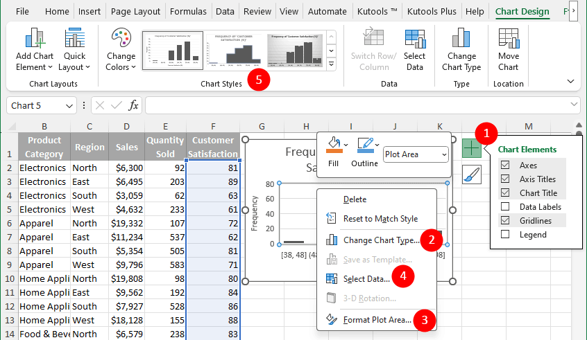
- To "add or remove chart elements" (including titles, labels, and other necessary details), select the chart and then click on the plus sign button that appears near the top-right corner of the chart.
- Right-click on the chart and select "Change Chart Type" to "change the chart style" (e.g., line or pie chart) that suits your data better.
- Right-click on any element of the chart (like axes, legend, or data series) and select "Format" (e.g., Format Plot Area) to "format it", "adjusting colors", "fonts", and more.
- Right-click on the chart and select "Select Data" to "change the data that the chart is based on".
- Use the "Chart Styles" options in the "Chart Design" tab (or "Design" tab if it's a PivotChart) to quickly "change the chart's appearance".
 Additional Tip: For more formatting options for your charts, double-click on any chart element. This action will open the Formatpane on the right side of Excel, offering extensive customization choices for each component of your chart.

Make adjustments on PivotTables
In the following sections, we'll explore two key areas of PivotTable customization: Direct adjustments you can make within the PivotTable itself, such as filtering and sorting data, and modifying calculation columns. Advanced customizations using the PivotTable Fields pane, which allow for more detailed and specific adjustments to enhance your data analysis.
Easily filter, sort, and customize calculations directly in your PivotTable
By clicking on an element within your PivotTable, you can easily access and alter various features.
- Select the filter icon
 in the PivotTable headers to "filter for specific items or multiple criteria".
 - Select the sort icon
 to "arrange the data" in the PivotTable as desired.
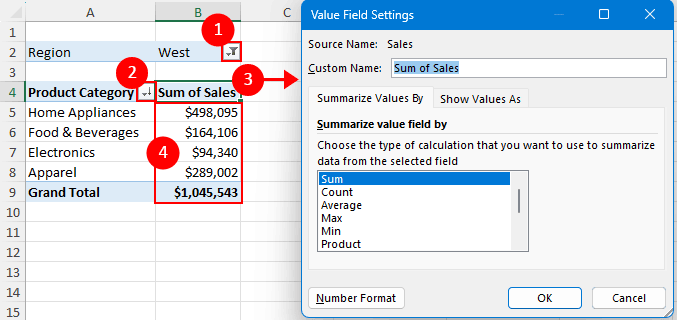
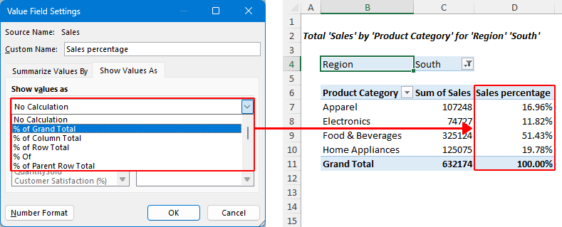
 - Double-click on the header of the calculation column to open the "Value Field Settings" dialog, where you can rename the column, and choose different types of calculations.
Tip: Within the dialog, you can also set a specific number format. By navigating to the "Show Value As" tab, you can present values in different ways, such as displaying them as a percentage of the grand total.
- Double-click on any of the calculation results to extract the underlying data used for that particular calculation.
 Additional Tip: Explore more adjustment options by right-clicking on a cell within your PivotTable, or using features on the PivotTable Analyze tab in the ribbon.
 in the PivotTable headers to "filter for specific items or multiple criteria".
 to "arrange the data" in the PivotTable as desired.
Using the fields pane for detailed PivotTable and PivotChart customizations
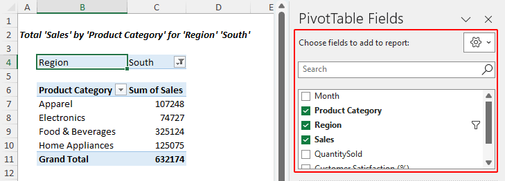
When you select a PivotTable or PivotChart, the "PivotTable / PivotChart Fields" pane will appear on the right side of the screen. This pane provides a variety of additional customization options, allowing for a more refined and detailed analysis of your data.
- Select the checkbox next to each field name in the "Choose fields to add to report" box to add fields to your PivotTable. Tip: Clearing the checkbox removes the corresponding field.
- Drag the same field more than once to the "Values" area, and then select the newly added field and choose "Value Field Settings" to display different calculations.

- Within the "Value Field Settings" dialog, switch to the "Show Values As" tab, and select an option to present values in different formats, like a percentage of the grand total. The screenshot below illustrates this with the second sales field displayed as a percentage.
- Rearrange a field by clicking on it and using commands such as "Move Up", "Move Down", "Move to Beginning", "Move to End", and more.

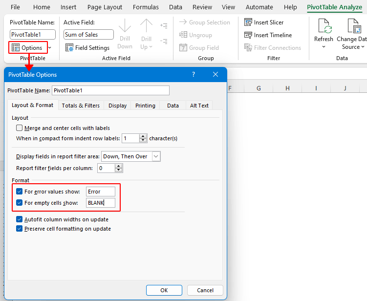
- Modify how errors and empty cells are displayed by selecting anywhere in your PivotTable, navigating to the "PivotTable Analyze" tab, and choosing "Options" in the "PivotTable" group. In the dialog box that appears, under the "Layout & Format" tab, select the "For error values / empty cells show" check box, and type the value you want to display.
 Additional Tip: For more adjustments, select any field in the "Drag fields between areas below" section, or explore the "PivotTable Analyze" tab in the ribbon.


Update Analyze Data results when data changes
Note: To accommodate anticipated data expansion (such as adding new rows beneath your current table), it's advisable to transform your data range into an official Excel table. This can be done by pressing "Ctrl" + "T" and then "Enter". Subsequently, ensure automatic expansion by accessing "Options" > "Proofing" > "AutoCorrect Options" > "AutoFormat As You Type" and checking “Include new rows and columns in table” and “Fill formulas in tables to create calculated columns” options. By doing so, any new rows appended beneath the table will be automatically incorporated.
When using the "Analyze Data" feature in Excel, the behavior of charts and PivotTables in response to data changes varies:
- "Charts": If you have inserted a chart using Analyze Data, it will automatically update when the underlying data changes. This is because charts in Excel are dynamically linked to their data sources.
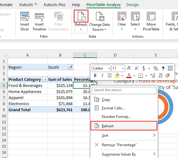
- "PivotTables": PivotTables, on the other hand, do not automatically update when the source data changes. To reflect the latest data in a PivotTable, you need to manually refresh it. You can do this by right-clicking within the PivotTable and selecting "Refresh", or by using the "Refresh" button in the "Data group" under the "PivotTable Analyze" tab.

Note: This distinction is important to remember for maintaining accuracy in your data analysis and presentations.
Limitations of Analyze Data
While Analyze Data is powerful, it has its boundaries:
- Limitation on Large Datasets: Analyze Data can't process datasets larger than 1.5 million cells. Currently, there's no direct solution. However, you can filter your data and copy it to a new location for analysis.
- Data Structure Considerations: For optimal results, Analyze Data works best with structured, tabular data. Complex or unstructured data might require additional processing, potentially using tools like Power Query for better organization and analysis.
- Handling String Dates: Dates formatted as strings, like "2024-01-01," are treated as text. To analyze these as dates, create a new column using DATE or DATEVALUE functions and format it appropriately.
- Compatibility Mode Issue: Analyze Data is incompatible with Excel in compatibility mode (.xls format). To use this feature, save your file in .xlsx, .xlsm, or .xlsb format.
- Challenge with Merged Cells: Merged cells complicate data analysis as it can confuse the AI. For tasks like centering a report header, unmerge the cells and use the "Center" option you need in the "Alignment" group on the Home tab.
- Inability to Perform Arithmetic Operations Between Columns: Analyze Data cannot perform arithmetic operations between data from two different columns. While it can execute in-column calculations such as sum and average, it cannot directly calculate operations between two columns. For such calculations, you'll need to rely on standard Excel formulas in your worksheet.
- AI Limitations: The AI component of Analyze Data might have trouble understanding certain fields or could aggregate data unnecessarily.
Analyze Data in Excel represents a significant advancement in data analysis, offering a blend of ease and depth. By understanding its capabilities and limitations, and learning to ask the right questions, you can harness the full power of AI to make informed decisions based on your data. I hope you find the tutorial helpful. If you're looking to explore more Excel tips and tricks, please click here to access our extensive collection of over thousands of tutorials.
The Best Office Productivity Tools
Kutools for Excel - Helps You To Stand Out From Crowd
Kutools for Excel Boasts Over 300 Features, Ensuring That What You Need is Just A Click Away...
Office Tab - Enable Tabbed Reading and Editing in Microsoft Office (include Excel)
- One second to switch between dozens of open documents!
- Reduce hundreds of mouse clicks for you every day, say goodbye to mouse hand.
- Increases your productivity by 50% when viewing and editing multiple documents.
- Brings Efficient Tabs to Office (include Excel), Just Like Chrome, Edge and Firefox.
Table of contents
- Video: Analyze Data in Excel
- What is Analyze Data
- Where to find Analyze Data
- How to use Analyze Data to create charts / get answers
- Easy guide to asking questions in Excel's Analyze Data
- Do not have a question in mind (Explore possibilities in your data)
- Customize the charts or PivotTables created by Analyze Data
- Make adjustments on charts
- Make adjustments on PivotTables
- Update Analyze Data results when data changes
- Limitations of Analyze Data
- Related articles
- The Best Office Productivity Tools
- Comments