Descriptive statistics in Excel (Quick and easy guide)
For those who often work with big datasets in Excel, using descriptive statistics is really helpful. Descriptive statistics are a fundamental aspect of data analysis, offering a way to summarize and interpret large data sets. Instead of calculating stats one by one, Excel's descriptive statistics tool puts everything together in one place, making your data work faster and simpler. This guide will show you how to use this feature to quickly summarize your data analysis.

What is descriptive statistics?
What is descriptive statistics?
Descriptive statistics in Excel refer to a set of tools and functions used to summarize and analyze data in order to provide a better understanding of its characteristics. These statistics help you make sense of your data by providing measures of central tendency, dispersion, and distribution.
Key elements of descriptive statistics include:
- Measures of Central Tendency:
These provide a single value that represents the center of the data. The most common measures are the mean (average), median (middle value), and mode (most frequently occurring value). - Measures of Dispersion or Variability:
These describe the spread or variability within the data. Common measures include range (difference between the highest and lowest values), variance (average of the squared differences from the mean), and standard deviation (average distance of each data point from the mean). - Other Statistical Measures:
Such as the count (number of data points), minimum and maximum values, and measures of skewness (measure of asymmetry) and kurtosis (measure of whether the data are peaked or flat compared to a normal distribution).

How to find and add Data Analysis tool to the ribbon?
The "Data Analysis" tool in Excel, an add-in program, provides a variety of tools for financial, statistical, and engineering data analysis, including the Descriptive Statistics feature. However, it may not be apparent on the ribbon as it's not activated by default.
To find and activate the "Data Analysis" tool to the Excel ribbon, follow these steps:
- Click "File" > "Options", in the "Excel Options" dialog box:
- Click "Add-ins" from the left pane;
- And then, click "Analysis ToolPak" under the "Inactive Application Add-ins" section;
- At last, click "Go" button.

- In the "Add-ins" dialog box, check "Analysis ToolPak" option, and then, click "OK" button. See screenshot:

- Now, click "Data" tab, in the "Analysis" group, you can see the "Data Analysis" function has been activated, see screenshot:


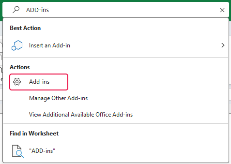
- Please go to "Search Bar" in Excel, and type "Add-Ins", select "Add-Ins" from the search list, see screenshot:
- Then, you will go to the "Add-ins" dialog box, check "Analysis ToolPak" option, and then, click "OK" button. The "Data Analysis" tool will be activated as well.


Unlock Excel Magic with Kutools AI
- Smart Execution: Perform cell operations, analyze data, and create charts—all driven by simple commands.
- Custom Formulas: Generate tailored formulas to streamline your workflows.
- VBA Coding: Write and implement VBA code effortlessly.
- Formula Interpretation: Understand complex formulas with ease.
- Text Translation: Break language barriers within your spreadsheets.
How to use descriptive statistics?
Now that you've enabled the Data Analysis tool in Excel, you can easily use descriptive statistics for your data.
Let's examine a basic dataset from a test, containing the scores of some students. Our goal is to use this score data to perform a descriptive statistics analysis, enabling us to gain a clearer understanding of the students' performance.
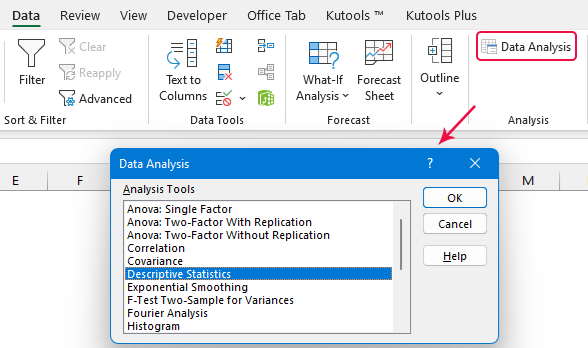
- Click "Data" > "Data Analysis", in the "Data Analysis" dialog box, click "Descriptive Statistics" from the list box, and then click "OK" button, see screenshot:
- In the "Descriptive Statistics" dialog box, please configure the following settings:

- Select the data range that you want to describe statistically from the "Input Range" box, here, I will select B1:B15, including the header cell.
- From the "Grouped By" section, select "Columns" option;
● "Grouped by Columns": This is the most common way. When data is grouped by columns, each column represents a different variable or attribute, and each row represents a separate observation or data point.
● "Grouped by Rows": When data is grouped by rows, each row represents a different variable or attribute, and each column represents an observation or data point. - If your selected data range includes the header cell, make sure to check the option "Labels in first row"; (Ignore this if you don’t select headers in the data range)
- Then, choose a place to output the statistics result from the "Output options" section; (you can select a cell in current worksheet, a new worksheet, or a new workbook.)
- And then, specify the statistical measures you want calculated.
● Check the "Summary statistics" box to get a full descriptive analysis, which typically includes mean, median, mode, standard deviation, range, and more.
● Select the "Confidence Level for Mean" option to show a confidence interval for the mean. (The default is 95%, you can change the value to your need.)
● The "Kth Largest" and "Kth Smallest" indicate to find the largest x or smallest x value in the data set. You can check them as you desired. (The default is 1, you can change them to your need. If you enter 2, it shows the second highest and lowest values.) - Finally, click "OK" button.
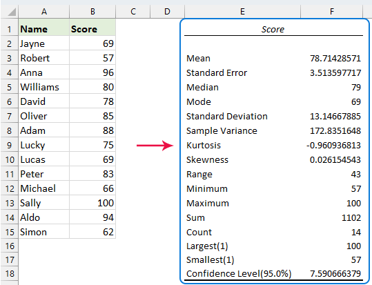
- Now, you will see the summary report of descriptive statistics data analysis is generated, see screenshot:


Interpreting Results:
Here's a simplified explanation of various descriptive statistics terms and corresponding Excel functions:
| Statistic | Description |
| Mean | The average value of your data. Use =AVERAGE(range) in Excel. |
| Standard Error | Measures accuracy of the sample in representing a population, using standard deviation. High Standard Error indicates more variability. Calculate with =STDEV.S(range)/SQRT(COUNT(range)). |
| Median | The middle number in a sorted list of your data. |
| Mode | The most frequent value in your data. Use =MODE.SNGL(range) in Excel. |
| Standard Deviation | Measures variation in your dataset. Use =STDEV.S(range) in Excel. |
| Sample Variance | Square of the Standard Deviation. Calculate with =VAR.S(range). |
| Kurtosis | Indicates how the tails of your distribution differ from a normal distribution. A normal distribution has a Kurtosis of zero. |
| Skewness | Measures asymmetry of your data. Zero skewness means a perfectly symmetrical distribution. Use =SKEW(range). |
| Range | The difference between the highest and lowest values in your data. |
| Minimum | The smallest value in your data. Use =MIN(range). |
| Maximum | The largest value in your data. Use =MAX(range). |
| Sum | The total of all values in your data. Use =SUM(range). |
| Count | The number of values in your data. |
| Largest(1,2…) | The largest value or second largest value in your data. |
| Smallest(1,2…) | The smallest value or second smallest value in your data |
| Confidence Level(95.0%) | A 95% confidence level for your data, indicating the degree of certainty that the interval contains the true mean. |
- When users employ the descriptive statistics function in Excel with multiple columns of data, where each column represents a different variable, the analysis will yield a statistical summary for each column (each variable).
To run the "Descriptive Statistics" function in Excel based on the above steps discussed, and you will get a result as following screenshot shown:
- The results generated by the "Descriptive Statistics" function are static; if the original data changes and you want to update the statistical results, you must rerun the function.

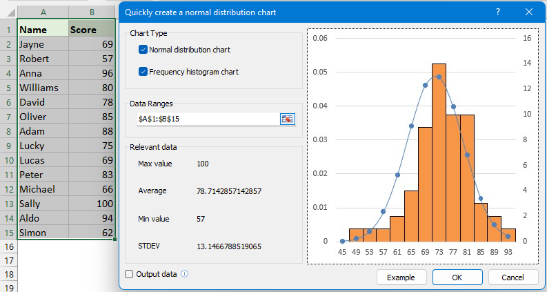
Effortlessly Create a Normal Distribution Chart in Excel
Whether you're analyzing test scores, measuring process variations, or evaluating statistical data, "Kutools for Excel" makes it easier than ever to represent your data graphically with a clear, accurate bell curve. Transform complex data into a visually appealing and informative chart, enhancing your data presentations and reports effortlessly with the "Normal Distribution / Bell Curve" utility of "Kutools for Excel". Download Kutools for Excel!
"Kutools for Excel" boasts over 60 chart types, including "Gantt charts", "Waterfall charts", "Speedometer Chart", and more, enabling you to quickly create a wide variety of charts that bring your worksheets with vivid and dynamic visuals. Download Kutools for Excel!
Best Office Productivity Tools
Supercharge Your Excel Skills with Kutools for Excel, and Experience Efficiency Like Never Before. Kutools for Excel Offers Over 300 Advanced Features to Boost Productivity and Save Time. Click Here to Get The Feature You Need The Most...
Office Tab Brings Tabbed interface to Office, and Make Your Work Much Easier
- Enable tabbed editing and reading in Word, Excel, PowerPoint, Publisher, Access, Visio and Project.
- Open and create multiple documents in new tabs of the same window, rather than in new windows.
- Increases your productivity by 50%, and reduces hundreds of mouse clicks for you every day!
All Kutools add-ins. One installer
Kutools for Office suite bundles add-ins for Excel, Word, Outlook & PowerPoint plus Office Tab Pro, which is ideal for teams working across Office apps.
- All-in-one suite — Excel, Word, Outlook & PowerPoint add-ins + Office Tab Pro
- One installer, one license — set up in minutes (MSI-ready)
- Works better together — streamlined productivity across Office apps
- 30-day full-featured trial — no registration, no credit card
- Best value — save vs buying individual add-in