Create a pareto chart in Excel
In Excel, a pareto chart is composed of a column and a line charts, where the column bars represent the frequency values in descending order, and the line indicates the cumulative totals on a secondary axis. It is used to analyze the significant areas of defects in a product, and determine the improvements that increase the value of a company. To create a pareto chart to display the most common reasons for failure, product defects in Excel worksheet, this article will help you.
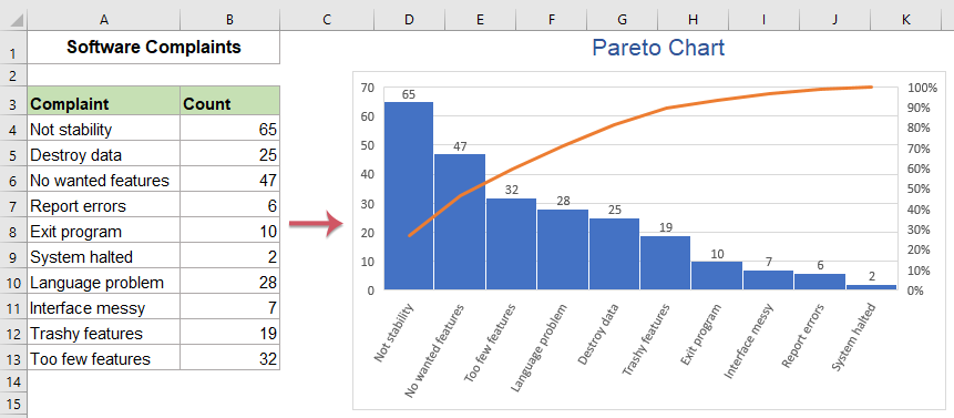
- Create a simple pareto chart in Excel 2016 and later versions
- Create a simple pareto chart in Excel 2013 and earlier versions
- Create a dynamic pareto chart in Excel
- Download Pareto Chart sample file
- Video: Create pareto chart in Excel
Create a simple pareto chart in Excel 2016 and later versions
If you have Excel 2016 and later versions, there is a built in feature - Pareto Chart, which can help you to insert a pareto chart quickly and easily. Please do as follows:
1. Select the data range that you want to create a pareto chart based on.

2. Then, click Insert > Insert Statistic Chart > Pareto, see screenshot:

3. And then, a pareto chart has been created at once as below screenshot:

4. Then, you can edit the chart title and add the data labels as you need, see screenshot:

Create a simple pareto chart in Excel 2013 and earlier versions
If you are using Excel 2013 and earlier versions, you should apply the following steps one by one:
First, Prepare the data for creating the pareto chart:
1. You should sort the data in descending order, please select cell B2, and then click Data > Sort Z to A, see screenshot:

2. And then data range has been sorted in descending order, see screenshot:

3. Then, calculate the Cumulative Count by typing this formula =B2 into the cell C2 in this case, and press Enter key. See screenshot:

4. And then, enter this formula =C2+B3 into cell C3, and drag the fill handle down to the cells, see screenshots:
 |  |
5. After getting the cumulative count, please go on calculating the cumulative percentage, enter this formula: =C2/$C$11 into cell D2, and drag the fill handle down to the cells you need, see screenshot:

6. Then, you should convert the decimal values to percentage values, select the formula cells, and then click Home > Percent Style, see screenshot:

Second, create the chart based on the data
7. After preparing the data, please select the data in column A, column B and column D by Ctrl key, see screenshot:

8. And then, click Insert > Insert Column or Bar Chart > Clustered Column, see screenshot:

9. And you will get a chart as below screenshot shown:

10. Then, right click one red bar (Cumulative Percentage) and choose Change Series Chart Type from the context menu, see screenshot:

11. In the Change Chart Type dialog box, under the All Charts tab, click Combo option from the left pane, in the Choose the chart type and axis for your data series list box, click the drop down list from the Cumulative field, and choose Line with Markers chart type, and check the checkbox, see screenshot:

12. And then, click OK button, and you will get a chart as below screenshot shown:

13. Then, right click the percentage axis, and then choose Format Axis option from the context menu, see screenshot:

14. In the Format Axis pane, under the Axis Options tab, beside the Maximum, set the number to 1.0 into the text box, and the pareto chart has been created successfully, see screenshot:

15. At last, you can change the chart title and add the data labels as you need.

Create a dynamic pareto chart in Excel
In this section, I will talk about how to create a dynamic pareto chart by using a scroll bar. When you change the target value by clicking or moving the scroll bar, the chart will highlight the bar of the issues automatically as below demo shown.

To create this type pareto chart, please do with the following step by step:
1. First, calculate the cumulative percentage in column C, please apply this formula into cell C2:
2. And then drag the fill handle down to the cells, and format the decimal numbers as percentage values, see screenshot:

3. Next, you need three helper cells which are Target, Cumulative Value, Scroll Bar Link Value to do some calculations as below screenshot shown:

4. After creating the three cells, then, click Developer > Insert > Scroll Bar (Form Control), and then draw a scroll bar as below screenshots shown:
 |  |
5. Then, right click the scroll bar, and choose Format Control from the context menu, in the popped out Format Object dialog box, under the Control tab, set the relative values and specify the linked cell as below screenshot shown:

6. And then, click OK button to close the dialog box. Now, please type the following two formulas into cell B14 and B15 separately, and then format them as percentage values:
B15: =IFERROR(INDEX($C$2:$C$11,IFERROR(MATCH($B$14,$C$2:$C$11,1),0)+1),1)

7. And now, you should create two helper columns beside the original data, and enter the below two formulas in to cell D2 and E2:
E2: =IF($B$15<C2,B2,NA())
8. Then copy the formulas to other cells as following screenshot shown:

9. After creating the data, please select the data in column A, column C, column D, column E by holding the Ctrl key, then click Insert > Insert Column or Bar Chart > Clustered Column, and a chart is inserted as below screenshot shown:

10. Then, select the chart, and click Design > Change Chart Type, in the Change Chart Type dialog box, under the All Charts tab, click Combo from the left pane, and then click Custom Combination chart, then in the Choose the chart type and axis for your data series section, please specify the following operations for each data series:
- Cumulative %: Line chart type, and check the Secondary Axis check box as well;
- Highlighted Bars: Clustered Column chart type;
- Remaining Bars: Clustered Column chart type.

11. Then, click OK button to close the dialog box, and you will get a chart as below screenshot shown:

12. And then, right click the percentage axis, and then choose Format Axis option, in the expanded Format Axis pane, under the Axis Options tab, beside the Maximum, set the number to 1.0 into the text box, see screenshot:

13. And then, go on right clicking any bar series in the chart, and then choose Format Data Series, in the Format Data Series pane, under the Series Options tab, enter 100% into the Series Overlap text box, see screenshot:

14. At last, you can move the scroll bar below the chart, and enter this formula: ="Target "&TEXT(B14,"0%") into a cell below the scroll bar to get the target percentage value, see screenshot:

15. Now, the dynamic pareto chart has been created, you can change the fill color of the highlighted bar as you need, and when changing the target value by using the scroll bar, the pareto chart will be updated automatically as below demo shown:
Download Pareto Chart sample file

Video: Create Pareto chart in Excel
The Best Office Productivity Tools
Kutools for Excel - Helps You To Stand Out From Crowd
Kutools for Excel Boasts Over 300 Features, Ensuring That What You Need is Just A Click Away...
Office Tab - Enable Tabbed Reading and Editing in Microsoft Office (include Excel)
- One second to switch between dozens of open documents!
- Reduce hundreds of mouse clicks for you every day, say goodbye to mouse hand.
- Increases your productivity by 50% when viewing and editing multiple documents.
- Brings Efficient Tabs to Office (include Excel), Just Like Chrome, Edge and Firefox.