Create a Histogram Chart in Excel
A histogram chart is a kind of column chart, which can represent the distribution of numerical or categorical data approximately. The below histogram chart shows the distribution of scores for a subject. Through the chart, you can easily figure out how many students fall into the scores “48 - 60”, and the number of students that have scored between 60 and 78, and so on. In this tutorial, we are going to show you how to create a histogram chart in Excel step by step.

Easily create a histogram chart with an amazing feature
Download the sample file
Video: Create histogram chart in Excel
Create a histogram chart in Excel 2019 and the earlier versions
Supposing you want to create a histogram chart based on the scores data as the below screenshot shown, please do as follows to get it down.
Note: Methods in this section can apply in not only Excel 2019, but in earlier Excel versions (Excel 2016, 2013, and 2010).

Create a histogram chart in Excel 2019 and the earlier versions with formula
1. Firstly, you need to divide the range of scores into a series of bins (intervals) based on your needs. In this case, I separate the scores into 4 bins.
Tips: Normally, the bins are specified as consecutive, non-overlapping intervals of the variable.

2. Calculate how many scores fall into each bin.
Select a blank cell to output the result for the first bin, copy the below formula into it and then press the Enter key.
=COUNTIFS($B$2:$B$28,">=48",$B$2:$B$28,"<60")

Note: In the formula, $B$2:$B$28 is the scores range, 48 and 60 are the range of values for the first bin.
3. Apply the same COUNTIF function (change the range of values for different bins) to get the frequencies for the other bins.

4. Select the Bins and Frequency data (include headers), click Insert > Insert Column or Bar Chart > Clustered Column.

Now a histogram chart is created as the below screenshot shown.

5. Right click the data series and select Format Data Series from the right-clicking menu.

6. In the Format Data Series pane, change the Gap Width to 0% under the Series Options tab.

7. Keep staying in the Format Data Series pane, and go ahead to do as follows.

8. Go back to the chart and change the chart title based on your needs.
Now the histogram chart is finished as the below screenshot shown.

Create a histogram chart in Excel 2019 and the earlier versions with Analysis ToolPak
Here recommend the Analysis ToolPak to create a histogram chart in Excel. This method can also apply in Excel 2019, 2016, 2013 and 2010.
1. Firstly, you need to create a helper column, and specify the bin ranges based on the original data range.
Note: As the below screenshot shown, the first bin 48 indicates that you will figure out the number of students that have scored less than 48, the second bin 60 will figure out how many students that have scored between 49 and 60, and so on.

2. Click File > Options to open the Excel Options window.
3. In the Excel Options window, click Add-ins in the left pane, make sure the Excel Add-ins option is selected in the Manager drop-down list, and then click the Go button.

4. In the Add-ins dialog box, check the Analysis ToolPak – VBA box and then click the OK button.

Now an Analysis group is added under the Data tab in Excel.
5. Go to the Data tab, click Data Analysis in the Analysis group.

6. In the Data Analysis dialog box, select Histogram in the Analysis Tools section, and then click OK.

7. In the popped out Histogram dialog box, please configure as follows.

Then a new range and a histogram chart are created as the below screenshot shown.

8. Go ahead to adjust your bins properly and change the other elements of the chart.
Finally, histogram chart is displayed as follows.

Create a histogram chart in Excel 2019 and 2016 with build-in feature
If you are using Excel 2019 or 2016, you can apply the build-in Histogram chart type to easily create a histogram chart in Excel. Please do as follows.
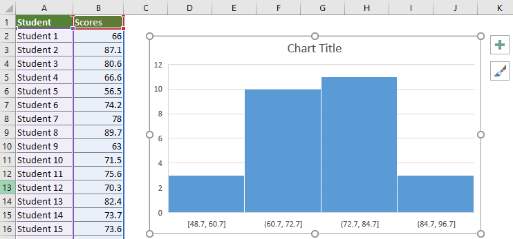
1. Select the whole table range and then click Insert > Insert Statistic Chart > Histogram.

The histogram chart is created as the below screenshot shown.
Note: The number of bins and the bin widths are calculated automatically based on the selected scores.
Tips:
If you want to configure the histogram chart, please right click the horizontal axis and select Format Axis from the right-clicking menu.

In the opening pane on the right side of Excel, there are several options you should know and adjust by yourself:

Easily create a histogram chart with an amazing feature
The Normal Distribution / Bell Curve utility of Kutools for Excelcan help you easily create a histogram chart in Excel with several clicks only as the below demo shown.
Download and try it now! 30-day free trail
Download the sample file

Video: Create histogram chart in Excel
The Best Office Productivity Tools
Kutools for Excel - Helps You To Stand Out From Crowd
Kutools for Excel Boasts Over 300 Features, Ensuring That What You Need is Just A Click Away...
Office Tab - Enable Tabbed Reading and Editing in Microsoft Office (include Excel)
- One second to switch between dozens of open documents!
- Reduce hundreds of mouse clicks for you every day, say goodbye to mouse hand.
- Increases your productivity by 50% when viewing and editing multiple documents.
- Brings Efficient Tabs to Office (include Excel), Just Like Chrome, Edge and Firefox.