Create a marimekko chart in Excel
Marimekko chart is also known as Mosaic chart, which can be used to visualize data from two or more qualitative variables. In a Marimekko chart, the column widths show one set of percentages, and the column stacks show another set of percentages.
The below Marimekko chart demonstrates the sales of Drink, Food and Fruit in a company from 2016 to 2020. As you can see, the column widths show the size of market segment for Drink, Food and Fruit in a year, and each segment in the column shows the sales for a certain category.
This tutorial will demonstrate the steps to create a Marimekko chart in Excel step by step.

Create a Marimekko chart in Excel
- Part 1: Create an intermediate data table
- Part 2: Insert a stacked area chart based on the intermediate data
- Part 3: Specify the X-axis values of the Marimekko chart
- Part 4: Display one set of percentages above the column widths
- Part 5: Display the series names on the right of the plot area
- Part 6: Display the series values on each segment in columns
Easily create a Marimekko chart with an amazing tool
Download the sample file
Create a Marimekko chart in Excel
Supposing you want to create a Marimekko chart based on data as the below screenshot shown, you can do as follows to get it down.

Part1: Create an intermediate data table
1. Create an intermediate data table based on the original data as follows.
The first column of the intermediate data table
As the below screenshot shown, values in the first helper column represent the position where each column ends on the X axis. Here we specify the minimum of the X-axis as 0 and the maximum as 100, so the column starts from 0 and ends with 100. You can do as follows to get the data between the minimum and maximum.


The other columns of the intermediate data table
Values in these columns represent the height for series in each stacked column. See screenshot:


Part2: Insert a stacked area chart based on the intermediate data and format it
2. Select the whole intermediate data table, click Insert > Line Chart or Area Chart > Stacked Area.

3. Right click the X-axis in the chart and select Format Axis from the right-clicking menu.

4. In the Format Axis pane, select the Date axis option under the Axis Options tab.

5. Keep the X-axis selected and then press the Delete key to remove it from the chart.
Then the chart is displayed as follows.

6. Right click the Y-axis and select Format Axis from the context menu.

7. In the Format Axis pane, please configure as follows.

Now the chart is displayed as follows.

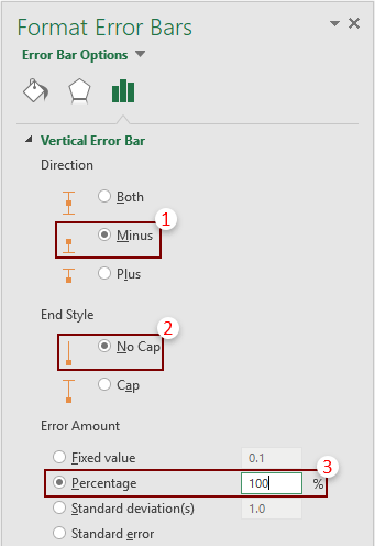
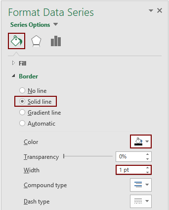
8. Now we need to add borders to show the occupation of each data in a series. Please do as follows.


- Select Minus in the Direction section;
- Select No Cap in the End Style section;
- Select the Percentage option and enter 100 into the text box in the Error Amount section.

- Click the Fill & Line icon;
- In the Border section, select Solid line;
- Select the black color in the Color drop down list;
- Change the Width to 1pt.

Now the chart is displayed as the below screenshot shown.

9. Repeat the operations in step 8 to add dividers to other segments. And finally the chart is shown as below.

Part3: Specify the X-axis values of the Marimekko chart
10. Now you need to calculate the middle value for each column and display the subcategory values (the first column data of the original data range) as the X-axis values.

Two helper rows are needed in this section, please apply the below formulas to handle it.


11. Right click the chart and click Select Data in the right-clicking menu.

12. In the opening Select Data Source dialog box, click the Add button.
13. Then an Edit Series dialog box pops up, please select the cells containing the 0 values in the Series value box, and then click the OK button.

14. When it returns to the Select Data Source dialog box, you can see a new series (Series4) is created, click the OK button to save the changes.

15. Right click the chart and select Change Series Chart Type.

16. In the Change Chart Type dialog box, select the chart type “Scatter with Straight Lines and Markers” for the Series4 in the Choose the chart type and axis for your data series box. And then click OK.

17. Right click the chart and choose Select Data.
18. In the Select Data Source dialog box, select the Series4 (the series name you created in step 14) and click the Edit button in the Legend Entries (Series) box.

19. In the Edit Series dialog box, select the first row cells in the Series X values box, and then click OK.

20. Click OK to save the changes when it returns to the Select Data Source dialog box.
Now a new series is added at the bottom of the plot area as the below screenshot shown.

21. Now you need to hide the line and markers. Please select this series, go to the Format Data Series pane and then do as follows.


22. Keep the series selected, click the Chart Elements button, and then check the Data Labels box.

23. Select the added labels, go to the Format Data Labels pane and configure as follows.


Now the chart is displayed as follows.

Part4: Display one set of percentages above the column widths
Now we need to display one set of percentages above the column widths. Firstly, we need to calculate the percentages of each column.
24. As there are five columns in the chart, you need to calculate five percentages as follows.

25. In the next row of the percentage, enter number 1 into each cell. Then you will get a new helper range as follows.

26. Right click the chart and select Select Data from the right-clicking menu.
27. In the Select Data Source dialog box, click the Add button.
28. In the opening Edit Series dialog box, you need to do as follows.

29. When it returns to the Select Data Source dialog box, a new series (Series5) is created, click the OK button to save the changes.
30. Right click the chart and select Change Series Chart Type.
31. In the Change Chart Type dialog box, select the chart type “Scatter with Straight Lines and Markers” for the Series5 in the Choose the chart type and axis for your data series box. And then click OK.

Now the chart is displayed as follows.

32. You need to hide the line and markers of the series (Click to see how).
33. Add data labels to this series (Click to see how). Specify this label position to Above.

Now the percentages are displayed above the column widths as the below screenshot shown.

Part5: Display the series names on the right of the plot area
As the below screenshot shown, for showing the series names on the right of the plot area in the chart, you need to calculate the middle values for each series of the last column firstly, add a new series based on this values and finally add the series names as the data labels of this new series.

34. To calculate the middle values for each series of the last column, please apply the below formulas.


35. In the next new row, enter number 100 into each cell. Finally another new helper range is created as the below screenshot shown.
Note: Here number 100 represents the maximum of the X-axis.

36. Right click the chart and select Select Data from the context menu.
37. In the Select Data Source dialog box, click the Add button.
38. In the Edit Series dialog box, please select the corresponding range as follows.

39. When it returns to the Select Data Source dialog box, click OK to save the changes.
40. Right click the chart and select Change Series Chart Type from the context menu.
41. In the Change Chart Type dialog box, select the chart type “Scatter with Straight Lines and Markers” for the Series6 in the Choose the chart type and axis for your data series box, and then click OK.

Then a new series is added on the chart as the below screenshot shown.

42. You need to hide the line and markers of the series (Click to see how).
43. Add data labels to this series (Click to see how). Keep the Label Position as Right.

Now the chart is displayed as follows.

Part6: Display the series values on each segment in columns
The last part here is going to show you how to display the series values(data labels) on each segment in columns as the below screenshot shown. Please do as follows.

44. Firstly, you need to calculate the middle value for each segment in columns, please apply the below formulas.


45. Right click the chart and click Select Data in the context menu.
46. In the Select Data Source dialog box, click the Add button.
47. In the Edit Series dialog box, please select the corresponding ranges as follows.

48. Repeat the step 46 and 47, using the remaining two column values to add two new series. See the below screenshots:


49. When it returns to the Select Data Source dialog box, you can see three new series are added, click OK to save the changes.

50. Right click the chart and select Change Series Chart Type from the context menu.
51. In the Change Chart Type dialog box, separately select the chart type “Scatter with Straight Lines and Markers” for the these three new series in the Choose the chart type and axis for your data series box, and then click OK.

The chart is displayed as follows.

52. You need to separately hide the lines and markers of the series (Click to see how).
53. Add data labels to the series (Click to see how). Specify the Label Position as Center.
Notes:


Now the chart is displayed as the below screenshot shown.

54. Remove the chart title and the legend from the chart.
55. Keep the chart selected, go to the Format Data Series pane, and then select Plot Area in the Series Options drop-down list.

56. The plot area of the chart is selected. Please narrow the plot area by dragging the borders until the above, bottom and the right values are fully displayed out of the plot area. See below demo.
Now a Marimekko Chart is complete.
Easily create a marimekko chart in Excel
The Marimekko Chart utility of Kutools for Excelcan help you quickly create a marimekko chart in Excel with several clicks only as the below demo shown.
Download and try it now! 30-day free trail
Download the sample file

The Best Office Productivity Tools
Kutools for Excel - Helps You To Stand Out From Crowd
Kutools for Excel Boasts Over 300 Features, Ensuring That What You Need is Just A Click Away...
Office Tab - Enable Tabbed Reading and Editing in Microsoft Office (include Excel)
- One second to switch between dozens of open documents!
- Reduce hundreds of mouse clicks for you every day, say goodbye to mouse hand.
- Increases your productivity by 50% when viewing and editing multiple documents.
- Brings Efficient Tabs to Office (include Excel), Just Like Chrome, Edge and Firefox.