Create a matrix bubble chart in Excel
Normally, you may use bubble chart to compare at least three sets of values and show the relationships within them. However, if there are at least three sets of values and each set of value has more series, how to compare all series values by bubble chart? Here we are going to show you a new chart – Matrix Bubble Chart. This chart can help to compare more series of at least three sets of values and show the relationships between them by placing the bubbles in a matrix permutation way.

Create a matrix bubble chart in Excel
Easily create a matrix bubble chart with an amazing tool
Download the sample file
Video: Create matrix bubble chart in Excel
Create a matrix bubble chart in Excel
Supposing you want to create a matrix bubble chart based on the data as the below screenshot shown, please do as follows to get it down.

Tips: Normally, each bubble is composed of three values: X value, Y value and the bubble size. Here the values in the above table can be used to determine the relative size of the bubble only. So we need to create two helper ranges to represent the X value and Y value in order to determine the center of the bubbles.
1. Create two helper ranges as the below screenshot shown.
Note: In this case, we have 6 sets of values in the original table, and each set of value has 5 series. In the helper range1, we need to create a column containing sequence numbers from 1 to 6; and in the helper range2, we need to create 5 columns containing the reverse sequence numbers from 6 to 1. Please specify your helper ranges based on your data.

2. Select all series in the original table (except column headers and row headers, here I select B2:F7).

3. Click Insert > Insert Scatter (X, Y) or Bubble Chart > Bubble to create a bubble chart.

4. Right click the bubble chart and click Select Data in the context menu.

5. In the Select Data Source dialog box, you need to:

6. In the Edit Series dialog box, please select the corresponding ranges as follows.

7. Now it returns to the Select Data Source dialog box, you can see the Series1 is added to the Legend Entries (Series) box. Please repeat the step 6 to add the other series, and finally click the OK button to save the changes.
In this case, we need to add 6 series to the Legend Entries (Series) box as the below screenshot shown.

The bubble chart is displayed as below.

Now you need to replace the current X-axis and Y-axis in the chart with the actual sets of values and the series names.
8. Right click the X-axis and click Format Axis in the right-clicking menu.

9. In the Format Axis pane, expand the Labels section under the Axis Options tab, and then choose None from the Label Position drop-down list.

10. Repeat the step 8 and 9 to hide the Y-axis labels as well.
Now the chart is displayed as the below screenshot shown. You can see the X-axis and the Y-axis are hidden in the chart.

11. You need to create two other new helper ranges to help adding the sets of values and the series names to the chart. The two ranges are as follows.

12. Right click the chart and click Select Data in the context menu.

13. In the Select Data Source dialog box, click the Add button.

14. In the Edit Series dialog box, please select the corresponding ranges in the helper range3.

15. When it returns to the Select Data Source dialog box, click the Add button again.
16. In the Edit Series dialog box, please select the corresponding ranges in the helper range4.

17. When it returns to the Select Data Source dialog box, you can see the Series7 and Series8 are added to the Legend Entries (Series) box, please click OK to save the changes.

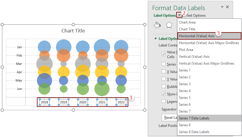
18. Go to select the Series7 (locate below all the bubbles) in the chart, click the Chart Elements button, and then check the Data Labels box. See screenshot:

19. Select the data labels you added just now to display the Format Data Labels pane. In this pane, please configure as follows.

Now the chart is shown as below.

20. Select the Series8 (locate on the left side of the bubbles) in the chart, click the Chart Elements button, and then check the Data Labels box.

21. Select this added data labels to display the Format Data Labels pane, and then configure as follows.

22. Remove the legend by selecting it and pressing the Delete key.
Now the chart is displayed as the below screenshot shown.

23. Now you can regard the series names and the sets of values as the X-axis and the Y-axis of the chart. Because they are locating inside the gridlines, we need to move them out of the gridlines as follows.

24. For moving the sets of values out of the gridlines in the chart, please do as follows.


25. Now you need to manually drag the inner borders to adjust the X-axis and Y-axis until they completely locate out of the gridlines. See the below demo.
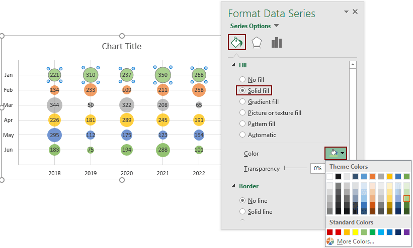
26. And then you can format the bubbles based on your needs. For example, scale the bubble size, add data labels to bubbles, change the bubble colors and so on. Please do as follows.
Scale the bubble size
Click to select any one of the bubbles, in the Format Data Series pane, change the number in the Scale bubble sizeto box to 50.

Now the bubble sizes are changed to the size you specified. See screenshots:

Add data labels to bubbles


Change the bubble color
Remove or edit the chart title
Now a matrix bubble chart is complete as the below screenshot shown.
Easily create a matrix bubble chart in Excel
The Matrix Bubble Chart utility of Kutools for Excelcan help you quickly create a matrix bubble chart in Excel with several clicks only as the below demo shown.
Download and try it now! 30-day free trail

Download the sample file

Video: Create a matrix bubble chart in Excel
The Best Office Productivity Tools
Kutools for Excel - Helps You To Stand Out From Crowd
Kutools for Excel Boasts Over 300 Features, Ensuring That What You Need is Just A Click Away...
Office Tab - Enable Tabbed Reading and Editing in Microsoft Office (include Excel)
- One second to switch between dozens of open documents!
- Reduce hundreds of mouse clicks for you every day, say goodbye to mouse hand.
- Increases your productivity by 50% when viewing and editing multiple documents.
- Brings Efficient Tabs to Office (include Excel), Just Like Chrome, Edge and Firefox.