Create a Slope Chart in Excel
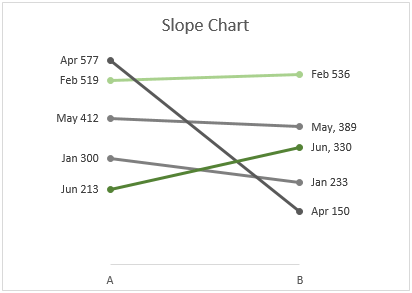
A slope chart helps to compare data changes over time by plotting the change between two points only. As the below slope chart shown, you can easily figure out which months increase stably, which months decrease speedily than other....
In this tutorial, we provide a step-by-step guide to show you how to create a slope chart in Excel.
Create a slope chart in Excel
Easily create a slope chart with an amazing tool
Download the sample file
Video: Create slope chart in Excel
Create a slope chart in Excel
Please do as follows to create a slope chart in Excel.
Supposing you need to create a slope chart based on the table data as the below screenshot shown.

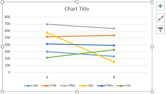
1. Select the whole table data, click Insert > Insert Line or Area Chart > Line with Markers.

Then a chart is created as shown below.

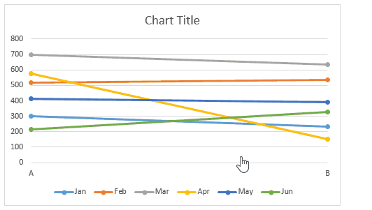
2. Keep the chart selected, and then click Design > Switch Row/Column.

Now the chart is converted as the below screenshot shown.
3. Select the x-axis, right click it and select Format Axis from the context menu.

4. In the Format Axis pane, select the On tick marks option in the Axis position section.
Tips: As we still need this pane in the next operation, please don’t close it.

5. Now please format the slope chart.
6. Keep formatting the chart as you need.
For changing the line color, select the line and then go to the Format Data Series pane;

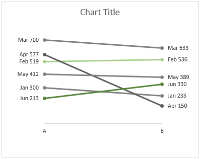
Now the slope chart is displayed as the below screenshot shown.

7. Add data labels to the series. Right click a line, and then select Add Data Labels > Add Data Labels as the below screenshot shown.

Now only values are displayed on the label. If you want to add the series name and adjust the label position, please go ahead to do as follows.
8. Click on a label twice to select it. At the same time, the Format Data Label pane is enabled, you need to:

Tips: Repeat the above step 7 and 8 until all labels adding in the chart.
Now the slope chart is displayed as follows.
Tips: If you want to bring a certain line to the front. For example, I will bring the Apr line to the front and then the Jun line. Please do as follows.


Change the chart title as you need. Then the slope chart is complete as the below screenshot shown.

Easily create a slope chart in Excel
The Slope Chart utility of Kutools for Excelcan help you quickly create a slope chart in Excel with several clicks only as the below demo shown.
Download and try it now! 30-day free trail
Download the sample file

Video: Create slope chart in Excel
The Best Office Productivity Tools
Kutools for Excel - Helps You To Stand Out From Crowd
Kutools for Excel Boasts Over 300 Features, Ensuring That What You Need is Just A Click Away...
Office Tab - Enable Tabbed Reading and Editing in Microsoft Office (include Excel)
- One second to switch between dozens of open documents!
- Reduce hundreds of mouse clicks for you every day, say goodbye to mouse hand.
- Increases your productivity by 50% when viewing and editing multiple documents.
- Brings Efficient Tabs to Office (include Excel), Just Like Chrome, Edge and Firefox.