Create waterfall or bridge chart in Excel
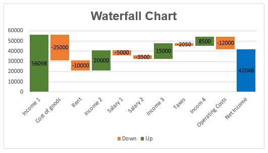
A waterfall chart, also named as bridge chart is a special type of column chart, it helps you to identify how an initial value is affected by an increase and decrease of intermediate data, leading to a final value.
In a waterfall chart, the columns are distinguished by different colors so that you can quickly view positive and negative numbers. The first and last value columns start on the horizontal axis, and the intermediate values are floating columns as below screenshot shown.

- Create waterfall chart in Excel 2016 and later versions
- Create waterfall chart in Excel 2013 and earlier versions
- Create horizontal waterfall chart in Excel by kutools
- Download Waterfall Chart sample file
- Video: Create waterfall chart in Excel
Create waterfall chart in Excel 2016 and later versions
In Excel 2016 and later versions, a new built-in Waterfall chart has been introduced. So, you can create this chart quickly and easily with the below steps:
1. Prepare your data and calculate the final net income as below screenshot shown:

2. Select the data range that you want to create a waterfall chart based on, and then click Insert > Insert Waterfall, Funnel, Stock, Surface, or Radar Chart > Waterfall, see screenshot:

3. And now, a chart has been inserted into the sheet, see screenshot:
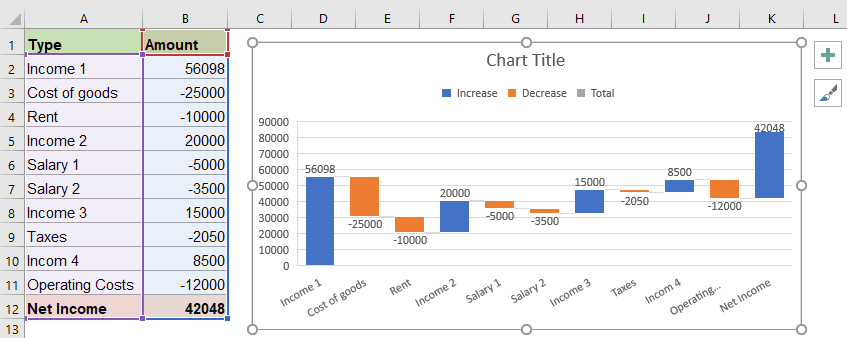
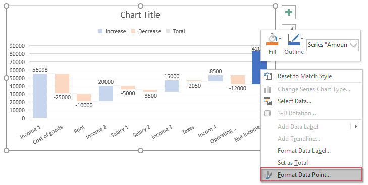
4. Next, you should set the net total income value to start on the horizontal axis at zero, please double click the last data point to select the column only, and then right click, choose Format Data Point option, see screenshot:
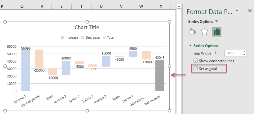
5. Then, in the opened Format Data Point pane, check Set as total option under the Series Options button, now, the total value column has been set to start on the horizontal axis instead of floating, see screenshot:
Tip: To get this result, you can also just select Set as Total option from the right click menu. See screenshot:
6. At last, to make your chart more professional:
- Rename the chart title to your need;
- Delete or format the legend as your need, in this example, I will delete it.
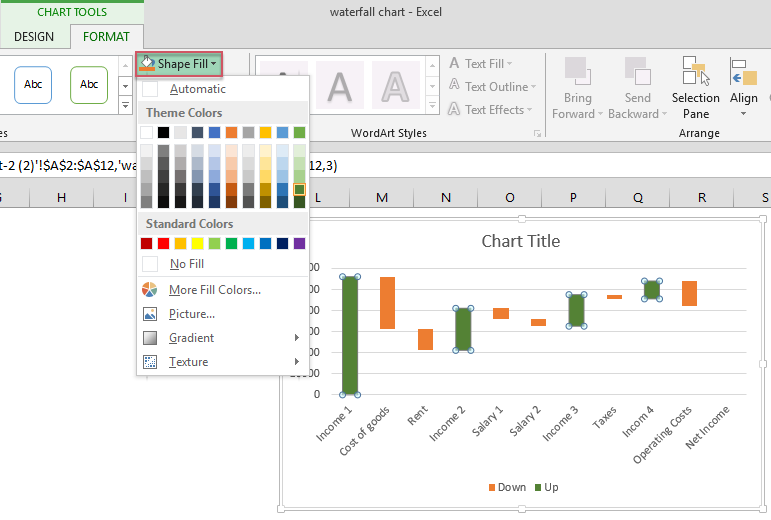
- Give different colors for the negative and positive numbers, for example, columns with negative numbers in orange and positive numbers in green. To do this, please double click one data point, and then click Format > Shape Fill, then choose the color you need, see screenshot:

To color other data point columns one by one with this operation. And you will get the waterfall chart as below screenshot shown:

Create waterfall chart in Excel 2013 and earlier versions
If you have Excel 2013 and earlier versions, the Excel does not support this Waterfall chart feature for you to use directly, in this case, you should apply the below method step by step.
Create helper columns for the original data:
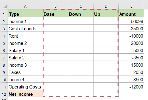
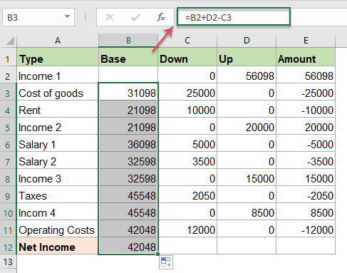
1. First, you should rearrange the data range, insert three columns between the original two columns, give them header names as Base, Down and Up. See screenshot:
- Base column is used as the starting point for the up and down series in the chart;
- Down column locates all the negative numbers;
- Up column locates all positive numbers.
2. Then, please enter a formula: =IF(E2<=0, -E2,0) into cell C2, and drag the fill handle down to the cell C11, you will get all negative numbers from column E will be displayed as positive numbers, and all positive numbers will be displayed as 0. See screenshot:

3. Go on entering this formula: =IF(E2>0, E2,0) into cell D2, then drag the fill handle down to the cell D11, now, you will get the result that if cell E2 is greater than 0, all positive numbers will be displayed as positive, and all negative numbers are displayed as 0. See screenshot:

4. Then, enter this formula: =B2+D2-C3 into cell B3 of the Base column, and drag the fill handle down to cell B12, see screenshot:
Insert a stacked chart and format it as waterfall chart
5. After creating the helper columns, then, select the data range but exclude the Amount column, see screenshot:

6. Then, click Insert > Insert Column or Bar Chart > Stacked Column, and a chart is inserted as below screenshots shown:
 |  |
7. Next, you need to format the stacked column chart as a waterfall chart, please click on the Base series to select them, and then right click, and choose Format Data Series option, see screenshot:

8. In the opened Format Data Series pane, under the Fill & Line icon, select No fill and No line from the Fill and Border sections separately, see screenshot:

9. Now, the Base series columns become invisible, just delete Base from the chart legend, and you will get the chart as below screenshot shown:

10. Then, you can format the Down and Up series column with specific fill colors that you need, you just need to click on the Down or Up series, and then click Format > Shape Fill, and choose one color you need, see screenshot:
11. In this step, you should display the last Net Income data point, double click the last data point, and then click Format > Shape Fill, choose one color you need to show it, see screenshot:

12. And then, double click any one of the chart columns to open the Format Data Point pane, under the Series Options icon, change the Gap Width smaller, such as 10%, see screenshot:

13. At last, give a name for the chart, and now, you will get the waterfall chart successfully, see screenshot:

Note: Sometimes, you may want to add data labels to the columns. Please do as follows:
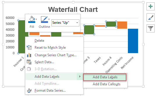
1. Select the series that you want to add the label, then right click and choose the Add Data Labels option, see screenshot:
2. Repeat the operation for the other series, and delete the unnecessary zero values from the columns, and you will get the following result:

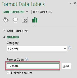
3. Now, you should change the positive values to negatives for the Down series column, click on the Down series, right click and choose Format Data Labels option, see screenshot:
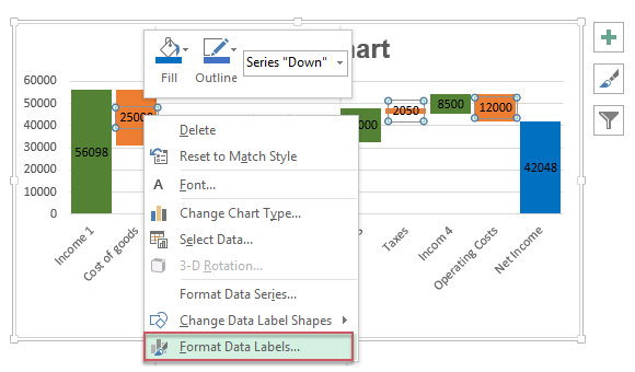
4. In the Format Data Labels pane, under the Number section, type -General into the Format Code text box, and then click Add button, see screenshots:
 |  |
5. Now, you will get the chart with data labels as below screenshot shown:
Create horizontal waterfall chart in Excel by kutools
Creating a horizontal waterfall chart manually can be challenging.If you have Kutools for Excel, with its Horizontal Waterfall Chart feature, you can create a professional-looking horizontal waterfall chart with just a few clicks.
After installing Kutools for Excel, please do with the following steps:
- Click Kutools > Charts > Difference Comparison > Horizontal Waterfall Chart, see screenshot:

- In the Horizontal Waterfall Chart dialog box, please do the below operations:
- (1.) Select Chart in the Chart Type section;
- (2.) Then, select the Axis Labels and Data range separately in the textboxes;
- (3.) Finally, click OK button.

- Now, a horizontal waterfall chart is created successfully, see screenshot:


In conclusion, creating a waterfall chart in Excel depends on your version. Excel 2016 and later versions offer a built-in waterfall chart feature that allows you to create the chart quickly and easily. For Excel 2013 and earlier versions, although there is no direct option, you can still achieve a similar result by using helper columns and a stacked column chart approach. If you need horizontal waterfall charts, Kutools can help you to create the chart with just a few clicks. By choosing the method that fits your version and needs, you can effectively visualize your data and make your analysis more impactful. If you're interested in exploring more charts, our website offers dozens of chart tutorials.
Download Waterfall Chart sample file

Video: Create waterfall chart in Excel
The Best Office Productivity Tools
Kutools for Excel - Helps You To Stand Out From Crowd
Kutools for Excel Boasts Over 300 Features, Ensuring That What You Need is Just A Click Away...
Office Tab - Enable Tabbed Reading and Editing in Microsoft Office (include Excel)
- One second to switch between dozens of open documents!
- Reduce hundreds of mouse clicks for you every day, say goodbye to mouse hand.
- Increases your productivity by 50% when viewing and editing multiple documents.
- Brings Efficient Tabs to Office (include Excel), Just Like Chrome, Edge and Firefox.