Quickly and easily create a rectangular pie chart in Excel
Kutools for Excel
Boosts Excel With 300+
Powerful Features
What is rectangular pie chart?
Rectangular pie chart is a comparison chart which is formed by multiple rectangles overlapping by the area size of each rectangle in Excel. Each rectangle represents one value that you use to compare. The data size corresponds to the area size of the rectangles, and the rectangle presenting the smallest value is placed on the top, while the rectangle related to the largest value is placed at the bottom.
The rectangular pie chart is usually used to compare the sizes of multiple values. Differing from other ordinary comparison charts, the rectangular pie chart takes a smaller space occupation but directly shows the relationship of the size of each value, also it is more professional and distinctive.
In Excel, to create such a rectangular pie chart is quite complex and easy to occur errors by creating formulas to make some data. However, the Rectangular Pie Chart utility of Kutools for Excel supports to create this chart only with 2 steps.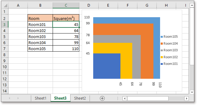
Create rectangular pie chart
Apply this utility by clicking Kutools > Charts > Category Comparison > Rectangular Pie chart. See screenshot:
In the popping Rectangular Pie Chart dialog, click the selection icon ![]() to choose the axis labels and series values as you need.
to choose the axis labels and series values as you need.
Click Ok, a dialog pops out to remind you there will be a hidden sheet created to store some data. Click Yes to continue. Then the rectangular pie chart is created successfully.

Axis Labels: click the selection icon ![]() next to Axis Labels to select the series legends that you want to show in the chart.
next to Axis Labels to select the series legends that you want to show in the chart.
Series Value:click the selection icon ![]() next to Series Value to select the values of each series.
next to Series Value to select the values of each series.
Example: If you use this utility for the first time, you can click the Example button, which will open a new workbook which contains example data and the created rectangular pie chart for you to study.
Note:
1) If the series value is negative, the chart will be created incorrectly.
2)A hidden sheet named Kutools_Chart will be created to store data, do not change the data in this sheet, otherwise, some error may occur.
3) The chart may be shown incorrectly as the original data changes, you need to recreate the rectangular pie chart when the data is changed.
4) If existing duplicate series values, the last one may be totally overlapped by the first one.
5) If the series values are in big gap, it may happen that the smallest one cannot be viewed clearly in the chart.
Productivity Tools Recommended
Office Tab: Use handy tabs in Microsoft Office, just like Chrome, Firefox, and the new Edge browser. Easily switch between documents with tabs — no more cluttered windows. Know more...
Kutools for Outlook: Kutools for Outlook offers 100+ powerful features for Microsoft Outlook 2010–2024 (and later versions), as well as Microsoft 365, helping you simplify email management and boost productivity. Know more...
Kutools for Excel
Kutools for Excel offers 300+ advanced features to streamline your work in Excel 2010 – 2024 and Microsoft 365. The feature above is just one of many time-saving tools included.
