Easily create a Y-axis threshold segmentation chart in Excel
Kutools for Excel
Boosts Excel With 300+
Powerful Features
Supposing you have a range of data, and want to create a chart to analyze which data exceeds a specified threshold and which one does not exceed it, the Y-axis threshold segmentation chart is your best choice. In this tutorial, we introduce the Threshold Value Chart utility of Kutools for Excel to help you easily create a Y-axis threshold segmentation chart in Excel with several clicks only.
Create a Y-axis threshold segmentation chart in Excel
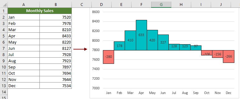
For a monthly sales table as the below screenshot shown, you want to create a chart to figure out which month’s sale exceeds 7800 and which month’s sale does not exceed it, and display the excess or unreached values as well, please do as follows.

1. Select the data range (if the header row of the table is a merged cell, you need to exclude it from the selection), and then click Kutools > Charts > Difference Comparison > Threshold Value Chart.

2. In the Threshold Value Chart dialog box, you need to configure as follows.
Note: If you have selected data in step 1, the corresponding ranges will be outputted in the Axis Labels box and Data range box automatically. Otherwise, please set them as following:

Now the y-axis threshold segmentation chart is created.
Productivity Tools Recommended
Office Tab: Use handy tabs in Microsoft Office, just like Chrome, Firefox, and the new Edge browser. Easily switch between documents with tabs — no more cluttered windows. Know more...
Kutools for Outlook: Kutools for Outlook offers 100+ powerful features for Microsoft Outlook 2010–2024 (and later versions), as well as Microsoft 365, helping you simplify email management and boost productivity. Know more...
Kutools for Excel
Kutools for Excel offers 300+ advanced features to streamline your work in Excel 2010 – 2024 and Microsoft 365. The feature above is just one of many time-saving tools included.
