Quickly create a chart with different colors based on data grouping
Kutools for Excel
Boosts Excel With 300+
Powerful Features
To create a column or bar chart in Excel, only one color is filled for the data bar. Sometimes, you may need to create a chart with different colors based on the data group to identify the differences between the data as below screenshot shown. Normally, there is not direct way for you to solve this task in Excel, but, if you have Kutools for Excel, with its Color Grouping Chart feature, you can quickly create a column or bar chart with various colors based on cell values.

Create a column or bar chart with different colors based on data grouping
Create a column or bar chart with different colors based on data grouping
For achieving this task, please do with the following steps:
1. Click Kutools > Charts > Category Comparison > Color Grouping Chart, see screenshot:

2. In the Color Grouping Chart dialog box, please do the following operations:
- Select the Column Chart or Bar Chart under the Chart Type decided by which chart you want to create;
- In the Data Ranges section, select the cell values for Axis Labels and Series Values from the original data.

3. Next, you should add the different data groups for your chart, please click  button, and in the popped out Add a group dialog box:
- Enter a group name in to the Group Name textbox;
- Create a rule based on the cell value for this group, in this example, I will create a rule that the score is between 91 and 100.

4. After setting the criteria, please click Add button, the first data group will be inserted into the Groups list box.
5. Repeat the above step 3-4 to add other data group rules that you want to create chart based on, and all the rules have been listed into the Groups list box, see screenshot:

6. After creating the data group rules, click Ok button, and a prompt box is popped out to remind you a hidden sheet will be created, see screenshot:

7. Then click Yes button, a column or bar chart will be created with different colors based on your specified rules as below screenshot shown:

Notes:
1. If the colors are not what you want, you just need to click to select each group data bar separately, and then format the color you like.

2. This chart is dynamic, the chart color will be updated as the original value changes.
3. In the Color Grouping Chart dialog box:
 : Add button: is used to add the data group rule based on the cell values you need;
 : Edit button: to edit or modify the selected rule;
 : Delete button: to delete the selected rule from the Groups dialog box;
 : Save Scenario button: to save the current added group rules as a scenario for future using, in the Save Scenario dialog box, type the scenario name as below screenshot shown:
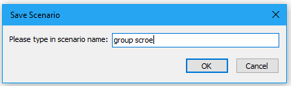
 : Open Scenario button: open the scenario dialog box for managing the scenarios you have saved, such as delete or open the selected scenario, see screenshot:
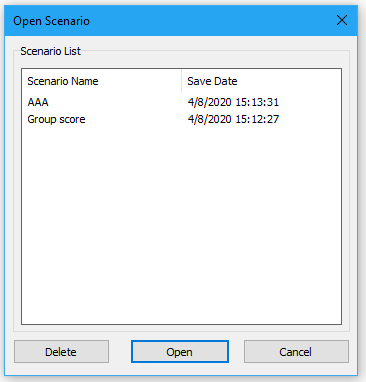
 : Add button: is used to add the data group rule based on the cell values you need;
 : Edit button: to edit or modify the selected rule;
 : Delete button: to delete the selected rule from the Groups dialog box;
 : Save Scenario button: to save the current added group rules as a scenario for future using, in the Save Scenario dialog box, type the scenario name as below screenshot shown:
 : Open Scenario button: open the scenario dialog box for managing the scenarios you have saved, such as delete or open the selected scenario, see screenshot:
4. In the Color Grouping Chart dialog box, you can click the Example button to open a new workbook with the sample data and sample color coded chart in your first time using.
Create a chart with different colors based on data grouping
Explore the Kutools / Kutools Plus tab in this video – packed with powerful features, including powerful AI tools! Try all features free for 30 days with no limitations!
Productivity Tools Recommended
Office Tab: Use handy tabs in Microsoft Office, just like Chrome, Firefox, and the new Edge browser. Easily switch between documents with tabs — no more cluttered windows. Know more...
Kutools for Outlook: Kutools for Outlook offers 100+ powerful features for Microsoft Outlook 2010–2024 (and later versions), as well as Microsoft 365, helping you simplify email management and boost productivity. Know more...
Kutools for Excel
Kutools for Excel offers 300+ advanced features to streamline your work in Excel 2010 – 2024 and Microsoft 365. The feature above is just one of many time-saving tools included.
