Create a bar chart with percentage difference arrow in Excel
Kutools for Excel
Boosts Excel With 300+
Powerful Features
Sometimes, while comparing two groups of data, you need to not only list the data as bars in the chart, but also want to display the percentage difference between two data. However, the common bar chart in Excel cannot support but the Difference Arrow Chart of Kutools for Excel can.
Applying this utility by clicking Kutools > Charts > Difference Comparison > Difference Arrow Chart.
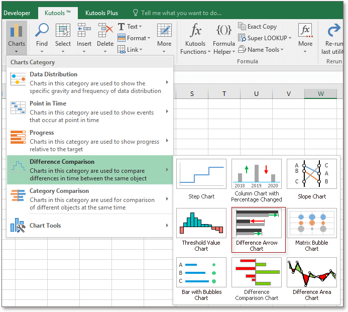
1. Enable the sheet that you want to create and insert a difference arrow chart, then click Kutools > Charts > Difference Comparison > Difference Arrow Chart.
2. In the Difference Arrow Chart dialog, firstly, select a chart type you want to create, then go to click ![]() buttons to separately select the data cells into the Select Data section.
buttons to separately select the data cells into the Select Data section.![]()
3. Click Ok, a dialog pops out to remind you there will be a hidden sheet created at the same time for placing the calculated data. click Yes to continue.![]()
Then the difference arrow chart has been created.
Bar chart![]()
Column chart![]()
Tips:
1. You can click Example button in the Difference Arrow Chart dialog to realize how to use this utility.
2. The chart changes as the data changes.
3. If you want to change the bar or column color, choose one bar or column, then go to click the Format tab, choose one color as you need in the Shape Fill drop-down menu.![]()
Productivity Tools Recommended
Office Tab: Use handy tabs in Microsoft Office, just like Chrome, Firefox, and the new Edge browser. Easily switch between documents with tabs — no more cluttered windows. Know more...
Kutools for Outlook: Kutools for Outlook offers 100+ powerful features for Microsoft Outlook 2010–2024 (and later versions), as well as Microsoft 365, helping you simplify email management and boost productivity. Know more...
Kutools for Excel
Kutools for Excel offers 300+ advanced features to streamline your work in Excel 2010 – 2024 and Microsoft 365. The feature above is just one of many time-saving tools included.
