Create multiple series histogram or bar chart quickly in Excel
Kutools for Excel
Boosts Excel With 300+
Powerful Features
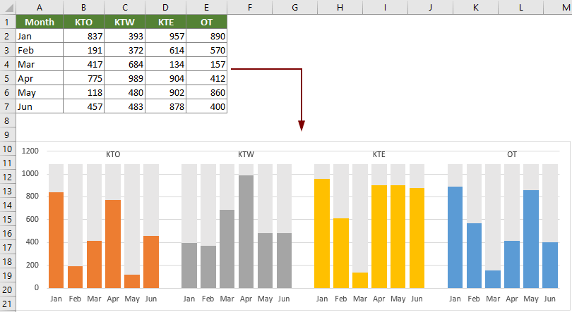
Normally, we are using column chart to compare values across a few categories in Excel. If you don't want to compare the series data and just want to group and show values in the categories individually side by side in the same chart (as the below screenshot shown), a multi Series Histogram Chart can meet your needs. Kutools for Excel supports an easy tool – Multi Series Histogram Chart to create a multi series histogram or bar chart easily in Excel.
Create multiple series histogram or bar chart quickly in Excel
Create multiple series histogram or bar chart quickly in Excel
To create a multiple series histogram or bar chart, please do with following steps:
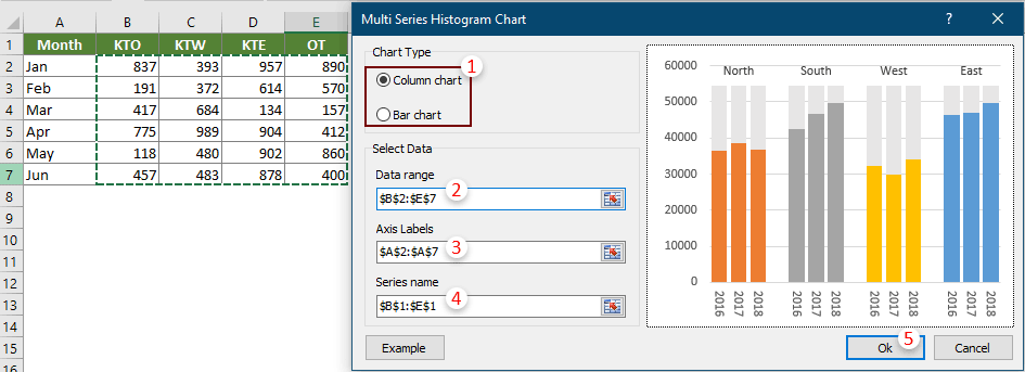
1. Click Kutools > Charts > Category Comparison > Multi Series Histogram Chart.

2. In the Multi Series Histogram Chart dialog box, configure as follows.
3. Then a Kutools for Excel dialog box pops up, click Yes to go ahead.

Now a multiple series histogram chart has been created as below screenshot shown:
If selected Bar Chart in the Chart Type section, you will get a multi-series bar chart as the below screenshot shown.

Notes:


Productivity Tools Recommended
Office Tab: Use handy tabs in Microsoft Office, just like Chrome, Firefox, and the new Edge browser. Easily switch between documents with tabs — no more cluttered windows. Know more...
Kutools for Outlook: Kutools for Outlook offers 100+ powerful features for Microsoft Outlook 2010–2024 (and later versions), as well as Microsoft 365, helping you simplify email management and boost productivity. Know more...
Kutools for Excel
Kutools for Excel offers 300+ advanced features to streamline your work in Excel 2010 – 2024 and Microsoft 365. The feature above is just one of many time-saving tools included.
