How to create a stacked clustered column/bar chart in Excel?
In professional data analysis, visualizing multiple categories and data groups within a single chart can provide a clearer comparison and more efficient data interpretation. One common requirement is to display a combination of stacked and clustered data, such as showing sales values by region and by quarter, grouped side by side. This article will walk you through the steps to create a stacked clustered column chart in Excel, which allows you to compare individual category values as clustered bars, while each cluster consists of stacked segments. This approach enables powerful comparative analysis between groups and across multiple variables, as shown in the screenshot below.

➤ Create a stacked clustered column chart in Excel
➤ VBA Code – Automate reshaping data and chart generation
➤ Excel Formula – Dynamically restructure data for stacked clustered charts
Create a stacked clustered column chart in Excel
To create a stacked clustered column chart in Excel, it's important to first understand that Excel does not natively support this type of chart. However, you can simulate the effect by carefully preparing your data and customizing the chart layout.
✅ What you need to know first:
- Excel does not offer a built-in "stacked clustered column chart" type. The result is created through data layout tricks.
- You must restructure your source data to simulate cluster groupings.
- Blank rows are added between category groups to separate each cluster visually.
Let’s walk through the process step-by-step using sample sales data for products over multiple quarters.
1. Organize your raw data: In this example, we have product names in column A and sales data (e.g., Actual vs Target for Q1 and Q2) in adjacent columns. The goal is to group each product’s data side by side and show actual/target values stacked within each cluster.
2. Restructure the data: You need to copy each group of data (e.g., each product row) to a new layout and insert an empty row between each group. This helps Excel interpret each group as a separate cluster in the stacked column chart.

3. Create the chart: Select your newly structured data. Then go to Insert > Column or Bar Chart > Stacked Column.

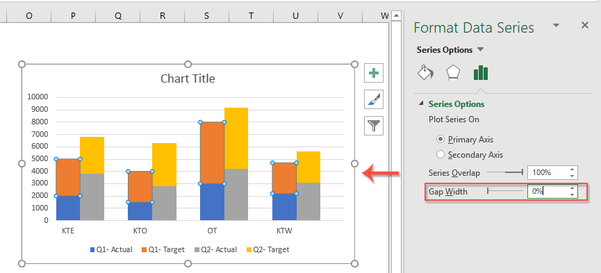
4. Format the series: Right-click any column in the chart, select Format Data Series.

5. Reduce the Gap Width: In the Format Data Series pane, go to Series Options, and set Gap Width = 0% to visually compress each group into one stacked cluster.

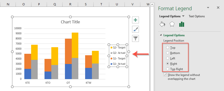
6. Adjust legend and layout: Right-click the legend > Format Legend.

7. Select legend position: Within the Format Legend pane, under the Legend Options, select the preferred legend position (Right, Top, Left, or Bottom) to best fit your chart layout and avoid overlapping with data.

✅ Result: You now have a stacked clustered column chart where each product’s actual/target data is grouped and stacked side-by-side for quick comparison.
⚠️ Limitation: This technique works well for smaller datasets. But for large datasets or frequently changing data, restructuring manually can be error-prone. See the following sections for VBA and formula solutions to automate this process.
VBA Code – Automate reshaping data and chart generation
When handling large datasets or frequently changing reports, manually rearranging data to create stacked clustered charts can be tedious and error-prone. Using VBA (Visual Basic for Applications) allows you to automate the entire process—from reshaping the source table to inserting the chart—saving you time and effort.
This method is best suited for users familiar with Excel macros or environments where VBA is permitted. It's particularly effective if your chart structure stays the same but data updates regularly. Here's how to implement it:
Step 1: Press Alt + F11 to open the VBA editor. In the editor, click Insert > Module.
Step 2: Paste the following VBA code into the module window:
Sub CreateStackedClusteredChart()
    Dim ws As Worksheet
    Dim rngData As Range
    Dim chartObj As ChartObject
    Dim chartRange As Range
    Dim xTitleId As String

    On Error Resume Next
    Set ws = ActiveSheet
    xTitleId = "KutoolsforExcel"

    ' Prompt user to select original data
    Set rngData = Application.InputBox("Select the original grouped data (including all headers):", xTitleId, Selection.Address, Type:=8)
    If rngData Is Nothing Then Exit Sub

    ' Create new worksheet for reshaped data
    Dim wsChartData As Worksheet
    Set wsChartData = Worksheets.Add
    wsChartData.Name = "ChartData_" & Format(Now(), "hhmmss")

    Dim numRows As Long, numCols As Long, i As Long, j As Long, outRow As Long
    numRows = rngData.Rows.Count
    numCols = rngData.Columns.Count
    outRow = 1

    ' Add headers
    wsChartData.Cells(outRow, 1).Value = "Category"
    For j = 2 To numCols
        wsChartData.Cells(outRow, j).Value = rngData.Cells(1, j).Value
    Next j
    outRow = outRow + 1

    ' Copy data and insert blank rows
    For i = 2 To numRows
        For j = 1 To numCols
            wsChartData.Cells(outRow, j).Value = rngData.Cells(i, j).Value
        Next j
        outRow = outRow + 1
        If i < numRows Then
            wsChartData.Cells(outRow, 1).Value = ""
            outRow = outRow + 1
        End If
    Next i

    ' Define chart data range
    Set chartRange = wsChartData.Range(wsChartData.Cells(1, 1), wsChartData.Cells(outRow - 1, numCols))

    ' Insert chart
    Set chartObj = wsChartData.ChartObjects.Add(Left:=100, Top:=30, Width:=500, Height:=350)
    With chartObj.Chart
        .SetSourceData Source:=chartRange
        .ChartType = xlColumnStacked
        .HasTitle = True
        .ChartTitle.Text = "Stacked Clustered Column Chart"
        .Legend.Position = xlLegendPositionRight
        .ChartGroups(1).GapWidth = 0
    End With

    MsgBox "Chart generated successfully.", vbInformation, "KutoolsforExcel"
End Sub
Step 3: Press Alt + F8 to open the Macro dialog. Select CreateStackedClusteredChart and click Run.
Step 4: When prompted, select your original dataset (with headers). The macro will generate a new worksheet with inserted blank rows and create the stacked clustered column chart automatically.
📝 Tips:
- Ensure your original table has consistent column headers and formatting.
- You can rerun the macro anytime your dataset updates—no need to repeat manual steps.
✅ Pros: Saves time, accurate layout, perfect for recurring reports.
⚠️ Cons: Requires macro-enabled Excel and basic familiarity with VBA.
Excel Formula – Dynamically restructure data for stacked clustered charts
If you prefer not to use VBA or need a solution that allows for dynamic chart updates as your raw data changes, formulas can be used to reshape your source data into the correct layout for stacked clustered charts. By leveraging built-in functions like INDEX, TRANSPOSE, and helper columns, you can set up a data transformation area that always delivers the correct structure for your chart with minimal effort.
This approach is especially practical when your raw data is regularly updated (new periods, categories, etc.), and you want your chart to adjust automatically without manual restructuring. The main requirement is to build a “helper” section that pulls and arranges blocks of data and blank rows using formulas, so your chart source always stays up to date.
Here is an example of how you might set this up:
- Suppose your original data is in A1:D7 (with A1 as the top-left header), structured as region/category in column A and subcategory values (e.g., Q1, Q2, Q3) in columns B, C, D.
- You want to display each category as a cluster with the Q-values stacked, using blank rows to separate clusters.
1. In your new sheet or adjacent area, create a helper structure to extract each group and insert blank rows. For example, to copy the first data row to E2:G2:
=INDEX($A$2:$D$7,INT((ROW()-2)/2)+1,COLUMN()-4+1)Drag this formula down as needed. To insert blank rows between groups, set up an IF formula to return blank ("") on alternate lines:
=IF(ISODD(ROW()), "", INDEX($A$2:$D$7,ROW()/2,COLUMN()-4+1))Use a combination of these formulas with carefully structured references to output your reshaped data, including blank rows at regular intervals.
2. Once your transformation range is complete (with stacks and clusters), select this new range and create your stacked column chart following the original method given earlier (Insert > Stacked Column). The chart will now automatically reflect any changes you make to the original data table.
For large datasets, it is often helpful to use the OFFSET function to make the extraction process more flexible or to apply dynamic named ranges for defining the chart source.
Pros: No VBA or macros required, ideal for environments with restricted scripting.
Cons: Complex formula setup for large data, possible performance lag with very large dynamic ranges.
Troubleshooting: If your chart does not update correctly, double-check for reference errors or mismatches in helper formulas. Ensure blank rows are properly inserted, as these are key to achieving the “clustered” appearance.
More relative chart articles:
- Create A Bar Chart Overlaying Another Bar Chart In Excel
- When we create a clustered bar or column chart with two data series, the two data series bars will be shown side by side. But, sometimes, we need to use the overlay or overlapped bar chart to compare the two data series more clearly. In this article, I will talk about how to create an overlapped bar chart in Excel.
- Create A Step Chart In Excel
- A step chart is used to show the changes happened at irregular intervals, it is an extended version of a line chart. But, there is no direct way to create it in Excel. This article, I will talk about how to create a step chart step by step in Excel worksheet.
- Highlight Max And Min Data Points In A Chart
- If you have a column chart which you want to highlight the highest or smallest data points with different colors to outstand them as following screenshot shown. How could you identify the highest and smallest values and then highlight the data points in the chart quickly?
- Create A Bell Curve Chart Template In Excel
- Bell curve chart, named as normal probability distributions in Statistics, is usually made to show the probable events, and the top of the bell curve indicates the most probable event. In this article, I will guide you to create a bell curve chart with your own data, and save the workbook as a template in Excel.
- Create Bubble Chart With Multiple Series In Excel
- As we know, to quickly create a bubble chart, you will create all the series as one series as screenshot1 shown, but now I will tell you how to create a bubble chart with multiple series as screenshot2 shown in Excel.
The Best Office Productivity Tools
Kutools for Excel Solves Most of Your Problems, and Increases Your Productivity by 80%
- Super Formula Bar (easily edit multiple lines of text and formula); Reading Layout (easily read and edit large numbers of cells); Paste to Filtered Range...
- Merge Cells/Rows/Columns and Keeping Data; Split Cells Content; Combine Duplicate Rows and Sum/Average... Prevent Duplicate Cells; Compare Ranges...
- Select Duplicate or Unique Rows; Select Blank Rows (all cells are empty); Super Find and Fuzzy Find in Many Workbooks; Random Select...
- Exact Copy Multiple Cells without changing formula reference; Auto Create References to Multiple Sheets; Insert Bullets, Check Boxes and more...
- Favorite and Quickly Insert Formulas, Ranges, Charts and Pictures; Encrypt Cells with password; Create Mailing List and send emails...
- Extract Text, Add Text, Remove by Position, Remove Space; Create and Print Paging Subtotals; Convert Between Cells Content and Comments...
- Super Filter (save and apply filter schemes to other sheets); Advanced Sort by month/week/day, frequency and more; Special Filter by bold, italic...
- Combine Workbooks and WorkSheets; Merge Tables based on key columns; Split Data into Multiple Sheets; Batch Convert xls, xlsx and PDF...
- Pivot Table Grouping by week number, day of week and more... Show Unlocked, Locked Cells by different colors; Highlight Cells That Have Formula/Name...

- Enable tabbed editing and reading in Word, Excel, PowerPoint, Publisher, Access, Visio and Project.
- Open and create multiple documents in new tabs of the same window, rather than in new windows.
- Increases your productivity by 50%, and reduces hundreds of mouse clicks for you every day!
