How to add average/grand total line in a pivot chart in Excel?
Have you even tried to add an average line or grand total line in a pivot chart in Excel? It seems hard to show or add average/grand total line as that you do in a normal chart. In this article I will share a tricky way to add an average/grand total line in a pivot chart in Excel easily.
- Add average/grand total line in a pivot chart
- 2 clicks to add average line in a normal chart with an amazing tool
Add average/grand total line in a pivot chart
Supposing you have a fruit sales table as below screen shot shown:

And you have created a pivot table and chart based on the sales table as below screenshot shown:

Now to add an average line or grand total line in a pivot chart in Excel, you can do as follows:
1. Insert a column before the Amount column with right clicking the Amount column in the source data, and selecting Insert from right-clicking menu.

2. In the new Column, type Average in Cell E1, and enter below formula into Cell F3 and drag the Fill Handle to Range F3:F21.
=AVERAGE($G$3:$G$21)

Notes:
(1) In the formula =AVERAGE($G$3:$G$21), $G$3:$G$21 are the amount values in the Amount Column.
(2) If you want to add the Grand Total line in the Pivot Chart, type Grand Total in Cell E1, and enter the formula =SUM($G$3:$G$21) into Cell F3 and drag the Fill Handle to Range F3:F21.
3. Click the Pivot Chart, and then click the Refresh button on the Analyze tab.

4. Now you will see the Average field (or Grand Total field) is added into to PivotChart Fields pane. Check the Average field (or Grand Total field) to add the filed to Values section.
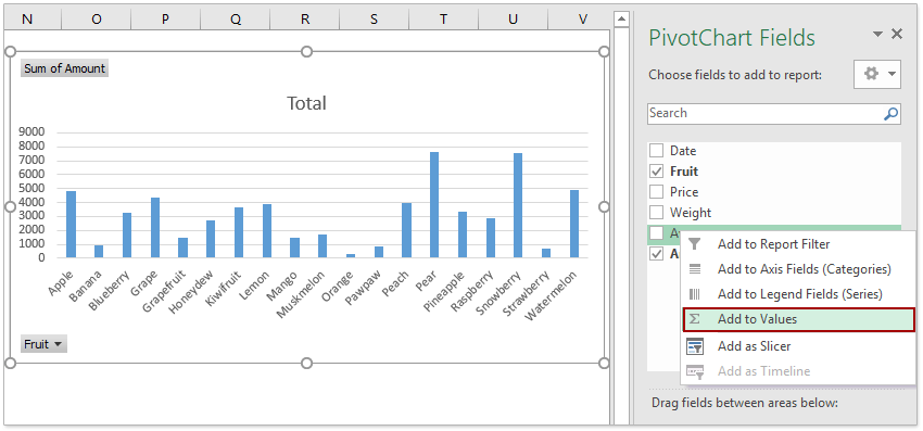
5. Now the average filed (or Grand Total filed) is added into the Pivot Chart. Right click the average filed (or Grand Total filed) and select Change Series Chart Type from the right-clicking menu.

6. In the opening Change Chart Type dialog box, click Combo in the left pane, and in the Choose the chart type and axis for your data series box, click the Sum of Average box and select the Line in the drop down list, and click the OK button.

Tips: If you are using Excel 2010 or earlier versions, you can click Line in the left bar of the Change Chart Type dialog, click to highlight a Line chart type, and click the OK button.
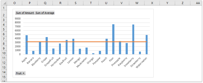
Now you will see the average line (or grand total line) is added in the Pivot Chart at once.
Demo: Add average/grand total line in a pivot chart
Only several clicks to add a line to a normal chart in Excel
Comparing to generally adding data series and changing chart type to add a normal horizontal line in a chart in Excel, Kutools for Excel's Add Line to Chart feature provides a fantastically simple way to add an average line, a target, benchmark, or base line to a chart quickly with only several click.
Kutools for Excel - Supercharge Excel with over 300 essential tools. Enjoy a full-featured 30-day FREE trial with no credit card required! Get It Now
Best Office Productivity Tools
Supercharge Your Excel Skills with Kutools for Excel, and Experience Efficiency Like Never Before. Kutools for Excel Offers Over 300 Advanced Features to Boost Productivity and Save Time. Click Here to Get The Feature You Need The Most...
")
Office Tab Brings Tabbed interface to Office, and Make Your Work Much Easier
- Enable tabbed editing and reading in Word, Excel, PowerPoint, Publisher, Access, Visio and Project.
- Open and create multiple documents in new tabs of the same window, rather than in new windows.
- Increases your productivity by 50%, and reduces hundreds of mouse clicks for you every day!
")