
How to create a chart with date and time on X axis in Excel?

In Excel, we usually insert a chart to better describe the data. But in some cases, when you create a column/bar/line chart based on a series of date and time, the X axis of the chart may be shown as below screenshot. And in this article, I introduce the way for how to show the date and time on X axis correctly in the Chart.
doc chart with date time 1

Create a chart with date and time on X axis correctly


arrow blue right bubble Create a chart with date and time on X axis correctly

To display the date and time correctly, you only need to change an option in the Format Axis dialog.

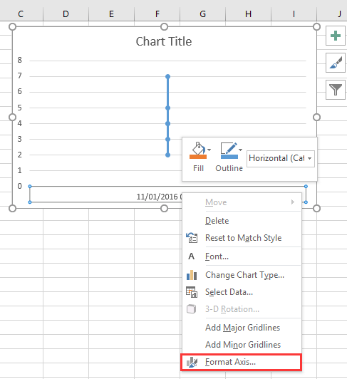
1. Right click at the X axis in the chart, and select Format Axis from the context menu. See screenshot:
doc chart with date time 2

2. Then in the Format Axis pane or Format Axis dialog, under Axis Options tab, check Text axis option in the Axis Type section. See screenshot:
  doc chart with date time 4
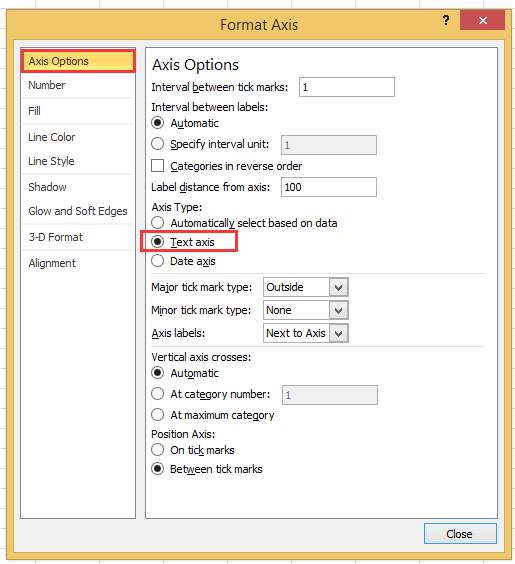
If you use the excel version later than 2010, you can see a Format Axis pane pops out, and check Text axis option under Axis Type in the Axis Options group.
doc chart with date time 3

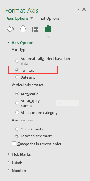
3. Click Close or go back to the chart, then then date and time data has been correctly display in the X axis. See screenshot:
doc chart with date time 5


Create a speedometer chart with two steps!

Sometimes, you may want to use a speedometer chart to display the pricessing of a project, but in Excel, to create a speedometer chart needs many steps which is complex and wasting time. Here, the Speedometer chart tool in Kutools for Excel can help you create a standard speedometer chart by two simplesteps. Download this tool with free 30-day trial now.
doc speedometer chart

Best Office Productivity Tools

Supercharge Your Spreadsheets: Experience Efficiency Like Never Before with Kutools for Excel

Popular Features: Find/Highlight/Identify Duplicates   |  Delete Blank Rows   |  Combine Columns or Cells without Losing Data   |   Round without Formula ...
Super Lookup: Multiple Criteria VLookup    Multiple Value VLookup  |   VLookup Across Multiple Sheets   |   Fuzzy Lookup ....
Advanced Drop-down List: Quickly Create Drop Down List   |  Dependent Drop Down List   |  Multi-select Drop Down List ....
Column Manager: Add a Specific Number of Columns     Move Columns   |   Unhide Columns   |   Compare Columns to Select Same & Different Cells ...
Featured Features: Grid Focus   |  Design View   |   Big Formula Bar    Workbook & Sheet Manager   |  Resource Library (Auto Text)   |  Date Picker   |  Combine Worksheets   |  Encrypt/Decrypt Cells    Send Emails by List   |  Super Filter   |   Special Filter (filter bold/italic/strikethrough...) ...
Top 15 Toolset12 Text Tools (Add Text, Remove Characters, ...)   |   50+ Chart Types (Gantt Chart, ...)   |   40+ Practical Formulas (Calculate age based on birthday, ...)   |   19 Insertion Tools (Insert QR Code, Insert Picture from Path, ...)   |   12 Conversion Tools (Numbers to Words, Currency Conversion, ...)   |   7 Merge & Split Tools (Advanced Combine Rows, Split Cells, ...)   |   Many More...

Kutools for Excel boasts over 300 features, ensuring that what you need is just a click away...

Supports Office/Excel 2007-2021 & newer, including 365   |   Available in 44 languages   |   Enjoy a full-featured 30-day free trial.

kte tab 201905


Office Tab Brings Tabbed interface to Office, and Make Your Work Much Easier

  • Enable tabbed editing and reading in Word, Excel, PowerPoint, Publisher, Access, Visio and Project.
  • Open and create multiple documents in new tabs of the same window, rather than in new windows.
  • Increases your productivity by 50%, and reduces hundreds of mouse clicks for you every day!
Comments (23)
No ratings yet. Be the first to rate!
This comment was minimized by the moderator on the site
I have the same issue when graphing data that has date AND time: points on the graph are equally spaced, whereas the underlying data has unequal gaps between datapoints. Data is in the form "dd/mm/yyyy hh:mm" formatted as date/time (not text). Data spans multiple days so it's not possible to extract just the time element.
This comment was minimized by the moderator on the site
I have a chart with x-axis in time that stretches during about 6h and 35min. I have data for each 20min in the beginning, then 15min and lastly each 10min. Also, in between I have 45min and 5min data.. The issue that I have, and several others, is that each gap between the date are equally spaced out. Meaning that, even if it is only 5min the gap is the same as if it was 45min.
This comment was minimized by the moderator on the site
i want to make a line graph which contains thousand of entries it's included date, time, month and year, so please help me out.
This comment was minimized by the moderator on the site
Hi, syed Mubashir alam, I do not understand your quetion, if you just create a line graph and the x-axis contains month/day/year hour:minute as below screenshot shown:
https://www.extendoffice.com/images/stories/comments/sun-comment/line-chart-1.png
just follow above steps of the article. If your question is about the axis contents are to long, there is no good idea.
This comment was minimized by the moderator on the site
i want to make a line graph which contains thousands of entries including time, date, month and year but i couldn't make a line graph so please help me out.
This comment was minimized by the moderator on the site
It's good coment that point is not a comma. When you want to add more numericals numbers you should use comma in excel ;)
This comment was minimized by the moderator on the site
Excel menus have changed - this is an out of date article - please update for 2020 .. e.g where is AXIS TYPE now?
This comment was minimized by the moderator on the site
I did not found Excel 2020, just 365 2019, which menus are the same as 2013,2016 version.
This comment was minimized by the moderator on the site
How do I remove days that don't have data in them. Example 8/1-8/31 but not data was captured on 8/3 or 8/4, how do I remove those dates from my graph? They are not in my data table so why is it pulling them?
This comment was minimized by the moderator on the site
Open the Excel file that holds the chart from which you want to exclude dates. Click the X-axis, located underneath the chart, so that it becomes surrounded by a small box. Right-click inside the box and choose "Format Axis" from the popup menu. Click "Axis Options" on the left side of the "Format Axis" window. Locate the three "Axis Type" options in the middle of the screen on the right side of the window. Click the radio button next to "Text axis."
This comment was minimized by the moderator on the site
Hi, I have an issue here. When I opened "Format Axis" and "Axis Options", there is no "Axis Type" choice here
This comment was minimized by the moderator on the site
Hi, Agassi, which Excel version you use?
This comment was minimized by the moderator on the site
Easy, useful, but i didn't know. Thanks a lot
This comment was minimized by the moderator on the site
But it doesnt show them in right relation to eachother. For example 2 hours and 6 hours are same in chart..
This comment was minimized by the moderator on the site
Hi Kiwi, maybe you can paint a chart to show me what you want the chart show.
This comment was minimized by the moderator on the site
This is not OK. It does not show correct order by time just puts the timestamps there as a text in equal distances.
This comment was minimized by the moderator on the site
I'm having the same issue. It would be better for the x-axis to show the time not as evenly spaced category labels, but in actual proportion to the durations between the time values. Example: Here's data on world population by year (note that the intervals between years are not evenly spaced):

Year: Population
1804: 1,000,000,000
1927: 2,000,000,000
1960: 3,000,000,000
1989: 5,000,000,000
2000: 6,000,000,000
2017: 7,500,000,000

An Excel line chart depicts this data on a fairly even slope (I'd post a picture, but this interface only allows text); however, the generally declining time intervals SHOULD yield a graph that looks much more exponential.

I was able to "fake" it by inserting rows in the data table for each year with no data (e.g., 122 rows for the years between 1804 and 1927 exclusive, 32 rows for the years between 1927 and 1960, etc.), so my graph looks more proportional now, but this has its own disadvantages. There are MANY empty rows and much wasted table space. I'd love to learn a better way to get Excel to treat time values in the x-axis as actual time values, rather than mere category labels
This comment was minimized by the moderator on the site
You should use a Scatter graph and the problem is resolved. I used YOUR data and immediately achieved the desired result with a scatter graph (Excel 2010). I then changed it to a standard line graph and achieved your "fairly even slope". XY graphs are perfect for time data that does NOT have the "same" time interval between them. If you had the population each year, there would be no difference between line and scatter. If you had no access to "scatter", then you would have to put in the missing years (without data) and then the line graph would be the same as the scatter, but the scatter is EASIER.
This comment was minimized by the moderator on the site
Hello, Vilmos, create the chart after you order the time data, then the chart will display the time in order.
This comment was minimized by the moderator on the site
Nope, you didnt' understand him. It's not proportional.
This comment was minimized by the moderator on the site
exactly.
i am looking desperately for that.
do you know any other software to create that graph?
This comment was minimized by the moderator on the site
I did it in Google Sheets, and it was pretty straight forward.

It was able to graph using a column with DateTime values for the x-axis, with appropriate spacing, and without having to resort to treating that column as text. It worked with the cells in that column formatted as either a date, or in datetime format. There weren't many options for the spacing on the x-axis lables, but at least you can hover over the trends and see the x-axis value for a given point, in whatever way the cells are formatted. Frustrating that there doesn't seem to be a way in Excel.
There are no comments posted here yet
Please leave your comments in English
Posting as Guest
×
Rate this post:
0   Characters
Suggested Locations