Create heat map chart in Excel
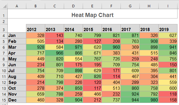
In Excel, a heat map chart looks like a table which is a visual representation that shows a comparative view of a dataset. If there is a large dataset in your worksheet, it’s really hard for you to identify the lower or higher values at a glance, but, in heat map, the cell value is shown in a different color pattern so that we can see the larger data or smaller data quickly and easily as below screenshot shown.
- Create a simple heat map chart with Conditional Formatting
- Create a dynamic heat map chart in Excel
- Example 1: Create a dynamic heat map by using Scroll Bar
- Example 2: Create a dynamic heat map by using Radio Buttons
- Example 3: Create a dynamic heat map by using Check Box
- Download Heat Map Chart sample file
- Video: Create heat map chart in Excel
Create a simple heat map chart with Conditional Formatting
There is no direct heat map chart utility in Excel, but, with the powerful Conditional Formatting feature, you can quickly create a heat map, please do with following steps:
1. Select the data range that you want to apply the Conditional Formatting.
2. And then click Home > Conditional Formatting > Color Scales, and then choose one style you need from the right expanded drop down, (in this case, I will select Green – Yellow – Red Color Scale) see screenshot:

3. Now, the heat map is created which highlight the cells based on their values, green color represents the highest values and red color represents the lowest values and the remaining values are showing a gradient color between green and red. See screenshot:

4. If you want to hide the numbers and only leave the colors, please select the data range, and press Ctrl + 1 keys to open the Format Cells dialog box.
5. In the Format Cells dialog box, under the Number tab, click Custom option in the left Category list box, and then enter ;;;into the Type text box, see screenshot:

6. Then, click OK button, and all numbers are hidden as below screenshot shown:

Note: To highlight the cells with other colors you like, please select the data range, and then click Home > Conditional Formatting > Manage Rules to go to the Conditional Formatting Rules Manager dialog box.

Then, double click the existing rule to open the Edit Formatting Rule dialog box, and then reset the rule to your need, see screenshot:

Create a dynamic heat map chart in Excel
Example 1: Create a dynamic heat map by using Scroll Bar
If there are multiple columns data in your worksheet, but you want to display them in a limited space, in this case, you can insert a scroll bar to the worksheet to make the heat map dynamically as below demo shown.
To create this type of dynamic heat map chart, please do with following steps:
1. Insert a new worksheet, and then copy the first column months from the original sheet to this new sheet.
2. Then, click Developer > Insert > Scroll Bar, see screenshot:

3. Then, drag the mouse to draw a scroll bar under the copied data, and right click the scroll bar, and select Format Control, see screenshot:

4. In the Format Object dialog box, under the Control tab, set the minimum value, maximum value, incremental change, page change and a linked cell based on your data range as below screenshot shown:

5. Then click OK to close this dialog box.
6. Now, in cell B1 of this new sheet, please enter the following formula, and press Enter key to get the first result:
Note: In the above formula, data1!$B$1:$I$13 is the original sheet with the data range excluding the row header (months), $I$1is the cell that the scroll bar linked, $B$1:B1 is the cell where you output the formula.
7. Then, drag this formula cell to the rest of the cells, if you want to show only 3 years in the worksheet, please drag the formula from B1 to D13, see screenshot:

8. And then, apply the Color Scale of the Conditional Formatting feature to the new data range to create the heat map, now, when you drag the scroll bar, the heat map will be moved dynamically, see screenshot:
Example 2: Create a dynamic heat map by using Radio Buttons
You can also create a dynamic heat map by using radio buttons, select one radio button will highlight the largest n values, and select another radio button will highlight the smallest n values as below demo shown:
To finish this type dynamic heat map, please do as this:
1. Click Developer > Insert > Option Button (Form Control), then, drag the mouse to draw two radio buttons, and edit the text to your need see screenshot:
 |  |
2. After inserting the radio buttons, right click the first one, and select Format Control, in the Format Control dialog box, under the Control tab, select a cell which lined to the radio button, see screenshot:

3. Click OK button to close the dialog box, and then repeat the above step (step 2) to link the second radio button to the same cell (cell M1) as well.
4. And then, you should apply the conditional formatting for the data range, please select the data range, and click Home > Conditional Formatting > New Rule, see screenshot:

5. In the New Formatting Rule dialog box, select Use a Formula to determine which cells to Format from the Select a Rule Type list box, and then enter this formula: =IF($M$1=1,IF(B2>=LARGE($B$2:$I$13,15),TRUE,FALSE)) into the Format values where this formula is true text box and then click Format button to select a color. See screenshot:

6. Click OK button, this will highlight the largest 15 values with red color when you select the first radio button.
7. For highlighting the smallest 15 values, please keep the data selected and go into the New Formatting Rule dialog box, and then type this formula: =IF($M$1=2,IF(B2<=SMALL($B$2:$I$13,15),TRUE,FALSE)) into the Format values where this formula is true text box, and click Format button to choose another color you need. See screenshot:

Note: In the above formulas, $M$1 is cell linked to the radio buttons, $B$2:$I$13 is the data range that you want to apply the conditional formatting, B2 is the first cell of the data range, the number 15 is the specific number that you want to highlight.
8. Click OK to close the dialog box, now, when selecting the first radio button, the largest 15 values will be highlighted, and selecting the second radio button, the smallest 15 values will be highlighted as below demo shown:
Example 3: Create a dynamic heat map by using Check Box
In this section, I will introduce a dynamic heat map chart by using check box which can help you to show or hide the heat map based on your need. If you tick the check box, the heat map will display, if untick the check box, it will be hidden at once, see the below demo:
1. First, you should convert your data range to a table format which can help you to apply the conditional formatting automatically when inserting new data row. Select the data range, and then press Ctrl + T keys together to open the Create Table dialog box, see screenshot:

2. Click OK to close the dialog box, and then click Developer > Insert > Check Box (Form Control), then, drag the mouse to draw a check box and edit the text to your need as below screenshots shown:
 |  |
3. Then, right click the check box, and select Format Control, in the Format Object dialog box, under the Control tab, select a cell which lined to the check box, see screenshot:

4. Click OK to close the dialog box, then, select the data range that you want to create heat map, and click Home > Conditional Formatting > New Rule to go to the New Formatting Rule dialog box.
5. In the New Formatting Rule dialog box, please do the following operations:
- Select Format all cells based on their values option from the Select a Rule Type list box;
- Choose 3-Color Scale from the Format Style drop down list;
- Select Formula in the Type boxes under the Minimum, Midpoint and Maximum drop down lists separately;
- And then, enter the following formulas into the three Value text boxes:
- Minimum: =IF($M$1=TRUE,MIN($B$2:$I$13),FALSE)
- Midpoint: =IF($M$1=TRUE,AVERAGE($B$2:$I$13),FALSE)
- Maximum: =IF($M$1=TRUE,MAX($B$2:$I$13),FALSE)
- Then, specify the highlight colors from the Color section to your need.
Note: In the above formulas, $M$1is the cell that linked to the check box, $B$2:$I$13 is the data range that you want to apply the conditional formatting.

6. After finishing the settings, click OK button to close the dialog box, now, when you tick the checkbox, the heat map will display, otherwise, it will be hidden. See below demo:

Download Heat Map Chart sample file

Video: Create Heat Map chart in Excel
The Best Office Productivity Tools
Kutools for Excel - Helps You To Stand Out From Crowd
Kutools for Excel Boasts Over 300 Features, Ensuring That What You Need is Just A Click Away...
Office Tab - Enable Tabbed Reading and Editing in Microsoft Office (include Excel)
- One second to switch between dozens of open documents!
- Reduce hundreds of mouse clicks for you every day, say goodbye to mouse hand.
- Increases your productivity by 50% when viewing and editing multiple documents.
- Brings Efficient Tabs to Office (include Excel), Just Like Chrome, Edge and Firefox.