Create stacked column chart with percentage
In Excel, it is easy for us to create a stacked column chart with data value labels. But, sometimes, you may need the stacked column chart with percentage values instead of the normal values, and display the total values for each column at the top of the bar as below screenshot shown. How could you create this type of chart in Excel?

- Create a stacked column chart with percentage values
- Create a stacked column chart with percentage values with an amazing feature
- Download Stacked Column Chart With Percentage Values sample file
- Video: Create a stacked column chart with percentage values
Create a stacked column chart with percentage values
For displaying both total values and percentage values in the stacked column chart, please do with the following steps:
1. First, please calculate the total values for each column data, enter the below formula into cell B6, and then drag the fill handle from right side of the cells you want to apply the formula, see screenshot:

2. Then, you should calculate the percentage of each values for the products separately, please apply the below formula into cell B9, and then drag the fill handle over other cells to calculate the percentage values. See screenshot:

3. Now, you need to change the decimal values to percentage values, please select the formula cells, and then click Home > Percentage from the General drop down list, see screenshot:

4. Now, select the original data including the total value cells, and then click Insert > Insert Column or Bar Chart > Stacked Column, see screenshot:

5. A stacked chart has been inserted as below screenshot shown:

6. Click to select the chart, and then click Design > Switch Row/Column, and you will get a chart as below screenshot shown:

7. Then, you can delete the unwanted elements from the chart, such as chart title, gridlines, see screenshot:

8. And then, click to select the chart, and click the Chart Elements icon to expand the Chart Elements list box, in the list box, check Data Labels to insert the data labels, see screenshot:

9. Then, click to select the total series data, and then right click, choose Change Series Chart Type from the context menu, see screenshot:

10. In the popped out Change Chart Type dialog box, in the Choose the chart type and axis for your data series list box, select Line chart type for the Total data series, see screenshot:

11. And then click OK button to close the dialog box, and the chart has been displayed as below screenshot shown:

12. Then, right click the line, and choose No Outline from the Outline drop down list to hide the line in the chart, see screenshot:

13. And then, click to select the total data values, and then click Chart Elements to expand the list box, in the Chart Elements list box, select Above from the Data Labels drop down, see screenshot:

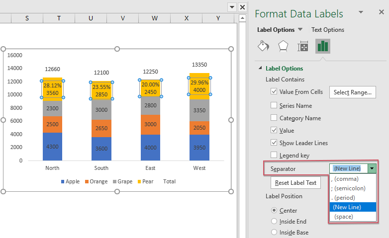
14. From now on, you should convert the data values to the percentage values, please right click the first series data labels (the data labels of the Pear, the data in the golden bars), and choose Format Data Labels, see screenshot:

15. In the opened Format Data Labels pane, under the Label Options tab, check Value From Cells, see screenshot:

16. In the popped out Data Label Rage dialog box, select the percentage values which are consistent with the data series (percentage values of Pear), see screenshot:

17. Then click OK to close the dialog, still in the Format Data Labels pane, uncheck the Value box in the Label Options section, and only the percentage values are displayed in the chart, see screenshot:

18. And then, you just need to repeat the above steps 14- 17 to convert the other data values to their own corresponding percentage values, and you will get the chart you need, see screenshot:

19. At last, format the Legend to your need, and delete the Total legend as well. The stacked chart with percentage values has been created successfully, see screenshot:

Create a stacked column chart with percentage values with an amazing feature
Kutools for Excel provides dozens of special types of charts that Excel does not have, such as Bullet Chart, Target and Actual Chart, Difference Arrow Chart and so on. With its handy tool- Stacked Chart with Percentage, you can create a stacked chart with both percentage values and total values with ease. Click to download Kutools for Excel for free trial!
Download Stacked Column Chart With Percentage Values sample file

Video: Create a stacked column chart with percentage values
The Best Office Productivity Tools
Kutools for Excel - Helps You To Stand Out From Crowd
Kutools for Excel Boasts Over 300 Features, Ensuring That What You Need is Just A Click Away...
Office Tab - Enable Tabbed Reading and Editing in Microsoft Office (include Excel)
- One second to switch between dozens of open documents!
- Reduce hundreds of mouse clicks for you every day, say goodbye to mouse hand.
- Increases your productivity by 50% when viewing and editing multiple documents.
- Brings Efficient Tabs to Office (include Excel), Just Like Chrome, Edge and Firefox.