How to rotate axis labels in chart in Excel?
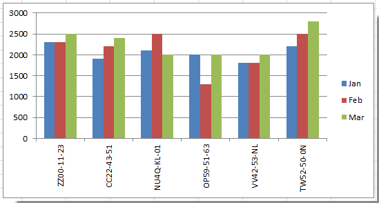
When working with charts in Excel, you may notice that axis labels can sometimes become quite lengthy, causing them to overlap or appear crowded, as illustrated in the screenshot below. This can make your chart difficult to read and interpret, especially when dealing with categories or data labels that contain a lot of text. Instead of resizing the entire chart or compressing your data, Excel provides flexible options to rotate the axis labels, enhancing both clarity and the overall appearance of your visualization.

Rotate axis labels in chart
Excel Formula: Insert line breaks in axis labels with CHAR(10)
VBA: Batch rotate or custom-orient axis labels in multiple charts
Rotate axis labels in chart
Whenever axis labels become cluttered in your chart, rotating them can help you optimize space and readability without the need for drastic changes to your chart size or layout. Rotating axis labels is especially helpful for charts with long category names, such as survey responses, product codes, or date formats.
Please follow these steps:
Rotate axis labels in Excel 2007/2010
1. Right-click on the axis whose labels you want to rotate and choose Format Axis from the context menu. (If you mistakenly right-click outside the axis or select the wrong element, simply try again to ensure the correct axis is highlighted before proceeding.)

2. In the Format Axis dialog, click the Alignment tab. Within the Text Layout section, you will find the Text direction drop-down list. Click this list and select the desired orientation for your labels, such as Horizontal, Rotate all text 90°, Rotate all text 270°, or Stacked. Different options suit different scenarios:
- Horizontal: Default, best for short labels.
- Rotate all text 90°/270°: Useful for long labels to avoid overlap.
- Stacked: Places each character or word on a new line if space is limited.

3. Click Close to exit the dialog. Your chart will immediately reflect the new label orientation.
Tip: If you want more control, such as setting a custom angle (other than the fixed 90° or 270°), stay in the Alignment tab and adjust the Custom angle box to your preferred rotation degree (from -90° to +90°). This allows for finer tuning based on your chart’s layout needs.
Rotate axis labels in chart of Excel 2013 or later
If you are working in Microsoft Excel 2013, 2016, Microsoft 365, or later versions, the interface for formatting axis labels is slightly updated but provides similar and sometimes enhanced options for label alignment and direction.
1. Locate your chart, then right-click on the axis labels that you wish to rotate. From the context menu, choose Format Axis.
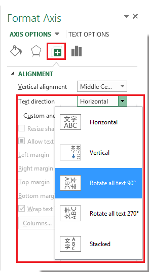
2. A Format Axis pane will appear on the right side of your screen. Click the Size & Properties button (depicted by an icon resembling a square with measurement marks). Next, locate the Text direction drop-down box and choose from similar options: Horizontal, Rotate all text 90°, Rotate all text 270°, or Stacked. Adjust and preview the effect to pick the best fit for your data layout.
Note: For custom text angles in Excel 2013 and later, look for the Text Options or Alignment controls on the Format Axis pane, and enter the specific degree you prefer. Misalignment may occur if negative or overly large angles are set, so preview changes before confirming.
Precaution: Rotating axis labels does not change the underlying data or chart structure. If labels still overlap after rotation, consider further options such as reducing font size, shortening text where possible, or adjusting overall chart dimensions for optimal visualization.
If you accidentally misalign your labels or want to restore the original settings, simply follow the same steps and return the orientation to “Horizontal”.
Excel Formula: Insert line breaks in axis labels with CHAR(10)
When rotating axis labels does not provide the desired clarity—especially if you want to keep text horizontal for aesthetic reasons—you can introduce line breaks within the labels themselves. This approach is useful in cases where labels are structured (such as containing a city and a state, or a product code and name), and breaking them onto multiple lines makes your chart significantly easier to read without altering the text’s orientation. This solution is highly recommended for complex, multi-part labels or when rotated text is difficult to interpret.
Applicable scenarios:
- Best where the logical structure of labels allows for natural breaks (e.g., separating by a hyphen, slash, or space).
- Ideal for dashboards, reports, or presentations where clarity and professionalism matter.
- If data feeds into the chart dynamically, update underlying formulas for auto-refreshing.
Parameter notes:
CHAR(10) represents a line break (new line) in Excel. This requires that the relevant cells have Wrap Text enabled in the cell formatting to display multi-line text properly.
Steps:
- Suppose your original axis labels are in column A. In a new column (e.g., column F), enter the following formula (in cell F2):
=SUBSTITUTE(A1,"-",CHAR(10))This formula replaces every hyphen in the label with a line break. You can customize the"-"argument to replace a comma, space, or other character based on your label structure. - Press Enter to apply the formula, then copy it down for the rest of your axis label source data.
- Apply Wrap Text formatting to column B for the line breaks to appear. To do this, select the entire column B, go to Home > Wrap Text.

- Set your chart's axis labels to reference the new formula column (e.g., column F) instead of the original column (A).
- Click any bar in your chart to activate the chart, then right-click and select "Select Data..." from the context menu.

- In the Select Data Source dialog box, go to the Horizontal (Category) Axis Labels section and click the "Edit" button.

- In the Axis Labels dialog box, replace the original label range with the new formula range, where column F contains your SUBSTITUTE(...,CHAR(10)) formulas.

- Click OK to confirm the label range, then click OK again to close the Select Data Source dialog.
- Click any bar in your chart to activate the chart, then right-click and select "Select Data..." from the context menu.


Error reminder: If line breaks are not showing after applying the formula, double-check that Wrap Text is enabled for the relevant cells. Also, on Mac, CHAR(10) may behave differently in some versions of Excel—test and adjust if needed.
VBA: Batch rotate or custom-orient axis labels in multiple charts
For advanced users or those managing numerous charts, manually rotating each axis label can be repetitive and time-consuming. Using a VBA macro allows you to automate the process—rotating axis labels in a batch, setting a custom angle, or even iterating across all charts in a workbook or worksheet. This is especially helpful for standardized corporate reports or when updating report layouts regularly.
Applicable scenarios:
- Updating the format of multiple charts simultaneously (e.g., company templates, periodic reports).
- Applying a specific angle or orientation to all axis labels according to corporate or publication guidelines.
- Saving time when frequent changes or adjustments are needed for consistent formatting.
Troubleshooting and parameter notes:
- If the axis you want to rotate contains empty or merged label cells, the macro may not apply as expected—ensure the axis labels are standard Excel chart axes.
- If running the macro on a protected workbook/sheet, unprotect it first to allow changes.
- This code can be adapted for X or Y axis by changing the code as needed.
Steps:
1. Click Developer > Visual Basic to open the VBA editor. In the new Microsoft Visual Basic for Applications window, click Insert > Module, then paste the following code into the open module:
Sub RotateAllChartAxisLabels()
    Dim cht As ChartObject
    Dim ws As Worksheet
    Dim angle As Integer

    On Error Resume Next
    xTitleId = "KutoolsforExcel"
    angle = Application.InputBox("Enter rotation angle in degrees (-90 to 90):", xTitleId, 45, , , , , 1)

    If angle < -90 Or angle > 90 Then
        MsgBox "Enter an angle between -90 and 90 degrees."
        Exit Sub
    End If

    For Each ws In ActiveWorkbook.Worksheets
        For Each cht In ws.ChartObjects
            cht.Chart.Axes(xlCategory).TickLabels.Orientation = angle
        Next cht
    Next ws
End Sub
2. After entering the code, click the ![]() button or press F5 to run the macro. A dialog will prompt you to specify your desired rotation angle (within the valid range of -90 to90 degrees).
button or press F5 to run the macro. A dialog will prompt you to specify your desired rotation angle (within the valid range of -90 to90 degrees).
Then all category axis labels in all charts throughout your workbook will be updated to the angle you entered.
Note: Always save your work before applying macros, and ensure macros are enabled in your Excel settings. If you experience errors with specific charts (such as PivotCharts or specialized chart types), you may need to adapt the code or apply manual adjustments.
Restoration: If you wish to reset the rotation to normal (horizontal), simply rerun the macro and enter0 for the rotation angle.
If the macro does not seem to take effect, check your Excel security settings to ensure macros are enabled, and confirm that the chart axes use standard Excel charting features.
Best Office Productivity Tools
Supercharge Your Excel Skills with Kutools for Excel, and Experience Efficiency Like Never Before. Kutools for Excel Offers Over 300 Advanced Features to Boost Productivity and Save Time. Click Here to Get The Feature You Need The Most...
Office Tab Brings Tabbed interface to Office, and Make Your Work Much Easier
- Enable tabbed editing and reading in Word, Excel, PowerPoint, Publisher, Access, Visio and Project.
- Open and create multiple documents in new tabs of the same window, rather than in new windows.
- Increases your productivity by 50%, and reduces hundreds of mouse clicks for you every day!
All Kutools add-ins. One installer
Kutools for Office suite bundles add-ins for Excel, Word, Outlook & PowerPoint plus Office Tab Pro, which is ideal for teams working across Office apps.
- All-in-one suite — Excel, Word, Outlook & PowerPoint add-ins + Office Tab Pro
- One installer, one license — set up in minutes (MSI-ready)
- Works better together — streamlined productivity across Office apps
- 30-day full-featured trial — no registration, no credit card
- Best value — save vs buying individual add-in