
How to adjust the Bar Chart to make bars wider in Excel?

This article is talking about adjusting Bar Chart to make all bars wider in Excel as below screenshot shown.

Adjust the Bar Chart to make bar wider in Excel


Adjust the Bar Chart to make bar wider in Excel

To make bar wider in a Bar Chart, please do as follows.

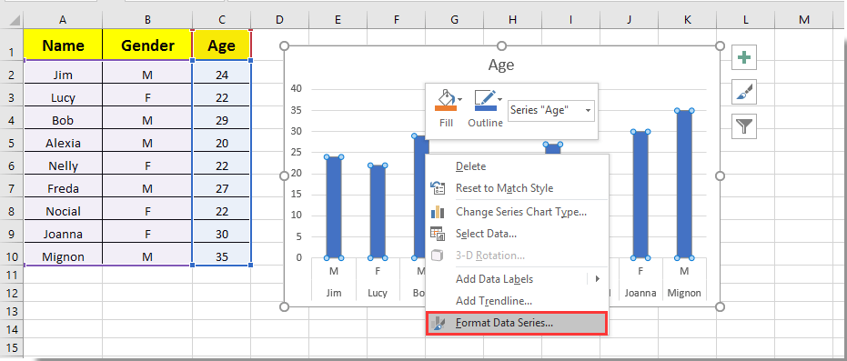
1. Click on any bar in the Bar Chart and right click on it, then select Format Data Series from the right-clicking menu. See screenshot:

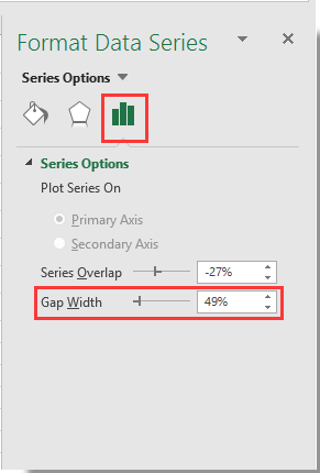
2. In the popping up Format Data Series pane, move the Zoom bar of the Gap Width to the left side until the bar width meets your needs under the Series Options section. See screenshot.

3. Close the Format Data Series pane.

Then you can see bars in specified Bar Chart becoming wider as below screenshot shown.

Best Office Productivity Tools

🤖 Kutools AI Aide: Revolutionize data analysis based on: Intelligent Execution   |  Generate Code  |  Create Custom Formulas  |  Analyze Data and Generate Charts  |  Invoke Kutools Functions…
Popular Features: Find, Highlight or Identify Duplicates   |  Delete Blank Rows   |  Combine Columns or Cells without Losing Data   |   Round without Formula ...
Super Lookup: Multiple Criteria VLookup    Multiple Value VLookup  |   VLookup Across Multiple Sheets   |   Fuzzy Lookup ....
Advanced Drop-down List: Quickly Create Drop Down List   |  Dependent Drop Down List   |  Multi-select Drop Down List ....
Column Manager: Add a Specific Number of Columns  |  Move Columns  |  Toggle Visibility Status of Hidden Columns  |  Compare Ranges & Columns ...
Featured Features: Grid Focus   |  Design View   |   Big Formula Bar    Workbook & Sheet Manager   |  Resource Library (Auto Text)   |  Date Picker   |  Combine Worksheets   |  Encrypt/Decrypt Cells    Send Emails by List   |  Super Filter   |   Special Filter (filter bold/italic/strikethrough...) ...
Top 15 Toolsets12 Text Tools (Add Text, Remove Characters, ...)   |   50+ Chart Types (Gantt Chart, ...)   |   40+ Practical Formulas (Calculate age based on birthday, ...)   |   19 Insertion Tools (Insert QR Code, Insert Picture from Path, ...)   |   12 Conversion Tools (Numbers to Words, Currency Conversion, ...)   |   7 Merge & Split Tools (Advanced Combine Rows, Split Cells, ...)   |   ... and more

Supercharge Your Excel Skills with Kutools for Excel, and Experience Efficiency Like Never Before. Kutools for Excel Offers Over 300 Advanced Features to Boost Productivity and Save Time.  Click Here to Get The Feature You Need The Most...

Description


Office Tab Brings Tabbed interface to Office, and Make Your Work Much Easier

  • Enable tabbed editing and reading in Word, Excel, PowerPoint, Publisher, Access, Visio and Project.
  • Open and create multiple documents in new tabs of the same window, rather than in new windows.
  • Increases your productivity by 50%, and reduces hundreds of mouse clicks for you every day!
Comments (9)
No ratings yet. Be the first to rate!
This comment was minimized by the moderator on the site
Thank you so much!!! so helpful.
This comment was minimized by the moderator on the site
Also been looking for a way to do this. Line chart over dates/times with bars when data (KGs) increased i.e. new delivery. Rather than change x axis type to text, I ended up having a filled border on bar. Need to select the same color fill as line and then select the border width to widen the bar. Can be done in VBA if chart is being produced with VBA?
This comment was minimized by the moderator on the site
Thanks. Works very well for me. At least I have gotten the bars wider. Easy to learn process. 
This comment was minimized by the moderator on the site
Your articles are life-savers!
This comment was minimized by the moderator on the site
Sorry... this doesn't work on a PC with Office365 2020.10. The control is there but even when set to zero percent for the gap width, the bars are scrawny little narrow bars which will accommodate no text overlay. Something not right.
This comment was minimized by the moderator on the site
Not in office365 but it might work for you, I have found a similar issue with "scrawny" bars on dates that adjusting overlay and gap width don't correct. To fix was as simple as reordering my data from oldest to newest and then changing axis type to "text axis" rather than "date axis" and then adjusting overlay and gap width. Give it a crack?
This comment was minimized by the moderator on the site
Well, that behaviour is brain-dead, but it worked for me too! Thanks.
This comment was minimized by the moderator on the site
Thanks Tom, that was a winner for me
This comment was minimized by the moderator on the site
same for my Office 365...
There are no comments posted here yet
Please leave your comments in English
Posting as Guest
Rate this post:
0   Characters
Suggested Locations