How to overlay line chart on bar chart in Excel?
For comparing different types of data, you can create a chart that displays these two unique sets of data in Excel. This article is talking about overlaying line chart on the bar chart in Excel.
Overlay line chart on bar chart in Excel
Overlay line chart on bar chart in Excel
To overlay line chart on the bar chart in Excel, please do as follows.
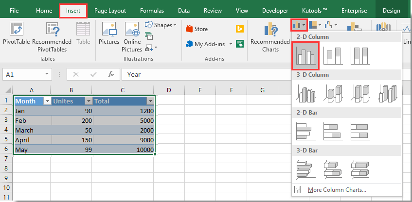
1. Select the range with two unique sets of data, then click Insert > Insert Column or Bar Chart > clustered column. See screenshot:
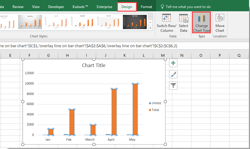
2. Now a bar chart is created in your worksheet as below screenshot shown. Select the specified bar you need to display as a line in the chart, and then click Design > Change Chart Type. See screenshot:
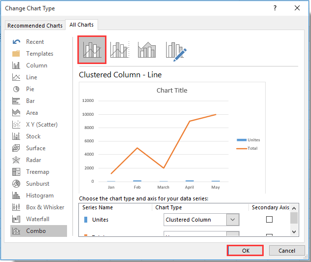
3. In the Change Chart Type dialog box, please select Clustered Column – Line in the Combo section under All Charts tab, and then click the OK button.
4. Select and right click the newly created line and select Format Data Series in the context menu. See screenshot:
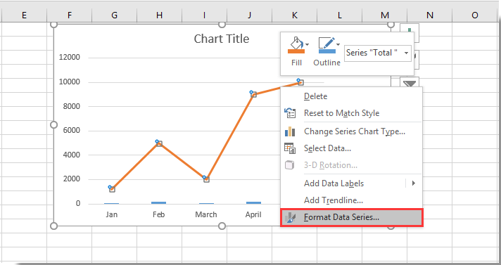
5. In the Format Data Series pane, select the Secondary Axis option in the Series Options section under the Series Options tab. See screenshot:

Now the line chart is overlaid on the bar chart as below screenshot:

Best Office Productivity Tools
Supercharge Your Excel Skills with Kutools for Excel, and Experience Efficiency Like Never Before. Kutools for Excel Offers Over 300 Advanced Features to Boost Productivity and Save Time. Click Here to Get The Feature You Need The Most...
Office Tab Brings Tabbed interface to Office, and Make Your Work Much Easier
- Enable tabbed editing and reading in Word, Excel, PowerPoint, Publisher, Access, Visio and Project.
- Open and create multiple documents in new tabs of the same window, rather than in new windows.
- Increases your productivity by 50%, and reduces hundreds of mouse clicks for you every day!
All Kutools add-ins. One installer
Kutools for Office suite bundles add-ins for Excel, Word, Outlook & PowerPoint plus Office Tab Pro, which is ideal for teams working across Office apps.
- All-in-one suite — Excel, Word, Outlook & PowerPoint add-ins + Office Tab Pro
- One installer, one license — set up in minutes (MSI-ready)
- Works better together — streamlined productivity across Office apps
- 30-day full-featured trial — no registration, no credit card
- Best value — save vs buying individual add-in