How to add horizontal benchmark/target/base line in an Excel chart?
Let's say you have created a column chart to show four teams' sales amount in Excel. But now, you want to add a horizontal benchmark line in the chart, how could you handle it? This article will introduce three solutions for you!
- Add horizontal benchmark/base/target line by adding a new data series in an Excel chart
- Add horizontal benchmark/target/base line in an Excel chart with an amazing tool
- Add horizontal benchmark/target/base line by Paste Special in Excel chart
Add horizontal benchmark/base/target line by adding a new data series in an Excel chart
This method will take the benchmark line for example to guide you to add a benchmark line, baseline, or target line in an existing chart in Excel.
1. Beside the source data, add a Benchmark line column, and fill with your benchmark values. See screenshot:
2. Right-click the existing chart, and click "Select Data" from the context menu. See screenshot: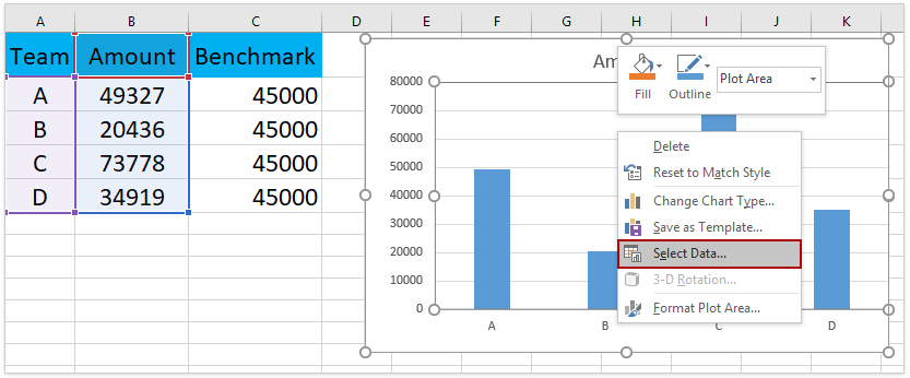
3. In the "Select Data Source" dialog box, please click the "Add" button in the "Legend Entries (Series)" section. See screenshot: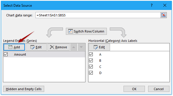
4. In the popping "Edit Series" dialog box, please (1) type Benchmark line in the "Series name" box, (2) specify the Benchmark line column excluding the column header as "Series value", and (3) click the OK buttons successively to close both dialog boxes. See screenshot:
5. Now the benchmark line series is added to the chart. Right-click the benchmark line series, and select "Change Series Chart Type" from the context menu. See screenshot:
6. In the "Change Chart Type" dialog box, please specify the chart type of the new data series as "Scatter with Straight Line", uncheck the "Secondary Axis" option, and click the OK button. See screenshot: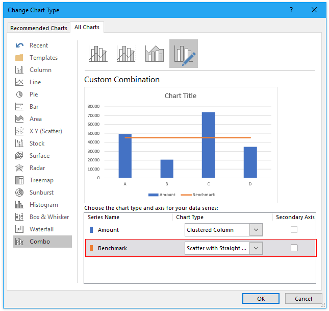
Now you will see the benchmark line is added to the column chart already. Go ahead to decorate the chart.
7. Right click the horizontal X axis, and select "Format Axis" from the context menu.
8. In the Format Axis pane, please check the "On tick marks" in the "Axis position" section on the "Axis Options" tab.
Now the horizontal benchmark line is added as following screenshot shown:
Add horizontal benchmark/target/base line in an Excel chart with an amazing tool
If you have Kutools for Excel installed, you can apply its "Add Line to Chart" feature to quickly add average line, benchmark line, target line, based line, etc. to the currently selected chart in Excel.
1. Select the chart you will add benchmark line for.
2. Click "Kutools" > "Charts" > "Add Line to Chart" to enable this feature.
3. In the Add line to chart dialog, please check the "Other values" option, refer the cell containing the specified value or enter the specified value directly, and click the Ok button. See screenshot:
Now the specified benchmark line is added in the selected chart.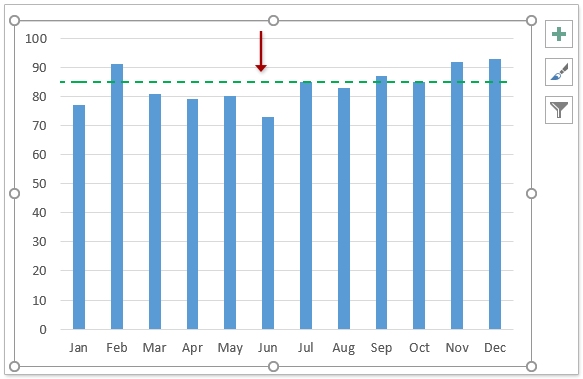
Note: You can easily format the benchmark line as you need:
(1) Double click the benchmark line to enable the "Format Error Bars pane".
(2) Enable the "Fill & Line" tab, and you can change the parameters to format the benchmark line freely, says line color, dash type, line width, etc.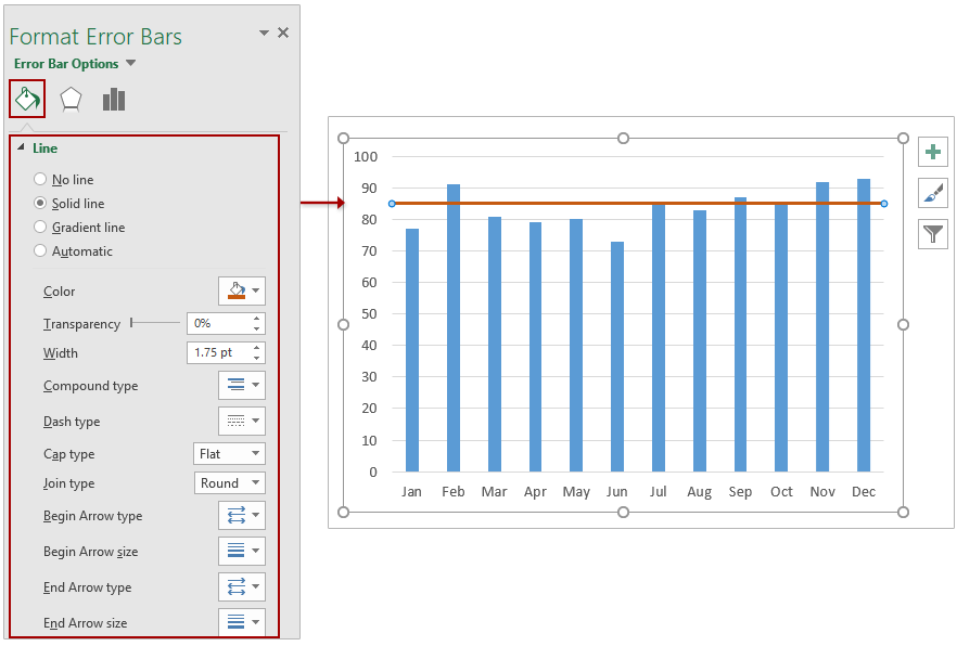
Add horizontal benchmark/target/base line by Paste Special in Excel chart
This method will guide you to copy the benchmark/target/baseline data to the destination chart as a new data series, and then change the chart type of the new series to Scatter with Straight Line in Excel.
1. Enter your benchmark data in the worksheet as below screenshot shown.
Note: In the screenshot, 12 indicates there are 12 records in our source data; 85 means the benchmark sales, and you can change them as your need.
2. Select the benchmark data (the Range D2:E4 in my example), and press Ctrl + C keys simultaneously to copy it.
3. Click to activate the original chart, and then click "Home" > "Paste" > "Paste Special". See screenshot:
4. In the opening "Paste Special" dialog, please check the "New Series" option, the "Columns" option, the "Series Names in First Row" checkbox, the "Categories (X Labels) in First Column" checkbox, and then click the OK button. See screenshot:
Now the benchmark data has been added as a new data series in the activated chart.
5. In the chart, right click the new Benchmark series, and select "Change Series Chart Type" from the context menu. See screenshot:
6. Now the Change Chart Type dialog comes out. Please specify the Chart Type of Benchmark series as "Scatter with Straight Lines", uncheck the "Secondary Axis" option behind it, and then click the OK button. See screenshot: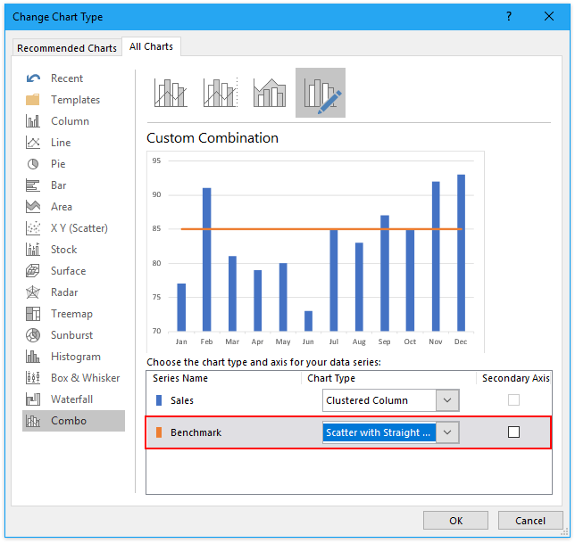
So far, the benchmark line has been added in the chart. However, the benchmark line neither begins at the outside border of the first column, nor reaches the outside border of the last column.
7. Right click the horizontal X axis in the chart, and select "Format Axis" from the context menu. See screenshot:
8. In the "Format Axis" pane, under the "Axis Options" tab, please check the "On tick marks" option in the "Axis Position" section. See screenshot:
Now you will see the benchmark line comes across all column data in the chart. See screenshot:
Notes:
(1) This method can also add horizontal benchmark line in an area chart.
(2) This method can also add horizontal benchmark line in a line chart.
Add horizontal benchmark/target/base line by Paste Special in Excel chart
Best Office Productivity Tools
Supercharge Your Excel Skills with Kutools for Excel, and Experience Efficiency Like Never Before. Kutools for Excel Offers Over 300 Advanced Features to Boost Productivity and Save Time. Click Here to Get The Feature You Need The Most...
Office Tab Brings Tabbed interface to Office, and Make Your Work Much Easier
- Enable tabbed editing and reading in Word, Excel, PowerPoint, Publisher, Access, Visio and Project.
- Open and create multiple documents in new tabs of the same window, rather than in new windows.
- Increases your productivity by 50%, and reduces hundreds of mouse clicks for you every day!
All Kutools add-ins. One installer
Kutools for Office suite bundles add-ins for Excel, Word, Outlook & PowerPoint plus Office Tab Pro, which is ideal for teams working across Office apps.
- All-in-one suite — Excel, Word, Outlook & PowerPoint add-ins + Office Tab Pro
- One installer, one license — set up in minutes (MSI-ready)
- Works better together — streamlined productivity across Office apps
- 30-day full-featured trial — no registration, no credit card
- Best value — save vs buying individual add-in