Create a column chart with percentage change in Excel
In Excel, you may create a simple column chart for viewing the data trends normally. For making the data looks like more intuitively to display the variances between the years, you can create a column chart with percentage change between each column as below screenshot shown. In this type of chart, the up arrows indicate the increased percentage that the later year than the previous year while the down arrows indicate the decreased percentage.
This article, we will introduce how to create a column chart that displays the percentage change between the columns in Excel.

- Create a column chart with percentage change by using error bars
- Create a column chart with percentage change by using up down arrows
- Create a column chart with percentage change by using a powerful feature
- Download Column Chart With Percentage Change sample file
Create a column chart with percentage change by using error bars
Using the error bars to create a column chart with percentage change, you should insert some helper columns as below data shown, and then create the chart based on the helper data. Please do as follows:

First, create the helper columns data
1. In cell C2 that beside the original data, type the following formula, and then drag the formula to cell C10, see screenshot:

2. Go on enter the below formula into cell D2, and then drag and copy the formula into cell D10, see screenshot:

3. Then, in cell E2, enter the following formula, and then, drag the fill handle down to cell E9, see screenshot:

4. Then, please enter the below formula into cell F2, and then drag the fill handle down to the cell F9, see screenshot:

5. Go on entering the following formula into cell G2, and drag it into cell G9, see screenshot:

6. Then, go on typing the following formula into cell H2, and copy this formula to cell H9, see screenshot:

7. Now, insert the last helper column, please apply the below formula into cell I2, and drag it to cell I9, and then format the decimal results to Percent Style. see screenshot:

Second, Create the chart based on the helper columns data
8. After creating the helper data, then, select the data in column C, column D and column E, and then, click Insert > Insert Column or Bar Chart > Clustered Column, see screenshot:

9. And then, a column chart has been inserted, you can delete the unneeded elements of the chart, such as chart title, legend or gridlines, see screenshots:
 |  |
10. Then, click the column bar which displays the invisible data, and then, click the Chart Elements button to expand the Chart Elements list box, and choose Error Bars > More Options, see screenshot:

11. In the opened Format Error Bars pane, under the Error Bar Options tab:
- Select Both from the Direction section;
- Choose Cap from the End Style;
- Select Custom from the Error Amount, and then click Specify Value, in the following Custom Error Bars dialog box, select the data from cell G2:G10 into the Positive Error Value box, then select H2:H10 cells into the Negative Error Value box.
 |  |
12. Then, click OK button, and you will get the chart as below screenshot shown:

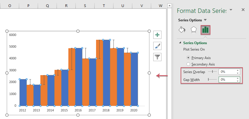
13. And now, right click the bar column which displays the Order 1 data, and choose Format Data Series from the context menu, see screenshot:

14. In the opened Format Data Series pane, under the Series Options tab, change the values in Series Overlap and Gap Width sections to 0%, see screenshot:
15. Now, you should hide the invisible data bar, right click any one of it, in the popped out context menu, choose No Fill from the Fill section, see screenshot:

16. With the invisible data bar still selected, click Chart Elements button, choose Data Labels > More Options, see screenshot:

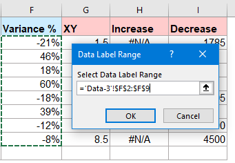
17. In the Format Data Labels pane, under the Label Options tab, check Value From Cells, and in the popped out Data Label Range prompt, select the variance data range I2:I9, see screenshots:
 |  |
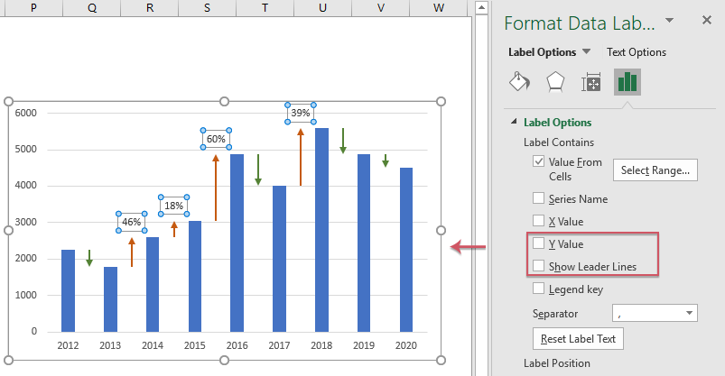
18. Then click OK, still in the Format Data Labels pane:
- Uncheck the Value and Show Leader Lines options under the Label Options;
- Then specify the label position as Outside End from the Label Position.

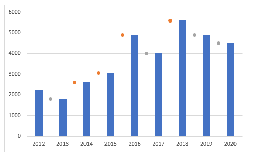
19. Now, you can see the data labels have been added into the chart, you can set the negative percentage labels to Inside End, and format the data labels to your need, see screenshot:

Create a column chart with percentage change by using up down arrows
Sometimes, you may want to use some arrows to replace the error bars, if the data increases in next year, an up arrow is displayed, if the data deceases in next year, a down arrow is displayed. At the same time, the data labels and the arrows will be dynamically changed as the data changes as below demo shown.

For creating this type of chart, you should insert two parts helper data as below screenshot shown. The first part calculates the variance and percentage variance as the blue part displayed, the second part is used for custom error bars for both increase and decrease as the red part displayed.

First, create the helper columns data
1. To insert the first part helper data, please apply the below formulas:
D2: =B2 (drag the formula to cell D10)
E2: =B3-B2 (drag the formula to cell E9)
F2: =E2/B2 (drag the formula to cell F9)

2. Then apply the following formulas to create the second part helper data:
H2: =IF(B3>=B2,B3,NA()) (drag the formula to cell H9)
I2: =IF(B3<B2,B3,NA()) (drag the formula to cell I9)

Second, Create the chart based on the helper columns data
3. Select the data in column C and column D, then click Insert > Insert Column or Bar Chart > Clustered Column to insert a column chart as below screenshot shown:

4. Then, press Ctrl + C to copy the data in column G, column H, column I, and then click to select the chart, see screenshot:

5. After selecting the chart, please click Home > Paste > Paste Special, in the Paste Special dialog box, select New series, Column options, and then check Series Name in First Row and Categories (X Labels) in First Column options, see screenshots:
 |  |
6. And then, you will get a chart as below screenshot shown:

7. Right click any one column bar in the chart, and then choose Change Series Chart Type from the context menu, see screenshot:

8. In the Change Chart Type dialog box, change both Increase and Decrease to Scatter chart, then uncheck the Secondary Axis box for each from Choose the chart type and axis for your series list box. See screenshot:

9. And then, click OK button, you will get a combo chart that the markers are positioned between the respective columns. See screenshot:
10. Then, please click to select the increase series (the orange dot), and then click Chart Elements button, check the Error Bars from the list box, and error bars have been added to the chart, see screenshot:

11. Select the horizontal error bars and press Delete key to delete them, see screenshot:

12. And then, select the vertical error bars, right click it, and choose Format Error Bars, in the Format Error Bars pane, under the Error Bar Options tab, do the following operations:
- Select Both option from the Direction;
- Select No Cap from the End Style;
- From the Error Amount section, select Custom, and then click Specify Value button, in the popped out Custom Error Bars dialog box, in the Positive Error Value box, enter ={0}, and in the Negative Error Value box, select the variance value E2:E9.
- Then, click OK button.
 |  |
13. Now, still in the Format Error Bars pane, click Fill & Line tab, do the following operations:
- Select Solid line in the Line section and choose a color you need, then specify the line width as you need;
- From the Begin Arrow type drop down list, choose one Arrow type.

14. In this step, you should hide the markers (the orange dots), select the orange dots, and right click, choose Format Data Series from the context menu, in the opened Format Data Series pane, under the Fill & Line tab, click Marker section, then select None from the Marker Options, see screenshot:

15. Repeat the above step 10-14 to insert the down arrow for the decrease data series and hide the grey markers, and you will get the chart as below screenshot shown:

16. After inserting the arrows, now, you should add the data labels, please click to select the hidden increase series, and then click Chart Elements > Data Labels > Above, see screenshot:

17. Then, right click any data label, and choose Format Data Labels from the context menu, in the expanded Format Data Labels pane, under the Label Options tab, check Value From Cells option, then, in the popped out Data Label Range dialog box, select the variance percentage cells (F2:F9), see screenshot:
 |  |
18. Click OK to close the dialog box, still in the Format Data Labels pane, uncheck the Y Value and Show Leader Lines options, see screenshot:
19. Then, you just need to repeat the above step 16-18 to add the negative percentage labels (this time, you should add labels below the decrease data points, choose Below in the sub-menu of Data Labels in Charts Elements), and the column chart with percentage change has been created successfully, see screenshot:

Create a column chart with percentage change by using a powerful feature
For most of us, the above methods are too difficult to use, but, if you have Kutools for Excel, it provides various special types of charts that Excel does not have, such as Bullet Chart, Target and Actual Chart, Slop Chart and so on. With its easy tool- Column Chart with Percentage Changed, you can create a column chart with percentage change by using the up and down arrows quickly and easily in Excel. Click to download Kutools for Excel for free trial!
Download Column Chart With Percentage Change sample file

The Best Office Productivity Tools
Kutools for Excel - Helps You To Stand Out From Crowd
Kutools for Excel Boasts Over 300 Features, Ensuring That What You Need is Just A Click Away...
Office Tab - Enable Tabbed Reading and Editing in Microsoft Office (include Excel)
- One second to switch between dozens of open documents!
- Reduce hundreds of mouse clicks for you every day, say goodbye to mouse hand.
- Increases your productivity by 50% when viewing and editing multiple documents.
- Brings Efficient Tabs to Office (include Excel), Just Like Chrome, Edge and Firefox.