How to add a horizontal average line to chart in Excel?
When working with data in Excel, it's common to use charts for visual analysis and to observe trends over time or across categories. In many cases, to better understand the distribution of your data, it's helpful to display the average value as a horizontal line across the chart. This average line serves as a visual benchmark, allowing you to quickly compare individual data points against the overall mean, highlight deviations, and facilitate discussions or decisions based on your chart.
Adding a horizontal average line to an Excel chart may seem tricky if you aren't familiar with chart customization features. Fortunately, Excel offers several approaches for achieving this. Below you’ll find practical methods for adding an average line and a summary of when each approach may be most suitable.
- Add a horizontal average line to a chart with a helper column
- Add a horizontal average line with an amazing tool
- Add a horizontal average line to a chart with VBA code
- Alternative Solution: Use Shapes to draw a horizontal line manually
Add a horizontal average line to a chart with a helper column
To visually represent the average value of your data with a horizontal line on a chart, you can first calculate the mean using Excel’s built-in functions, and then incorporate the result into your existing chart. This method works well for column, bar, or line charts where you want the average clearly visible as an overlay.
1. Begin by calculating the average for your dataset. In a helper column (for example, column C), enter the following formula in cell C2: =AVERAGE($B$2:$B$8). This formula computes the average for all values in the range B2 to B8. Next, use the AutoFill handle to drag this formula down to match the range of your data. This ensures each row displays the same constant average value, which will form a straight line in the chart.
Tip: Double-check the range in your formula to make sure it encompasses all relevant data. If your dataset is larger or located in a different column, adjust the cell references accordingly to avoid incorrect average values.
2. With your original data and the helper column selected, go to the Insert tab and choose a chart type that best fits your analysis, such as a 2-D Column chart. Plotting both the data and the average series sets the foundation for your customized chart.
3. After you insert the chart, locate the newly plotted average series, which will typically appear as a separate set of bars (often in red) next to your original data. Click on one of these bars to select the entire average series, then right-click and choose Change Series Chart Type from the context menu.
4. The Change Chart Type dialog box will appear. In the left panel, select Combo chart type. Then, for the Average series, choose a line chart style from the drop-down menu. This converts the average series from bars to a straight horizontal line, making the average visually prominent on the chart.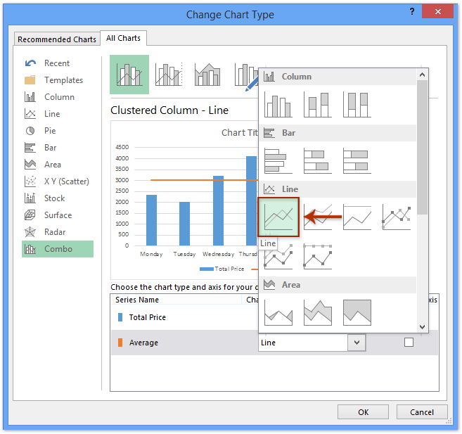
Tip: Be careful not to accidentally change your data series chart type to line unless you intend to do so, as this will alter the chart’s display.
5. Click OK. Your chart should now display a horizontal average line across your data columns, serving as a reference point for quick comparison.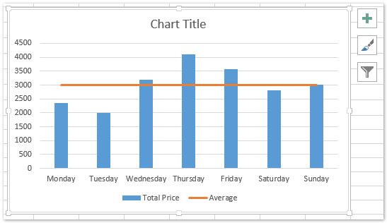
Applicable scenarios: This approach is ideal when you want a fully dynamic solution—if you update your dataset, the average and the chart will update automatically. It requires manual setup but doesn’t need any add-ins or code.
Advantages: Works with built-in Excel tools, updates automatically with data changes, highly customizable.
Limitations: Slightly more time-consuming for very large datasets or multiple series. You’ll need to adjust formulas and chart selections with more complex data structures.
Troubleshooting: If your average line doesn’t appear as expected, check the formula range, ensure you’ve selected both data and average columns before inserting your chart, and make sure you’re in the Combo chart dialog when changing chart type.
Quickly add a horizontal average line with an amazing tool
An alternative approach, especially useful when you routinely add average lines or other reference markers, is to utilize the Add Line to Chart feature in Kutools for Excel. This tool streamlines the process, reducing the number of steps and helping avoid manual formula setup. If you already have your chart created, Kutools can add an average line with just a couple of clicks and minimal configuration.
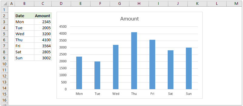
Suppose you have created a standard column chart, as shown in the screenshot below, and wish to quickly illustrate the average of your data points.
1. Select the column chart by clicking on it, then navigate to Kutools > Charts > Add Line to Chart. This will launch the feature dialog.
2. In the dialog box, simply check the Average option, then click OK.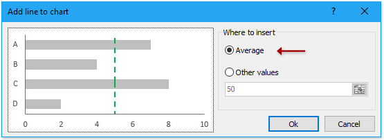
Your column chart now displays a horizontal average line instantly, which makes it easier to present your findings or compare data visually.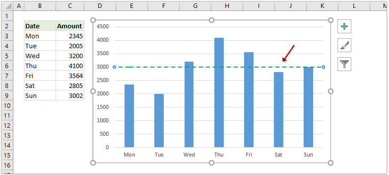
Applicable scenarios: This solution is perfect for users who deal with many charts or who want a time-saving, no-fuss process. It’s particularly useful for presentations or dashboards where quick visualization is essential.
Advantages: Fast and simple, no formulas or manual series manipulation, suitable for routine work, other helpful charting features are available.
Add a horizontal average line to a chart with VBA code
For those who prefer an automated or programmable solution, or need to repeat the process across multiple charts and worksheets, a simple VBA macro can be used to insert an average line directly onto a column chart. This method is flexible and can be customized, but involves basic coding and macro execution.
1.Click on any data column in your chart; all columns in the data series will be selected, as indicated by selection handles.
2. Hold the ALT + F11 keys to open the Microsoft Visual Basic for Applications window in Excel.
3. In the VBA editor, click Insert > Module to open a new module window. Copy and paste the following VBA code into the window:
VBA: add an average line to the chart
Sub AverageLine()
'Update 20130907
Dim ser As Series
Dim arr As Variant
Dim total As Double
Dim outArr As Variant
If VBA.TypeName(Application.Selection) <> "Series" Then Exit Sub
Set ser = Application.Selection
arr = ser.Values
total = Application.WorksheetFunction.Average(arr)
ReDim outArr(LBound(arr) To UBound(arr))
For i = LBound(outArr) To UBound(outArr)
    outArr(i) = total
Next
With ActiveChart.SeriesCollection.NewSeries
    .XValues = ser.XValues
    .Values = outArr
    .Name = "Average " & ser.Name
    .AxisGroup = ser.AxisGroup
    .MarkerStyle = xlNone
    .Border.Color = ser.Border.Color
    .ChartType = xlLine
    .Format.Line.ForeColor.ObjectThemeColor = msoThemeColorAccent6
End With
End Sub
4. After pasting the code, press F5 to run the macro. Upon execution, your column chart will immediately gain a horizontal average line as shown below:
Note: This VBA macro is designed for 2-D Column chart types only. If you use other chart formats, you may need to adapt the code or switch to supported chart types.
Applicable scenarios: Best suited for advanced users who need to automate chart modifications, or for bulk processing across multiple charts without manual intervention.
Advantages: Can be customized, enables batch processing, saves time for repeated tasks.
Limitations: Requires enabling macros and familiarity with VBA. Not as immediate as built-in charting tools or add-ins. May encounter issues if chart structure is complex.
Troubleshooting: If the macro does not execute or throws errors, ensure your chart is a 2-D column chart, double-check the VBA code for missing or incorrect references, and verify that macros are enabled within Excel’s Trust Center settings.
Practical tip: Save your workbook before running unfamiliar macros to avoid unintentional changes. For enhanced safety, run the macro on a copy of your data first.
Alternative Solution: Use Shapes to draw a horizontal line manually
Sometimes, especially for presentation or illustrative purposes, you might simply use Excel’s Shapes feature to draw a horizontal line at the average value on your chart.
1. First, identify or calculate the average value in your data.
2. Select the chart you want to add an average line.
3. Click Insert > Shapes > Line, and then manually draw the line across your chart at the desired vertical position.
Tip: Use the Format tab to adjust line color, thickness, and placement for clear visibility, and align the line precisely by referring to the axis scale.
Advantages: Extremely simple, no formulas, VBA, or add-ins needed. Works for any chart type. And this line will move automatically with the chart.
Limitations: Line is not dynamic.
Related articles:
- How to auto update a chart after entering new data in Excel?
- How to create combination charts and add secondary axis for it in Excel?
Best Office Productivity Tools
Supercharge Your Excel Skills with Kutools for Excel, and Experience Efficiency Like Never Before. Kutools for Excel Offers Over 300 Advanced Features to Boost Productivity and Save Time. Click Here to Get The Feature You Need The Most...
Office Tab Brings Tabbed interface to Office, and Make Your Work Much Easier
- Enable tabbed editing and reading in Word, Excel, PowerPoint, Publisher, Access, Visio and Project.
- Open and create multiple documents in new tabs of the same window, rather than in new windows.
- Increases your productivity by 50%, and reduces hundreds of mouse clicks for you every day!
All Kutools add-ins. One installer
Kutools for Office suite bundles add-ins for Excel, Word, Outlook & PowerPoint plus Office Tab Pro, which is ideal for teams working across Office apps.
- All-in-one suite — Excel, Word, Outlook & PowerPoint add-ins + Office Tab Pro
- One installer, one license — set up in minutes (MSI-ready)
- Works better together — streamlined productivity across Office apps
- 30-day full-featured trial — no registration, no credit card
- Best value — save vs buying individual add-in