How to shade the area between two lines in a line chart in Excel?
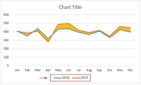
When creating a line chart for two data series, do you know how to shade the area between the two lines as shown in the screenshot below? This tutorial provides two methods to help you get it done step by step.

Shade the area between two lines in a line chart by inserting helper columns
Easily shade the area between two lines in a line chart with an amazing tool
Shade the area between two lines in a line chart by inserting helper columns
Suppose you have a monthly sales table for two years and want to create a line chart for them, shading the area between the two lines. Please do as follows to handle it.

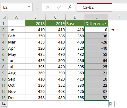
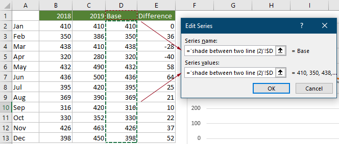
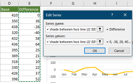
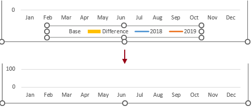
1. Firstly, you need to create two helper columns.
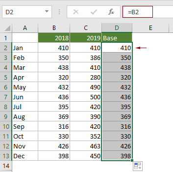
2. Select the whole range, click Insert > Insert Line or Area Chart > Line to insert a line chart.
Tip: If you have already created the line chart, skip this step and proceed to the Note.

Now a line chart is created as shown in the screenshot below.

Note: If you have already created a line chart for the original series (see the following screenshot) and want to shade the area between the lines. After creating the two helper columns, you need to do as follows.

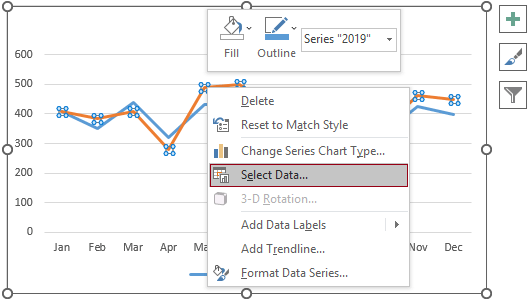
3. Right click on any line in the chart and select Change Series Chart Type in the right-clicking menu.

4. In the Change Chart Type dialog box, change the chart type of the Base and Difference series to Stacked Area and click the OK button to save the changes.

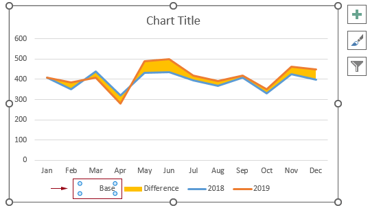
The chart now is displayed as follows.

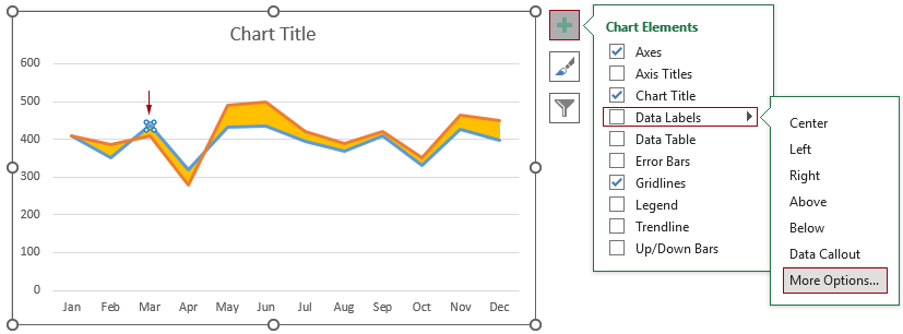
5. Select the largest highlighted area in the chart, and then click Format (under the Chart Tools tab) > Shape Fill > No Fill.

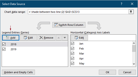
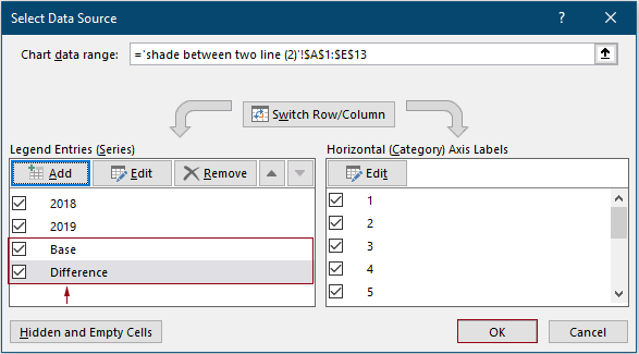
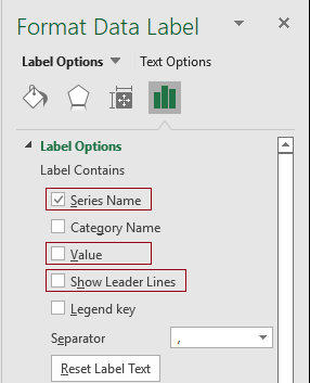
6. Now you need to remove the newly added series from the legend as follows.
Tips: If you want to remove the entire legend from the chart and display only the series names on the corresponding lines in the chart, please do as follows.
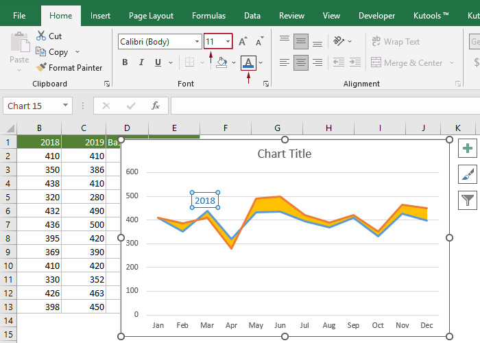
7. Select the shaded area in the chart, click Format (under the Chart Tools tab) > Shape Fill. Then choose a lighter fill color for it.

8. Change the chart title as you need.
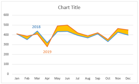
The chart now is finished. And the area between the two lines is highlighted as shown in the screenshot below.

Easily shade the area between two lines in a line chart with an amazing tool
The above method has many steps and is very time-consuming. Here I recommend the Different Area Chart feature of Kutools for Excel to help you easily solve this problem. With this feature, you don’t need to create helper columns, just need several clicks to get it done.
1. Select the whole data range, click Kutools > Charts > Difference Comparison > Difference Area Chart.

2. In the Difference Area Chart dialog box, you can see that the fields are automatically filled with corresponding cell references, click the OK button directly.

The chart is created. See the screenshot below.

Note: You can right-click on any element of the chart to apply a different color or style as you want.
Kutools for Excel - Supercharge Excel with over 300 essential tools, making your work faster and easier, and take advantage of AI features for smarter data processing and productivity. Get It Now
Demo: Shade The Area Between Two Lines In A Line Chart In Excel
Best Office Productivity Tools
Supercharge Your Excel Skills with Kutools for Excel, and Experience Efficiency Like Never Before. Kutools for Excel Offers Over 300 Advanced Features to Boost Productivity and Save Time. Click Here to Get The Feature You Need The Most...
Office Tab Brings Tabbed interface to Office, and Make Your Work Much Easier
- Enable tabbed editing and reading in Word, Excel, PowerPoint, Publisher, Access, Visio and Project.
- Open and create multiple documents in new tabs of the same window, rather than in new windows.
- Increases your productivity by 50%, and reduces hundreds of mouse clicks for you every day!
All Kutools add-ins. One installer
Kutools for Office suite bundles add-ins for Excel, Word, Outlook & PowerPoint plus Office Tab Pro, which is ideal for teams working across Office apps.
- All-in-one suite — Excel, Word, Outlook & PowerPoint add-ins + Office Tab Pro
- One installer, one license — set up in minutes (MSI-ready)
- Works better together — streamlined productivity across Office apps
- 30-day full-featured trial — no registration, no credit card
- Best value — save vs buying individual add-in