Create bubble chart in Excel
A bubble chart is an extension of the scatter chart in Excel, it consists of three data sets, X-axis data series, Y-axis data series, and the bubble size data series to determine the size of the bubble marker as below screenshot shown. The bubble chart is used to show the relationship between different datasets for business, economic or other fields. This article, I will introduce how to create bubble chart in Excel.

- Create simple bubble chart in Excel
- Change bubble chart color based on categories dynamically in Excel
- Create simple bubble chart in Excel with a powerful feature
- Download Bubble Chart sample file
- Video: Create bubble chart in Excel
Create simple bubble chart in Excel
To create a bubble chart, please do with the following steps:
1. Click a blank cell of your worksheet, and then click Insert > Insert Scatter (X,Y) or Bubble Chart, and then choose one type of bubble chart you like, see screenshot:

2. Then, a blank chart will be inserted into the worksheet, click to select the blank chart, and then click Select Data under the Design tab, see screenshot:

3. In the popped out Select Data Source dialog box, click Add button, see screenshot:

4. In the following Edit Series dialog box, specify the following operation:
- In Series name text box, select the name cell you want;
- In Series X values text box, select the column data you want to place in X axis;
- In Series Y values text box, select the column data you want to place in Y axis;
- In Series bubble size text box, select the column data you want to be shown as bubble size.

5. After selecting the data, click OK > OK to close the dialogs, and the bubble chart has been displayed as below screenshot shown:

6. As you can see, there are extra spaces before and after the chart, and the bubbles are crowed, so you can adjust the x axis, please right click the x axis, and then choose Format Axis from the context menu, see screenshot:

7. In the opened Format Axis pane, enter the suitable minimum value and maximum value based on your own data to get the chart is displayed as below screenshot shown:

8. Then, if you want the bubbles displayed with different colors, please right click the bubbles, and choose Format Data Series, in the opened Format Data Series pane, under the Fill & Line tab,check Vary colors by point option, and now, the bubbles are filled with different colors, see screenshot:

9. Next, please add data labels for the bubbles, click to select the bubbles, and then click Chart Elements > Data Labels > Center, see screenshot:

10. And then, right click the data labels, choose Format Data Labels option, see screenshot:

11. In the opened Format Data Labels pane, under the Label Options tab, check Value From Cells option, and in the popped out Data Label Range dialog, select the cells of data labels, see screenshots:
 |  |
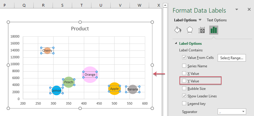
12. Then click OK, still in the Format Data Labels pane, uncheck Y Value check box, see screenshot:
13. Now, the bubbler chart is created completely. See screenshot:

Change bubble chart color based on categories dynamically in Excel
This section, I will talk about how to change the color of the bubbles based on the categories dynamically, which means the bubbles of the same category will fill the same color, and when changing the category name to another, the bubble color will be updated automatically as well as below demo shown.
To create this type of bubble chart, please do with the following step by step:
1. Insert a new blank row above the original data range, then type the category names into another range, and keep a blank cell between each category.
And then in the second row, type X, Y, Z ,Y, Z, Y, Z, Y, Z under the category names as below screenshot shown:

2. In the column of X header, please enter this formula: =B3 into cell F3, and then drag the fill handle down to the cells to fill this formula, this step will get the x data series of the chart, see screenshot:

3. In the column of first Y header, please enter the below formula into cell G3, and then drag the fill handle down to fill this formula, see screenshot:

4. Go on enter the below formula into cell H3 under the Z header column, then drag the fill handle down to fill this formula, see screenshot:

5. Then, select these two formula columns, and then drag the fill handle to right to apply these formulas to other cells, see screenshot:

6. After creating the helper columns, then click a blank cell, and then click Insert > Insert Scatter (X,Y) or Bubble Chart, and then choose one type of bubble chart you like to insert a blank chart, then right click the blank chart, and choose Select Data from the context menu, see screenshot:

7. Then, in the popped out Select Data Source dialog box, click Add button, see screenshot:

8. In the opened Edit Series dialog box, specify the series name, X value, Y value and bubble size from the helper data column, see screenshot:

9. And then, click OK to return the Select Data Source dialog box, now, you should repeat the above step 7 - step 8 to add the other data series into the chart as below screenshot shown:

10. After adding the data series, click OK button to close the dialog box, and now, the bubble chart with different colors by the category has been created as following screenshot shown:

11. At last, add the legend for the chart, please select the chart, and then click Chart Elements > Legend, and you will get the complete chart as below screenshot shown:

Create simple bubble chart in Excel with a powerful feature
Kutools for Excel provides 50+ special types of charts that Excel does not have, such as Progress Bar Chart, Target and Actual Chart, Difference Arrow Chart and so on. With its handy tool- Bubble Chart, you can create a bubble or 3D bubble chart as quickly as possible in Excel.. Click to download Kutools for Excel for free trial!
Download Bubble Chart sample file

Video: Create bubble chart in Excel
The Best Office Productivity Tools
Kutools for Excel - Helps You To Stand Out From Crowd
Kutools for Excel Boasts Over 300 Features, Ensuring That What You Need is Just A Click Away...
Office Tab - Enable Tabbed Reading and Editing in Microsoft Office (include Excel)
- One second to switch between dozens of open documents!
- Reduce hundreds of mouse clicks for you every day, say goodbye to mouse hand.
- Increases your productivity by 50% when viewing and editing multiple documents.
- Brings Efficient Tabs to Office (include Excel), Just Like Chrome, Edge and Firefox.