How to quickly create a bubble chart in Excel?
Bubble charts in Excel provide a distinctive way to visualize relationships between three sets of numerical values. Unlike traditional scatter plots, which use only the X and Y axes, bubble charts add a third dimension by varying the size of each data point (“bubble”) according to the value of an additional variable. This makes them ideal for presenting data where size, position, and relationship all matter—such as sales performance (sales volume, profit, and market share), scientific data comparisons, or project resource allocations.
For instance, if your data set contains three relevant metrics for each item, as shown below, a bubble chart can vividly convey these relationships at a glance.

- Create bubble chart by Bubble function – a basic bubble chart with bubbles in the same color
- Create bubble chart by a three-party tool – two steps to create a beautiful bubble chart
Create bubble chart by Bubble function
To create a bubble chart using Excel’s built-in feature, follow these detailed steps. This method is well suited for users who want full control over the data and chart presentation using native Excel tools. It is also good for straightforward scenarios, though bubble colors are uniform by default and custom styling or automation can require additional manual formatting.
1. Open the worksheet where you want to insert the bubble chart. Go to the Insert tab, then click Scatter (X, Y) or Bubble Chart (in Excel 2010, click Insert > Other Charts) and choose Bubble. See screenshot: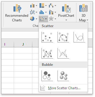
2. Right-click the blank chart that appears, and select Select Data. This prepares the chart to add your actual series data.
3. In the Select Data Source dialog, click Add to define your bubble series. You can later add multiple series if needed for comparisons.
4. Complete the Edit Series dialog as follows:
- For Series name, select the cell containing your series label.
- For Series X values, select the column to plot on the X axis.
- For Series Y values, select the column to plot on the Y axis.
- For Series bubble size, select the column whose values you want to determine the absolute size of each bubble.

Some practical tips:
- Ensure that the number of values for each field is the same; mismatched ranges will cause the chart to display incorrectly or result in errors.
- Bubbles are sized according to the third variable—be mindful if you have very large or very small size ranges as this can affect comparability.
5. If you wish to add labels, right-click any bubble, choose Add Data Labels or Add Data Callouts. This adds descriptive information on the chart.
You can edit data labels as needed for clarity—for example, showing additional series information.
To create a 3-D bubble chart, after completing the steps above, go to Insert > Scatter (X, Y) or Bubble Chart, then choose 3-D Bubble if you want a more visual presentation.
Create bubble chart by a three-party tool
When you need to quickly create visually appealing and well-formatted bubble charts—especially in bulk or with consistent color coding—consider using a third-party Excel add-in. For example, the Bubble feature in Kutools for Excel enables you to generate colorful and professionally formatted bubble charts in just a few clicks. This method is highly efficient for users who frequently need dynamic or customized bubble charts without manual formatting for each one.
After free downloading and installing Kutools for Excel, please follow these steps:
1. Go to the sheet you want to insert a bubble chart. Navigate to Kutools > Chart > Bubble.
2. In the Create bubble chart dialog, specify your data ranges for X values, Y values, bubble size, series name, and other advanced options as you need. You can preview your choice in the dialog box.
3. Click OK. Instantly, you’ll see a colorful bubble chart added to your sheet.
Advantages of this method include speed, convenience, and easy application of various design templates. It’s especially helpful when consistency across reports or dashboards is required.
Relative Articles:
Best Office Productivity Tools
Supercharge Your Excel Skills with Kutools for Excel, and Experience Efficiency Like Never Before. Kutools for Excel Offers Over 300 Advanced Features to Boost Productivity and Save Time. Click Here to Get The Feature You Need The Most...
Office Tab Brings Tabbed interface to Office, and Make Your Work Much Easier
- Enable tabbed editing and reading in Word, Excel, PowerPoint, Publisher, Access, Visio and Project.
- Open and create multiple documents in new tabs of the same window, rather than in new windows.
- Increases your productivity by 50%, and reduces hundreds of mouse clicks for you every day!
All Kutools add-ins. One installer
Kutools for Office suite bundles add-ins for Excel, Word, Outlook & PowerPoint plus Office Tab Pro, which is ideal for teams working across Office apps.
- All-in-one suite — Excel, Word, Outlook & PowerPoint add-ins + Office Tab Pro
- One installer, one license — set up in minutes (MSI-ready)
- Works better together — streamlined productivity across Office apps
- 30-day full-featured trial — no registration, no credit card
- Best value — save vs buying individual add-in