How to create speedometer or gauge chart in Excel?
If you've ever analyzed performance metrics, service levels, or financial benchmarks, you may have found a speedometer (also called a gauge) chart to be an engaging way to visualize current values against a range. These charts allow you to communicate progress, status, or trends at a glance, much like a car’s dashboard speedometer. Unlike standard chart types, Excel does not offer a direct speedometer/gauge chart option, but with the following methods, you can efficiently build one for clear and dynamic reporting.

Create speedometer chart with the help of Doughnut chart
Quickly create speedometer chart with an amazing tool (3 steps)
More tutorial for charts…
Create speedometer chart with the help of Doughnut chart
This method helps you manually assemble a speedometer chart by strategically combining Doughnut and Pie chart types. It’s suitable for users who want full control over chart component formatting, such as color sections, pointer location, and label placement. The process involves several key steps and requires careful attention to data preparation and chart options.
1. Before creating a speedometer chart, it’s essential to set up your supporting data correctly. This ensures the chart segments and pointer work as intended and helps avoid common errors in final visualization.
- Create the first value range to represent different sections of the speedometer chart. For example, if you want three sectors (e.g., Low, Medium, High), input values such as 30, 60, and 90 in cells A2, A3, and A4. In cell A5, enter the sum of these numbers (=30+60+90 =180), which acts as the total across the above three cells. This total is crucial for the chart's segmentation.
- Prepare the value range for the pointer indicator. In a separate column (such as Column D), enter your pointer values: type 10 in D2, 5 in D3 to form the data points for positioning, and enter the following formula into cell D4 to calculate the remaining arc of the chart:
This formula ensures the pointer section is accurately proportioned within a 360-degree chart area.=360-(D2+D3)

3. Select the numbers in your 'Value' column. Go to the Insert tab, choose Insert Pie or Doughnut Chart, then select Doughnut. This step visualizes the segmented value ranges.
4. Right-click the doughnut chart and select Format Data Series to open the formatting pane.

5. In the Format Data Series pane, set the Angle of first slice to 271. Adjusting this angle aligns the chart’s start point and improves the gauge effect’s visual accuracy.

5. Right-click the largest segment (it usually represents the background or invisible arc) and select Format Data Point from the context menu to open its formatting pane.

6. In the Format Data Point pane, go to Fill & Line, choose No fill to hide the segment, and close the pane. This step removes parts of the chart that shouldn’t display, sharpening the gauge's visual.

7. Right-click the doughnut, and then select Select Data.

8. In the Select Data Source dialog, click Add to create an additional series. This series will function as the pointer for the speedometer.

9. In the Edit Series dialog, provide a name for the series, select your pointer values (cells D2:D4), and confirm with OK.

10. After returning to the data source dialog, click OK to complete data selection.
11. Right-click the newly added doughnut segment (will appear as an outer circle), select Change Series Chart Type.

12. Under All Charts > Combo, select Pie type for the pointer series, tick Secondary Axis, and confirm with OK. This overlays the pointer pie chart onto the doughnut gauge.

13. Click the pie pointer series, right-click to choose Format Data Series again.

14. In the formatting pane, input 270 for Angle of first slice on the Series Options tab and close the pane. This accurately positions the pointer relative to the gauge.

15. Select the largest pie segment and format its data point by setting No fill to make it invisible.

16. In the Format Data Point pane, ensure No fill is chosen for any remaining large sections, hiding unnecessary pie parts.

17. Repeat steps to hide other unwanted pie slices or chart features such as legend, border, or title as necessary for a clear gauge look. Your chart should now resemble a speedometer:

18. Click the pointer segment, right-click, and select Add Data Label to enhance user readability.

19. Click the data label to select it, then click again to edit. Type "=" in the formula bar and select cell D2 (pointer value), then press Enter. This links the pointer label to your worksheet and enables dynamic updates.

Whenever the value in D2 changes, the chart pointer updates automatically, providing immediate feedback. See demo below:

Tip: To avoid common problems, be sure not to merge cells in your data ranges, as this may cause chart errors. Always verify your formula references, and double check that "No fill" formatting is applied only to the correct segments so your pointer renders properly. This manual method offers customization, letting you adjust every color and label—but it requires more time and precision, especially for updates or layout changes. If you want to automate chart creation, consider one of the alternative methods below.
Quickly create speedometer chart with an amazing tool
If you find manual speedometer chart creation complex or tedious, the Quickly Create Speedometer Chart utility in Kutools for Excel streamlines the process and delivers instant results. This tool lets you build a dynamic gauge chart in just a few steps, with easy parameter selection for min, max, and current values. The intuitive interface means even beginners can create and update speedometer charts, useful for dashboards, presentations, and progress visualization.

Here’s how to quickly create a speedometer chart with Kutools:
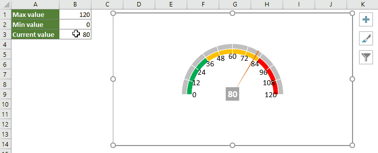
1. Prepare your worksheet data by specifying the maximum, minimum, and current values. These three parameters shape the gauge's visible range and pointer position.

2. Navigate to the Kutools tab, then go to Charts > Progress > Speedometer to open the utility.

3. In the Quickly create speedometer chart dialog, separately select the cells containing your max, min, and current values. Choose the preferred chart type, and optionally check Generate dynamic chart to allow the pointer to update automatically as data changes. Click OK to generate the chart.

From now on, updating the current value automatically moves the pointer, making your dashboard instantly responsive. See demo below:
Kutools provides flexible chart styles and handles formatting automatically, making it ideal for periodic reporting, quick layouts, or for users who want professional results without detailed manual setup. The main limitation is less control over low-level formatting compared to manual methods.
Kutools for Excel - Supercharge Excel with over 300 essential tools, making your work faster and easier, and take advantage of AI features for smarter data processing and productivity. Get It Now
Summary and recommendations: To choose between these solutions, consider your reporting frequency, required customization, and technical comfort level. Manual creation using doughnut charts is best for deep customization and learning Excel's chart mechanics, while Kutools streamlines the process for instant, dynamic dashboards with minimal effort.
Best Office Productivity Tools
Supercharge Your Excel Skills with Kutools for Excel, and Experience Efficiency Like Never Before. Kutools for Excel Offers Over 300 Advanced Features to Boost Productivity and Save Time. Click Here to Get The Feature You Need The Most...
Office Tab Brings Tabbed interface to Office, and Make Your Work Much Easier
- Enable tabbed editing and reading in Word, Excel, PowerPoint, Publisher, Access, Visio and Project.
- Open and create multiple documents in new tabs of the same window, rather than in new windows.
- Increases your productivity by 50%, and reduces hundreds of mouse clicks for you every day!
All Kutools add-ins. One installer
Kutools for Office suite bundles add-ins for Excel, Word, Outlook & PowerPoint plus Office Tab Pro, which is ideal for teams working across Office apps.
- All-in-one suite — Excel, Word, Outlook & PowerPoint add-ins + Office Tab Pro
- One installer, one license — set up in minutes (MSI-ready)
- Works better together — streamlined productivity across Office apps
- 30-day full-featured trial — no registration, no credit card
- Best value — save vs buying individual add-in