How to add best fit line/curve and formula in Excel?
When analyzing relationships between two variables, such as product units and total cost, it is often crucial to find a mathematical equation that best describes the trend of the data collected from experiments or business activities. In Excel, finding the "best fit" line or curve—also called a trendline—and displaying its formula helps in forecasting, understanding underlying patterns, or presenting research findings visually and clearly. Whether you work with experimental data, sales analysis, or financial projections, Excel provides several practical ways to add and interpret a best fit line/curve, and to calculate and display its corresponding formula or equation directly in your worksheets.
This guide covers a range of approaches for fitting a line or curve and getting the associated equation in Excel. Below, you will find practical, step-by-step solutions for various versions of Excel and different analytical needs, from chart-based user interfaces to automation through VBA code.
- Add best fit line/curve and formula in Excel 2013 or later versions
- Add best fit line/curve and formula in Excel 2007 and 2010
- Add best fit line/curve and formula for multiple sets of data
- VBA Code - Automate fitting best fit lines and displaying their equations programmatically
Add best fit line/curve and formula in Excel2013 or later versions
Suppose you have collected experimental data, to detect the general trend and build a predictive model, you may want to fit a best fit line or curve and obtain the corresponding equation (formula) in Excel 2013 or later. These steps are frequently used in cost analysis, quality control, sales forecasting, and scientific studies.
1. Select your data range, and go to the Insert tab. Click Insert Scatter (X, Y) or Bubble Chart > Scatter. 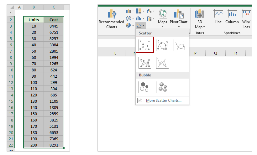
Tip: Ensure that your data is formatted as two columns—one for X values (independent variable) and one for Y values (dependent variable). Empty cells or non-numeric values might prevent a proper chart from appearing.
2. Click on the scatter chart to select it. Then, on the Design tab, choose Add Chart Element > Trendline > More Trendline Options.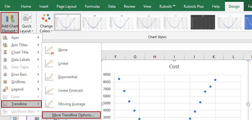
3. In the Format Trendline pane, select the Polynomial option for curved data trends, or another type such as Linear, Exponential, or Logarithmic, depending on your analytical scenario. Adjust the Order parameter for polynomials (higher orders fit more complex curves). Next, check the Display Equation on Chart option so that Excel displays the calculated formula directly on your chart.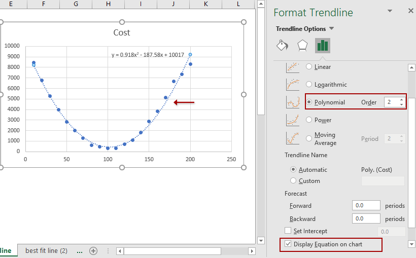
With these steps, your scatter chart will now visually display both the best fit line (or curve) and its analytical equation, allowing for easy forecasting and interpretation.
Easily combine multiple worksheets/workbooks into one worksheet/workbook
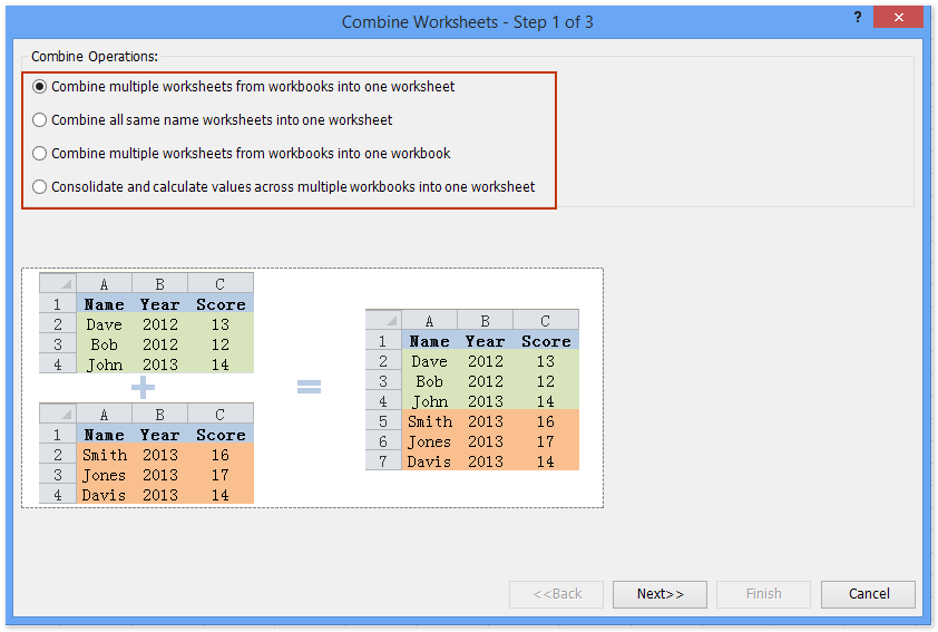
It may be tedious to combine dozens of sheets from different workbooks into one sheet. But with Kutools for Excel’s Combine (worksheets and workbooks) utility, you can get it done with just several clicks!
Add best fit line/curve and formula in Excel 2007 and 2010
While the core technique is similar between versions, the user interface in Excel 2007 and 2010 differs. Use this method if you are working with older Excel installations.
1. Highlight your experimental data within Excel and navigate to Insert > Scatter > Scatter. This step inserts a basic scatter chart.
Practical tip: Organize your known X values in one column and Y values in the next, ensuring they are side by side for easier chart creation.
2. Click to select the newly generated scatter chart, then go to Layout tab > Trendline > More Trendline Options. 
3. In the Format Trendline dialog, choose the Polynomial type (or your preferred trendline type) and enter the desired order. Select the Display Equation on chart option so the best fit curve's equation appears on your graph.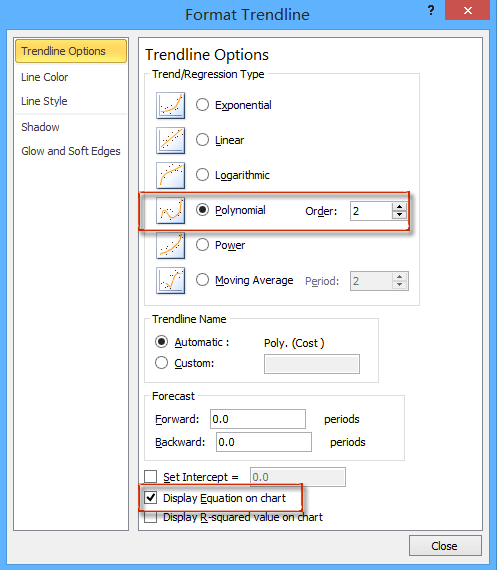
4. Click Close to apply changes and finalize your chart with the fitted curve and formula.
Add best fit line/curve and formula for multiple sets of data
When working with several groups of experimental or observational data, analyzing trends for each set and comparing their equations can provide more nuanced insights. While Excel charts let you visualize multiple data series, manually adding and formatting trendlines for each series can be time-consuming and prone to mistakes. Kutools for Excel solves this by offering a one-click tool—Add Trend Lines to Multiple Series.
1. Select all groups of data for analysis, then use Insert > Scatter > Scatter to generate a chart incorporating all data series.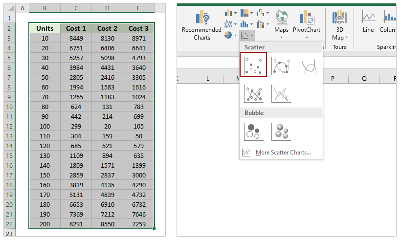
Tip: Each column (beyond the X values) should represent a separate series, allowing Excel to plot them individually.
2. Once the combined scatter chart appears, keep it selected and navigate to Kutools > Charts > Chart Tools > Add Trend Lines to Multiple Series.
Trendlines and their equations are now added for each series. Double-check if the trendlines appropriately fit your data; if not, you may refine the trendline type for each series individually.
3. In the chart, double-click any trendline to access its Format Trendline pane.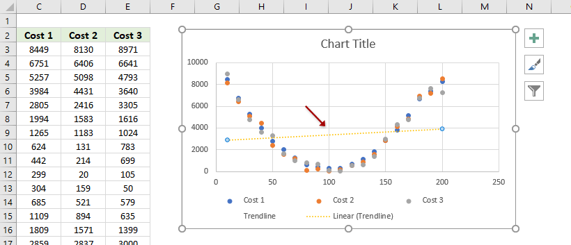
4. Within the Format Trendline pane, try selecting different trendline types for the current series to determine which is optimal (e.g., Linear, Polynomial, Exponential). For scientific or engineering data, polynomial trendlines are frequently preferred for curvature fitting. Always tick Display Equation on chart to show the formula.
If you make frequent use of this feature, Kutools for Excel can save significant time and reduce repetitive steps, especially with large or frequently updated datasets.
Kutools for Excel - Supercharge Excel with over 300 essential tools, making your work faster and easier, and take advantage of AI features for smarter data processing and productivity. Get It Now
VBA Code - Automate fitting best fit lines and displaying their equations programmatically
In cases where you have to fit trendlines to many charts or perform repeated regression analysis, automating trendline addition and equation extraction using Excel VBA can significantly improve efficiency. Using VBA is highly beneficial when managing large-scale projects, creating custom add-ins, or applying standardized procedures to multiple datasets or charts at once.
1. To begin, create the scatter chart. Then, go to Developer > Visual Basic. In the Microsoft Visual Basic for Applications window, click Insert > Module and paste the following code into the module area:
Sub AddTrendlineAndEquationToAllCharts()
    Dim ch As ChartObject
    Dim ws As Worksheet
    Dim i As Integer
    On Error Resume Next
    xTitleId = "KutoolsforExcel"
    For Each ws In ActiveWorkbook.Worksheets
        For Each ch In ws.ChartObjects
            For i = 1 To ch.Chart.SeriesCollection.Count
                With ch.Chart.SeriesCollection(i)
                    .Trendlines.Add Type:=xlPolynomial, Order:=2, Forward:=0, Backward:=0, DisplayEquation:=True
                End With
            Next i
        Next ch
    Next ws
End Sub2. To execute the macro, click the ![]() run button or press F5 in the VBA editor. After execution, review your workbook to confirm that trendlines and equations have been added where appropriate.
run button or press F5 in the VBA editor. After execution, review your workbook to confirm that trendlines and equations have been added where appropriate.
This macro automatically adds a second-order (quadratic) polynomial trendline to every series of every chart in every worksheet, displaying each corresponding equation on the chart. You can adjust the Order:=2 value for higher or lower polynomial fits, and change Type to xlLinear for straight lines as needed.
Troubleshooting and tips: If you receive errors, ensure you have charts present and that macros are enabled in your workbook. If your charts already have trendlines, duplications might occur—remove old trendlines before application if needed. Always save your workbook before running macros as changes cannot be easily undone. For very repetitive needs, this approach saves significant manual effort.
Demo: Add best fit line/curve and formula in Excel 2013 or later versions
Related articles:
Best Office Productivity Tools
Supercharge Your Excel Skills with Kutools for Excel, and Experience Efficiency Like Never Before. Kutools for Excel Offers Over 300 Advanced Features to Boost Productivity and Save Time. Click Here to Get The Feature You Need The Most...
Office Tab Brings Tabbed interface to Office, and Make Your Work Much Easier
- Enable tabbed editing and reading in Word, Excel, PowerPoint, Publisher, Access, Visio and Project.
- Open and create multiple documents in new tabs of the same window, rather than in new windows.
- Increases your productivity by 50%, and reduces hundreds of mouse clicks for you every day!
All Kutools add-ins. One installer
Kutools for Office suite bundles add-ins for Excel, Word, Outlook & PowerPoint plus Office Tab Pro, which is ideal for teams working across Office apps.
- All-in-one suite — Excel, Word, Outlook & PowerPoint add-ins + Office Tab Pro
- One installer, one license — set up in minutes (MSI-ready)
- Works better together — streamlined productivity across Office apps
- 30-day full-featured trial — no registration, no credit card
- Best value — save vs buying individual add-in