How to add a right hand/side Y axis to an Excel chart?
By default, Excel places the Y axis on the left side of a chart. However, in many cases—such as for design clarity, layout symmetry, or better alignment with data labels—you may prefer to display the Y axis on the right. Fortunately, Excel provides a built-in way to reposition the Y axis by changing its Label Position to High. In addition, there are other workarounds and enhancements—such as using a secondary axis or VBA—for more complex scenarios. This article introduces multiple methods for adding or moving the Y axis to the right-hand side of an Excel chart, helping you choose the one that best fits your needs.
- Move Y axis to the right using Label Position setting
- Add a right hand/side Y axis to an Excel chart
- Add a right hand/side Y axis in a chart in Excel 2010
- Add a right-side Y axis using VBA code


Move Y axis to the right using Label Position setting
This is the simplest and most direct method. Excel allows you to change the position of the Y axis labels, effectively moving the axis from left to right.
Steps:
- Click the chart to activate it.
- Right-click the Y axis (usually shown on the left by default), and choose "Format Axis" from the context menu.

- In the Format Axis pane (or dialog box), go to the Axis Options tab (usually represented by a bar chart icon).
- Scroll down to the "Labels" section. From the Label Position dropdown, select "High".

- Close the Format Axis pane.


Your Y axis will now appear on the right side of the chart.
- This method only changes the visual position of the Y axis. It doesn't create a new secondary axis.
- If your chart already uses a secondary Y axis, make sure not to confuse it with this label position adjustment.
Add a right hand/side Y axis to an Excel chart
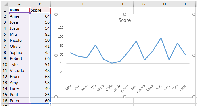
For illustration, let’s say you have constructed a line chart as shown below. You may want to have the Y axis appear on the right, such as to display dual data ranges or simply to match a specific formatting requirement. Here’s how you can add a right-side Y axis to your chart in common versions of Excel:
1. Right-click anywhere on your chart, and select Select Data from the context menu that appears.
Note: This menu allows you to modify the data series that are currently part of your chart. Ensuring you click directly on the plot area will make the correct right-click menu appear.
2. In the Select Data Source dialog box, click the Add button.
Tip: You are about to add a duplicate of your original data series, which enables you to plot it on a secondary axis.
3. In the Edit Series dialog box, specify the Series name and Series values to exactly match your original series (for example, set Series name as cell B1 and series values as B2:B16). Then click OK to close the dialog boxes.
Advice: Using the same series ensures the chart remains visually consistent—even if you later adjust only one axis.
4. Right-click the new line in the chart that represents the series you just added, and select Change Series Chart Type from the menu.
Caution: Make sure you are selecting the newly added data series, not the original one.
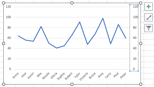
5. In the Change Chart Type dialog box, find the Secondary Axis column. Tick the checkbox corresponding to your newly added series to plot it on a secondary (right-side) Y axis. Click OK.
Parameter note: The “Secondary Axis” assignment places the chosen series on the right side, thus activating the appearance of the secondary Y axis.
6. Back in your chart, right-click the left Y axis and select Format Axis.
7. In the Format Axis pane, switch to Text Options and select the No Fill option to hide the left Y axis. This cleans up the visual result for a right-only Y axis.
Practical tip: If you want both left and right Y axes visible, you can skip step 7. Hiding the left axis can be useful when only the right axis is relevant or avoids confusion.
You should now see your chart display the Y axis on the right side, just as you intended.
Applicable scenarios and notes:
- Moving the Y axis to the right side is often helpful for layout customization, chart readability, or aligning with user interface design preferences. It does not affect the data range or scaling.
- If you want to display separate Y axis scales, use distinct series data on the secondary axis.
- If your chart has multiple data series, double-check which series is plotted on each Y axis to avoid confusion.
- Some chart types may not support secondary axes (e.g.,3D charts or pie charts).
- If formatting options seem unavailable, try updating your Excel version or ensure your chart is selected before accessing formatting settings.
Troubleshooting suggestions:
- If the right axis does not appear, confirm you have assigned a data series to the secondary axis.
- For visual customization, use the Format Axis options to adjust labels, tick marks, and axis line formatting.
- After adding the secondary axis, review the alignment and readability of your chart for the intended audience.

Unlock Excel Magic with Kutools AI
- Smart Execution: Perform cell operations, analyze data, and create charts—all driven by simple commands.
- Custom Formulas: Generate tailored formulas to streamline your workflows.
- VBA Coding: Write and implement VBA code effortlessly.
- Formula Interpretation: Understand complex formulas with ease.
- Text Translation: Break language barriers within your spreadsheets.
Add a right hand/side Y axis in a chart in Excel 2010
If you are using Excel 2010, the process to add a right-side Y axis is slightly different due to changes in the interface, but the fundamental idea remains the same: plot your data on a secondary axis and remove or hide the primary (left) Y axis if needed.
1. Follow the Step1-3 described in the previous method to add a duplicate data series to your chart.
2. Right-click the new data series (the duplicate line) in the chart, and select Format Data Series from the menu.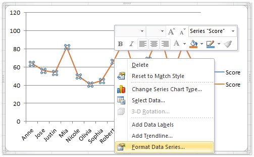
Tip: In Excel2010, you often need to make sure you have precisely selected the correct line or data series.
3. In the Format Data Series dialog box, go to Series Options from the sidebar, and then check the Secondary Axis radio button. Close the dialog box once done.
Note: Assigning a series to the secondary axis triggers Excel to display the right-side Y axis automatically.
4. Select the left Y axis in the chart, then on the ribbon, click Home > Font Color > White (or another color to match your chart background) to visually hide the left axis. Alternatively, you can set the axis line color to 'No Color' for a cleaner appearance.
At this point, the Y axis should be displayed on the right side of your chart.
Applicable scenarios and notes:
- Ideal when presenting charts that are intended for publications or presentations, where a right-side Y axis matches specific design standards or improves clarity.
- This method can be repeated for different chart types, but always make sure the secondary axis accurately represents your data.
Potential issues and troubleshooting:
- If the secondary axis overlaps with chart elements, adjust the plot area or axis position using Format Axis options.
- If the left Y axis doesn't completely disappear after changing the font color, double-check for axis line formatting or try removing the axis via the chart layout options.
Add a right-side Y axis using VBA code
If your workbook contains multiple charts, manually adjusting the Y axis position one by one can be time-consuming. This VBA solution offers a one-click method to add a secondary Y axis to the selected chart — no manual configuration needed. It's especially helpful when you want to consistently apply a right-side Y axis across many charts for visual balance or layout purposes. Once selected, the macro automatically creates a synchronized secondary axis, saving you time and effort.
1. Navigate to Developer Tools > Visual Basic to launch the Microsoft Visual Basic for Applications editor. Click Insert > Module, and paste the following code into the blank module window:
Sub AddRightYAxisAligned()
'Updated by Extendoffice
    Dim cht As Chart
    Dim primaryAxis As Axis, secondaryAxis As Axis

    If ActiveChart Is Nothing Then
        MsgBox "Please select a chart before running the macro.", vbExclamation, "KutoolsforExcel"
        Exit Sub
    End If

    Set cht = ActiveChart

    With cht.SeriesCollection.NewSeries
        .Name = "Secondary Axis"
        .Values = Array(0, 0)
        .ChartType = xlLine
        .AxisGroup = xlSecondary
        .Format.Line.Visible = msoFalse
    End With

    Set primaryAxis = cht.Axes(xlValue, xlPrimary)
    Set secondaryAxis = cht.Axes(xlValue, xlSecondary)


    With secondaryAxis
        .MinimumScale = primaryAxis.MinimumScale
        .MaximumScale = primaryAxis.MaximumScale
        .MajorUnit = primaryAxis.MajorUnit
        .MinorUnit = primaryAxis.MinorUnit
    End With
End Sub
2 After entering the code, return to Excel and select the chart to which you want to add the right-side Y axis. Then press F5 (or click the ![]() 'Run' button) to execute the macro.
'Run' button) to execute the macro.
Once the macro is successfully run, the secondary Y axis will appear on the right side of the chart. You can now manually remove the left one as needed.
Precautions and tips:
- This macro only applies to one selected chart at a time, please select the chart before running the macro. If needed, you can run it repeatedly for other charts.
- This method does not remove the original Y axis—it only adds a new one on the right side.
- If you receive an error, ensure your chart is selected before running the macro.
Related articles:
Best Office Productivity Tools
Supercharge Your Excel Skills with Kutools for Excel, and Experience Efficiency Like Never Before. Kutools for Excel Offers Over 300 Advanced Features to Boost Productivity and Save Time. Click Here to Get The Feature You Need The Most...
Office Tab Brings Tabbed interface to Office, and Make Your Work Much Easier
- Enable tabbed editing and reading in Word, Excel, PowerPoint, Publisher, Access, Visio and Project.
- Open and create multiple documents in new tabs of the same window, rather than in new windows.
- Increases your productivity by 50%, and reduces hundreds of mouse clicks for you every day!
All Kutools add-ins. One installer
Kutools for Office suite bundles add-ins for Excel, Word, Outlook & PowerPoint plus Office Tab Pro, which is ideal for teams working across Office apps.
- All-in-one suite — Excel, Word, Outlook & PowerPoint add-ins + Office Tab Pro
- One installer, one license — set up in minutes (MSI-ready)
- Works better together — streamlined productivity across Office apps
- 30-day full-featured trial — no registration, no credit card
- Best value — save vs buying individual add-in