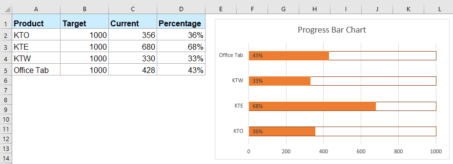
How to create progress bar chart in Excel?
Progress bar charts in Excel are commonly used to visually track progress toward a specific goal or target, whether that's task completion, sales targets, or project milestones. These charts offer an immediate, intuitive way to see how much work has been completed and how much remains, making them valuable for both reporting and daily operations. But how exactly can you create different types of progress bar charts in Excel, and which method best suits your needs?
Create a progress bar chart in Excel with normal Insert Bar function
Create a progress bar chart in Excel with Conditional Formatting function
Create a progress bar chart in Excel with a handy feature
Create a dynamic progress bar chart with VBA (Auto-Updating Chart Based on Data Changes)
Create in-cell progress bars using Excel REPT formula (Without Charts or Conditional Formatting)
Create a progress bar chart in Excel with normal Insert Bar function
A standard approach is to use Excel’s built-in Clustered Bar Chart and adapt it to show progress. This method is suitable when you want an actual chart that can be further customized, and when you may need to export or present progress data. The steps below walk you through setting up a simple progress bar chart:
1. Select the data that you want to create the progress bar chart based on, and then click Insert > Insert Column or Bar Chart > Clustered Bar under the 2-D Bar section as following screenshot shown:

2. Then a clustered chart has been inserted, then click the target data series bar, and then right click to choose Format Data Series from the context menu, see screenshot:

3. In the Format Data Series pane, click the Fill & Line icon button. Select No fill under the Fill section (to show only the bar outline), and then choose Solid line for the border. Pick a color that makes the bar stand out. This lets the chart visually represent progress with a clean and clear look. See screenshot:

4. After closing the Format Data Series pane, select the whole chart. Go to Design > Add Chart Element > Data Labels > Inside Base. This displays the numeric values inside each bar for easier comparison, as shown below:
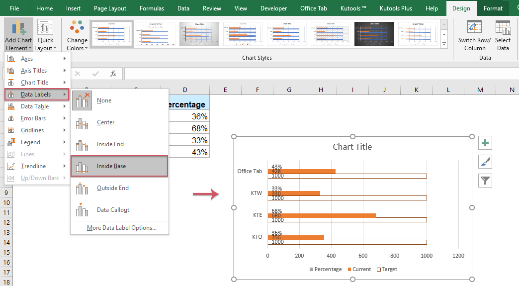
5. If your chart includes multiple series, you may want to delete unnecessary data labels and keep only those representing your main progress dataset, as displayed below:

6. Next, right-click your main progress data series again and select Format Data Series. Under the Series Options, move the Series Overlap slider to 100% for a seamless, single-bar effect.

7. To set the progress bar maximum, right-click the horizontal value axis and choose Format Axis as below:

8. In the Format Axis pane, under Axis Options, input the maximum value corresponding to your goal in the Maximum field. This ensures the bars accurately display the percentage achieved toward each target. Your progress bar chart is now complete!

Tips and Remarks: This approach is versatile: you can easily adjust bar colors or axis scaling for various projects. However, manual formatting steps may be time-consuming for large datasets, and the chart requires updating if the maximum target changes.
Troubleshooting: If your bars appear stacked rather than overlapped, double-check the "Series Overlap" setting. Also, set the axis maximum according to your true goal or upper limit for accurate visual representation.
Create a progress bar chart in Excel with Conditional Formatting function
Conditional formatting allows you to visually display progress bars directly inside worksheet cells, removing the need for separate chart objects. This is useful in dashboards or tables where compact visualization is required, and frequent updates are needed as data changes.
1. Select the value cells where you want to insert the progress bar chart, and then click Home > Conditional Formatting > Data Bars > More Rules, see screenshot:

2. In the New Formatting Rule dialog box, please do the following operations:
(1.) In Type section, choose Number in Minimum and Maximum drop down list;
(2.) Set the min and max values in Minimum and Maximum box based on your data; this ensures that the data bar scales correctly and reflects true progress proportionally;
(3.) Finally, choose Solid Fill option under the Fill drop down, and then select a color as you need. Adjusting the color can help visually distinguish different statuses.

3. Then click OK button, and progress bars will appear inside the selected cells, visually indicating the progress against your set maximum, see screenshot:

Advantages: This method keeps your worksheet uncluttered and lets you monitor progress directly where your data lives. It automatically updates as values change.
Potential Issues: Data bars are for visual purposes only—there is no numeric summary unless you add separate formulas. For very small or very large values, bars may not display well unless you fine-tune min/max settings. When you copy and paste cells containing the Data Bars to another workbook, the conditional formatting rules are normally preserved if you paste normally (Ctrl+C / Ctrl+V).
Create a progress bar chart in Excel with a handy feature
If you regularly create progress bar charts and want a fast method with more flexibility, Kutools for Excel can simplify the task. The dedicated "Progress Bar Chart" feature allows chart insertion based on percentage completion or pairs of actual vs target values, making it ideal for more complex business reports or tracking multiple projects at once. This method reduces the risk of user error from manual formatting and is readily accessible to those who have installed the Kutools add-in.
After installing Kutools for Excel, please do as this:
1. Click Kutools > Charts > Progress > Progress Bar Chart, see screenshot:

2. In the popped out Progress Bar Chart dialog box, please do the following operations:
- Under the Axis label range, select the axis values from the original data;
- Select Percentage of current completion option if you want to create the progress bar chart based on the percentage values;
- Then, select the percentage values from the data range.

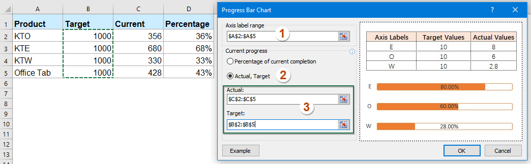
3. After setting the operations, please click OK button, and the progress bar char has been inserted at once, see screenshot:

Create in-cell progress bars using Excel REPT formula (Without Charts or Conditional Formatting)
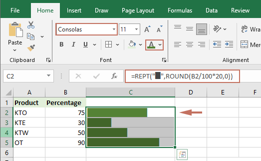
In some cases, you may wish to create simple, visually effective progress bars directly inside worksheet cells, without making use of charts or conditional formatting features. This approach is particularly useful in tables, task lists, or status columns where you need a quick, at-a-glance visual without managing chart objects. Using the REPT function in Excel, you can create in-cell bar graphs by repeating a specific character (such as "█" or "|") based on your current progress.
1. Enter the following formula in the target cell where you want the progress bar to appear (e.g., C2):
=REPT("█",ROUND(B2/100*20,0))This formula assumes that cell B2 contains your progress (for example,75 for 75%). The "20" indicates the total number of bars shown at 100% completion. Adjust this number for longer or shorter progress bars. You can change the character to another symbol if desired.
2. Press Enter to confirm. To apply the formula to other rows, copy cell C2 and paste it to the range where you need progress bars.
3. Use a monospaced font (such as Consolas or Courier New) in the progress bar cells to keep the bars aligned.
4. By default, the progress bar is displyed in black. You can change the color by specifying a different font color.
Parameter Notes: Adjust "B2" and "20" as needed to fit your data structure and preferred bar length.
Advantages: This method is lightweight, requires no graphics, and updates automatically as progress values change.
Limitations: Visual style is basic compared to data bars or charts. Customization is limited to changing the symbol or bar length. Not suitable for complex reports that require more detailed visualization.
Common Issues: If the bars do not appear as expected, check that your cell contains numeric values and the font supports the chosen symbol.
More relative chart articles:
- Create A Bar Chart Overlaying Another Bar Chart In Excel
- When we create a clustered bar or column chart with two data series, the two data series bars will be shown side by side. But, sometimes, we need to use the overlay or overlapped bar chart to compare the two data series more clearly. In this article, I will talk about how to create an overlapped bar chart in Excel.
- Create A Step Chart In Excel
- A step chart is used to show the changes happened at irregular intervals, it is an extended version of a line chart. But, there is no direct way to create it in Excel. This article, I will talk about how to create a step chart step by step in Excel worksheet.
- Highlight Max And Min Data Points In A Chart
- If you have a column chart which you want to highlight the highest or smallest data points with different colors to outstand them as following screenshot shown. How could you identify the highest and smallest values and then highlight the data points in the chart quickly?
- Create Gantt Chart In Excel
- When you need to display your timeline of the project management in Excel, the Gantt chart can help you. Most of users may be known that the Gantt chart is a horizontal bar chart which is often used in project management applications, and from it you can view the timelines of each project managements visually and intuitively.
Best Office Productivity Tools
Supercharge Your Excel Skills with Kutools for Excel, and Experience Efficiency Like Never Before. Kutools for Excel Offers Over 300 Advanced Features to Boost Productivity and Save Time. Click Here to Get The Feature You Need The Most...
Office Tab Brings Tabbed interface to Office, and Make Your Work Much Easier
- Enable tabbed editing and reading in Word, Excel, PowerPoint, Publisher, Access, Visio and Project.
- Open and create multiple documents in new tabs of the same window, rather than in new windows.
- Increases your productivity by 50%, and reduces hundreds of mouse clicks for you every day!
All Kutools add-ins. One installer
Kutools for Office suite bundles add-ins for Excel, Word, Outlook & PowerPoint plus Office Tab Pro, which is ideal for teams working across Office apps.
- All-in-one suite — Excel, Word, Outlook & PowerPoint add-ins + Office Tab Pro
- One installer, one license — set up in minutes (MSI-ready)
- Works better together — streamlined productivity across Office apps
- 30-day full-featured trial — no registration, no credit card
- Best value — save vs buying individual add-in